Design map using color palette rule
The following steps guides you to design a map using color palette rule and optimal distribution to display the US presidential election results.
Create data set
- In the data panel, click
New Data.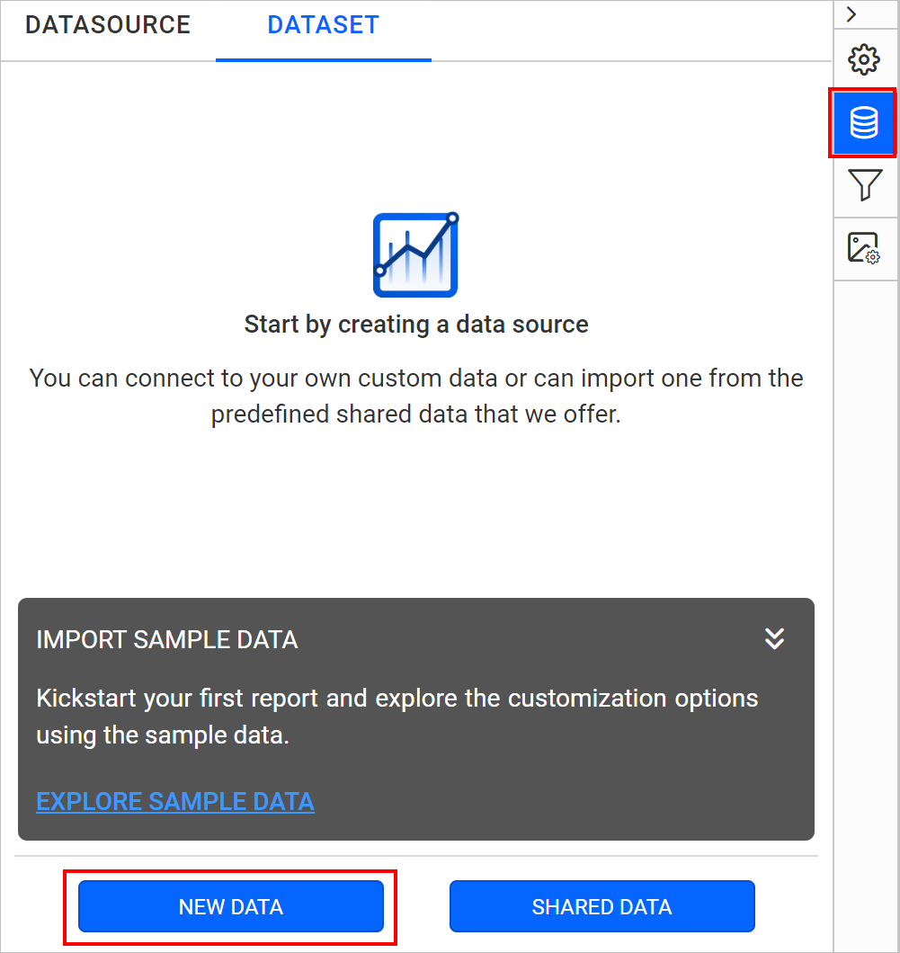
- Choose the
JSONconnection type.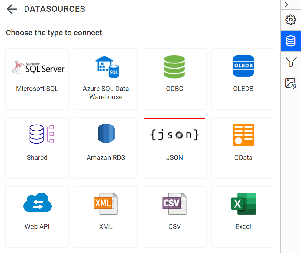
- Choose
FileasType.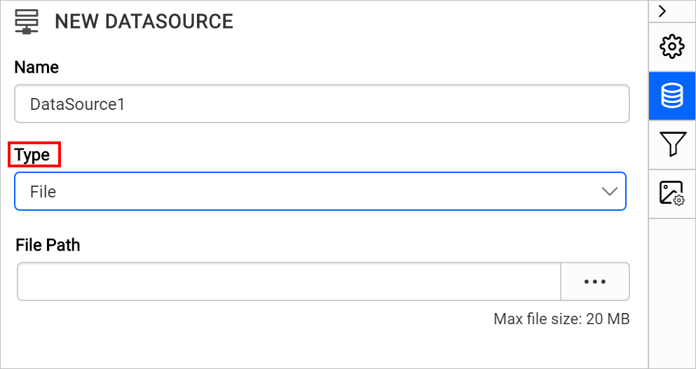
- Click on the upload button, browse and upload the JSON file in
File Pathfield.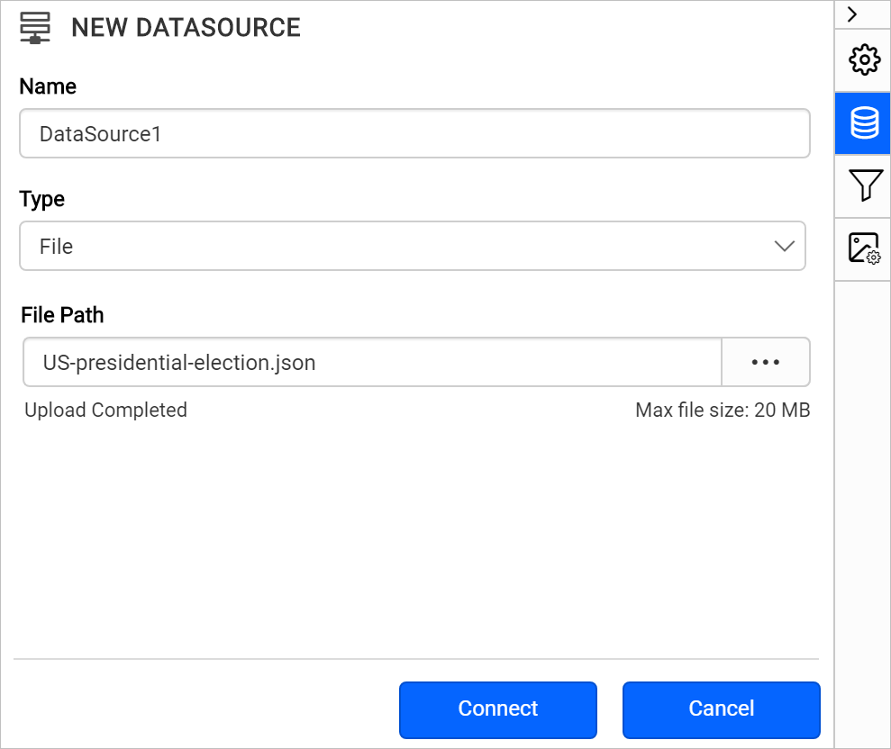
- Click on the
Connectbutton. - In the query builder, the available fields in JSON file will be loaded under default table name,
Result.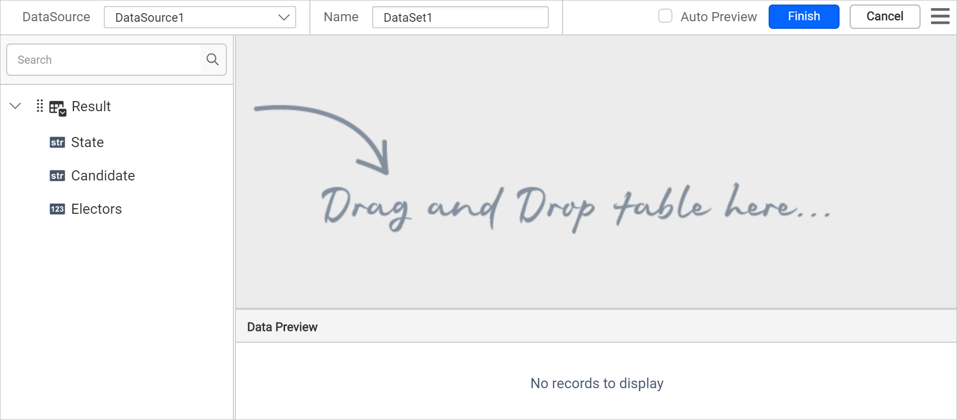
- Drag and drop the
Resulttable and execute.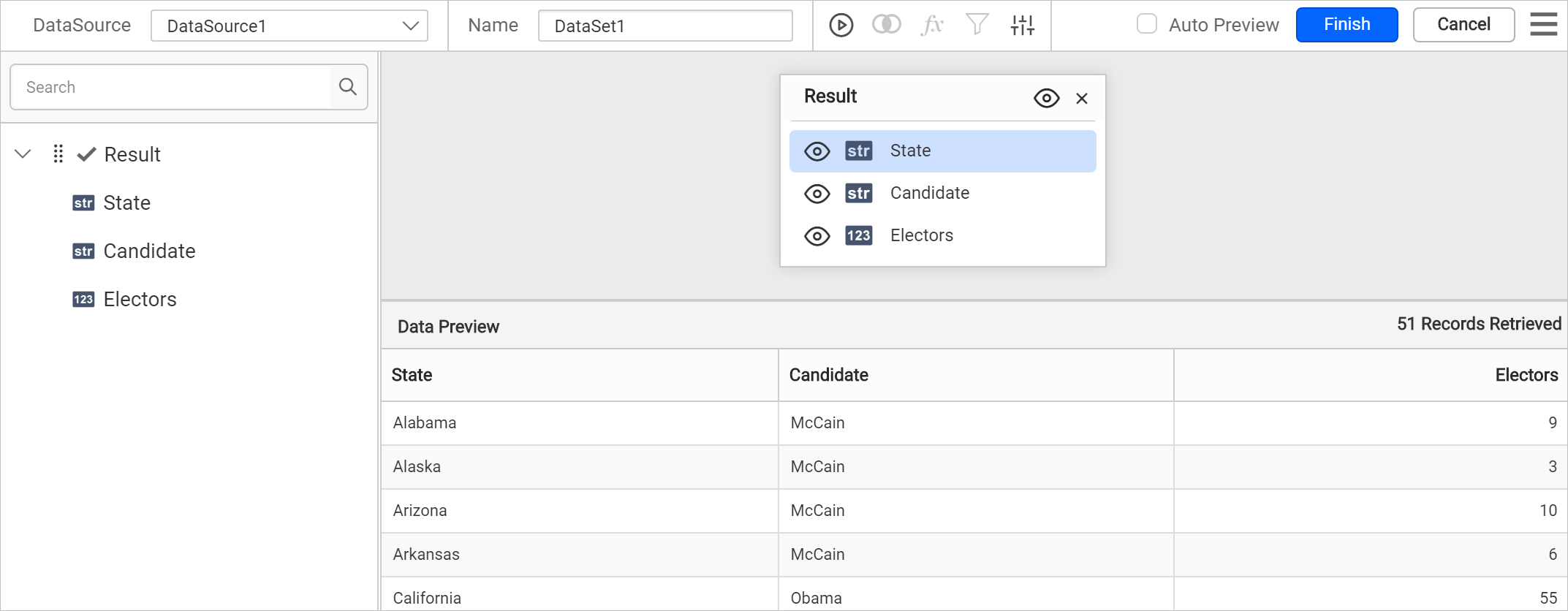
- Modify the data set
Nameand click Finish.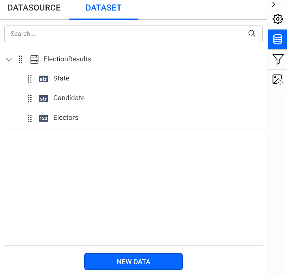
Download the sample JSON file from here.
Add map to the report design
The Map report item is listed under Data Regions category in the item panel.
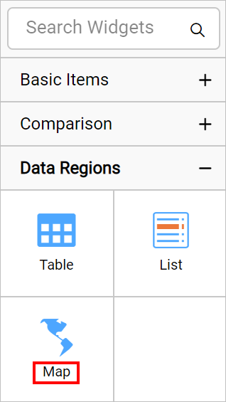
To add a Map report item to the report, drag the map from the item panel into design area.

Now, the map item will be rendered in the design area and the map properties will be listed in properties panel.
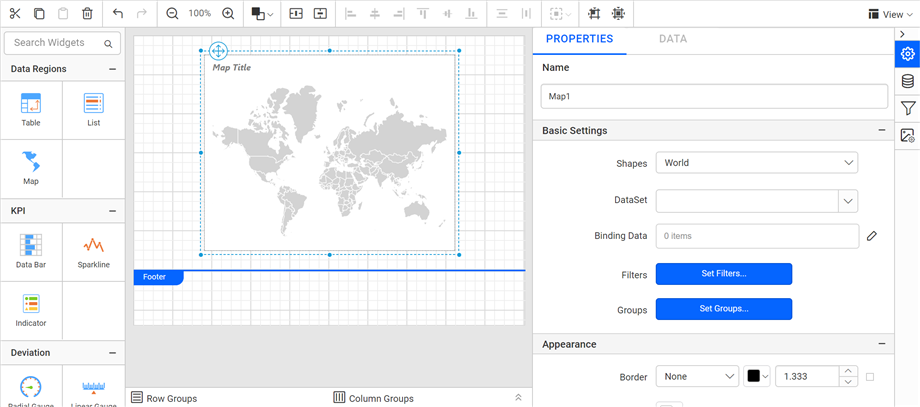
By default map report item renders with world map shapes.
Bind analytical and shape data
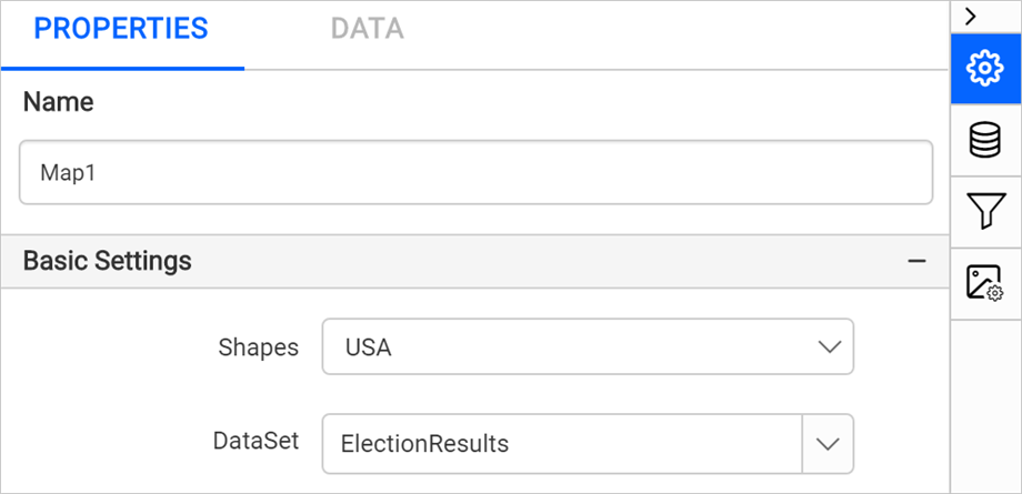
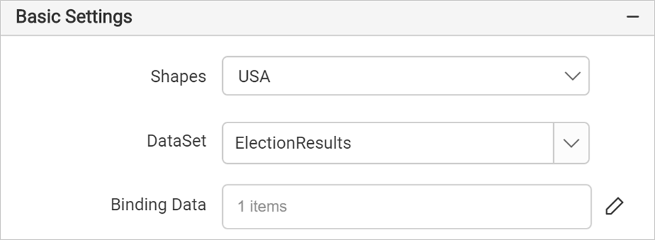
In the Properties panel, under the Basic Settings category, set USA in Shapes property and choose the data set in the DataSet property.
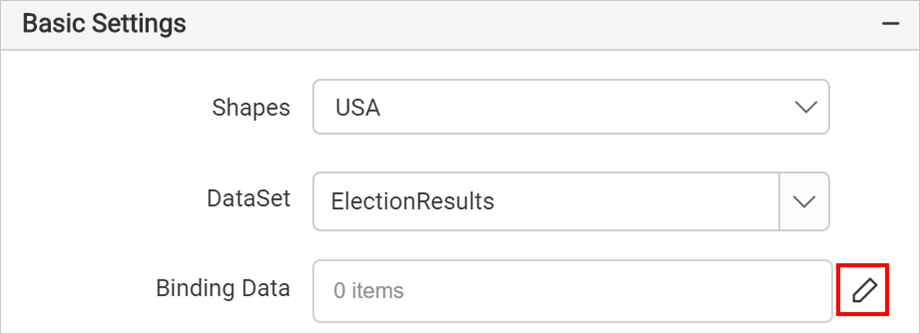
Then click on the edit icon for the Binding Data property under Basic Settings.
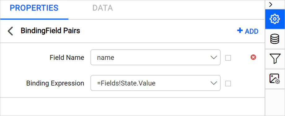
Refer Binding Data section and match analytical and shape data. Choose name in the Field Name drop-down and choose the =Fields!State.Value expression in Binding Expression.
Click on the Update.
Customize map appearance
Let’s customize the map name, title, legend, color settings, and other properties.
Name
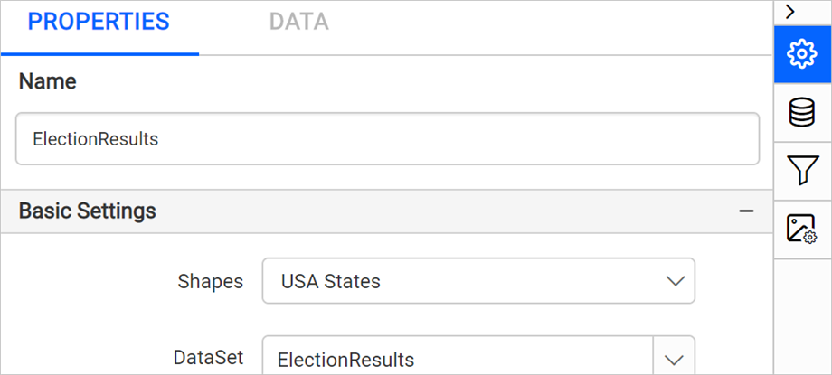
In the Name property, you can provide a unique name for specific map report items.
Appearance
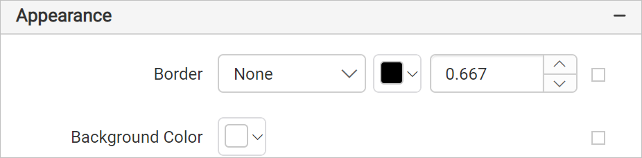
Under the Appearance category, set the border width and color properties as required.
Title
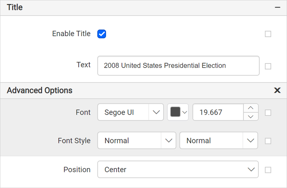
Under the Title category, set the title text, position, and font properties for the map title. First, enable the Enable Title check box. Then, add the title and position.
Legend
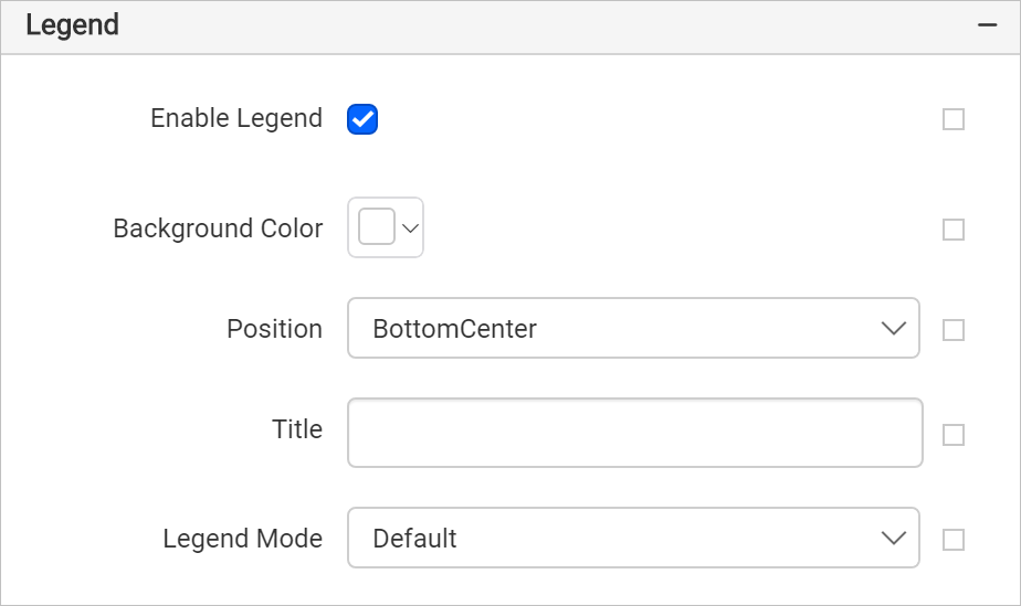
Under the Legend category, enable the Enable Legend check box. Set the background color as White, position BottomCenter, remove title text and set the legend mode as Default.
Shape settings
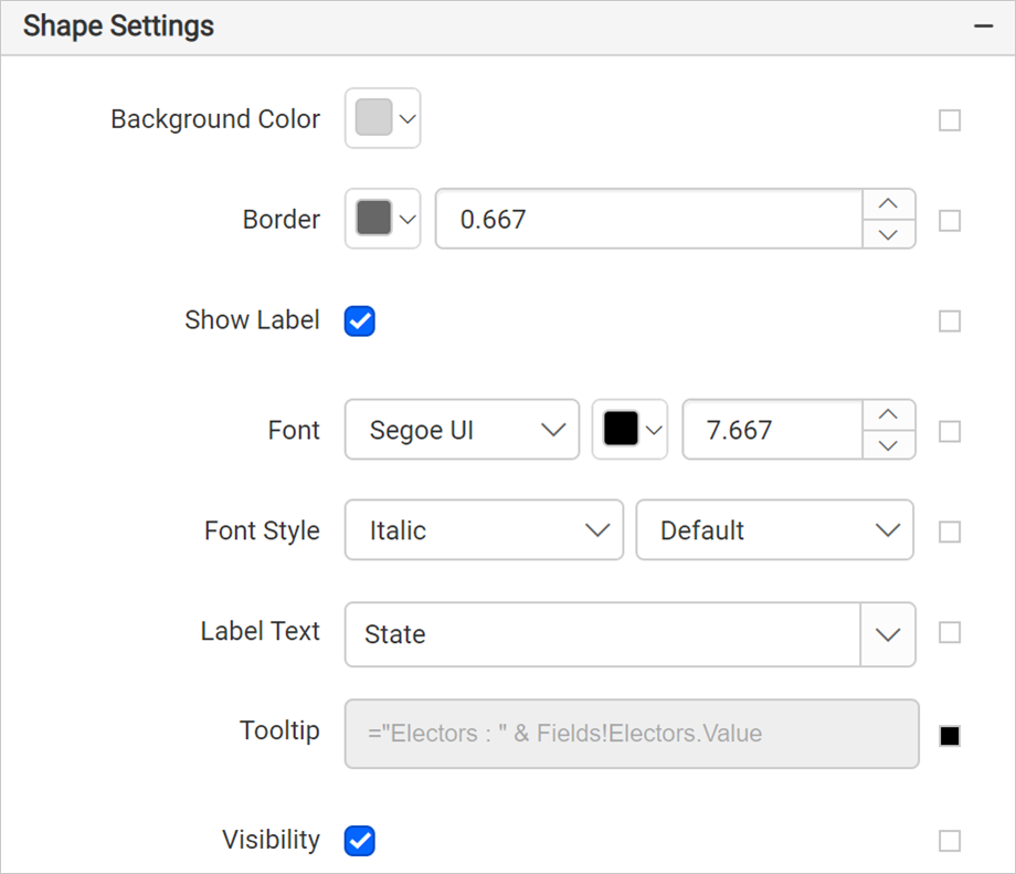
Under the Shape Settings, set the border color as #676767 and width as 0.667px, label text as =Fields!State.Value and tooltip as ="Electors : " & Fields!Electors.Value expression.
Shape color rule
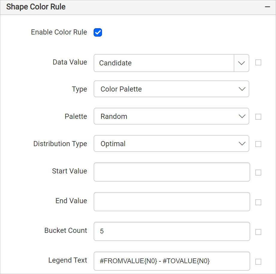
Under Shape color rule category, enable the Enable Color Rule check box.
- Choose the
Candidatename in Data Value. - Choose Color Palette as the Type.
- Choose Optimal for Distribution type. This type adjusts the size of data intervals so as to limit the grouping blunder and in this manner the map looks increasingly adjusted and the outcomes appear to be progressively right, with only a couple of shapes in the highest class as one would anticipate.
The shape color rule configuration should be as below,
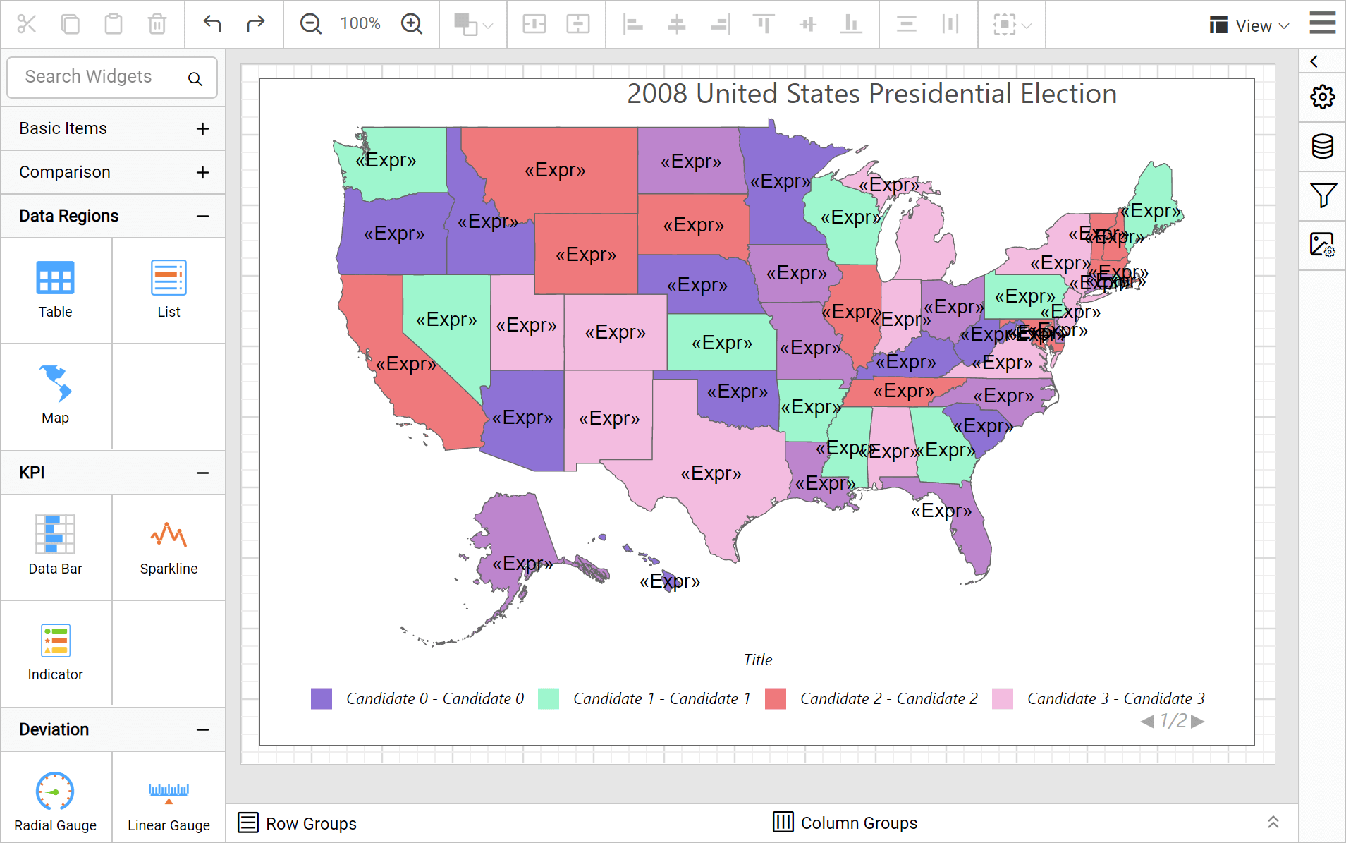
Now, the colors are applied to the map shapes but with sample data.
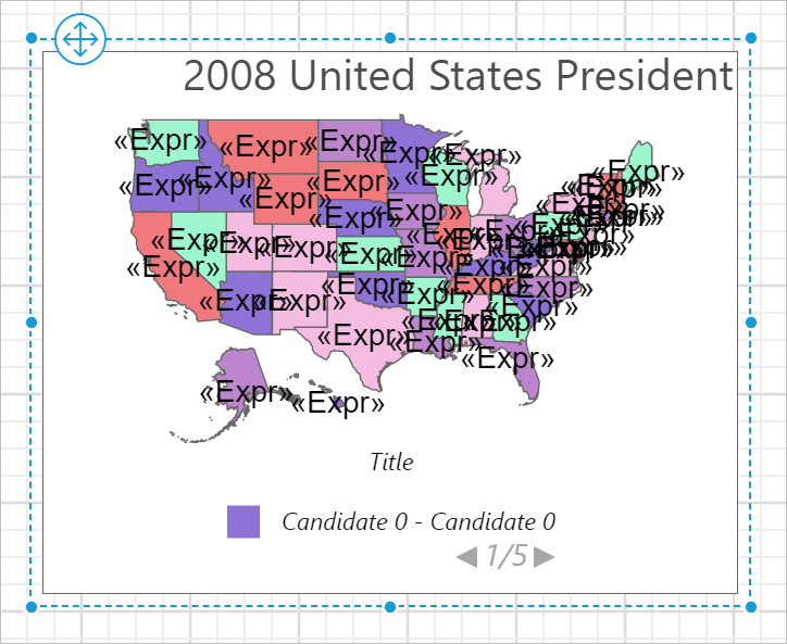
To see the actual data on map surface, preview the report. Before that, resize the width and height of the map, so as to view the information clearly in preview.
Preview report
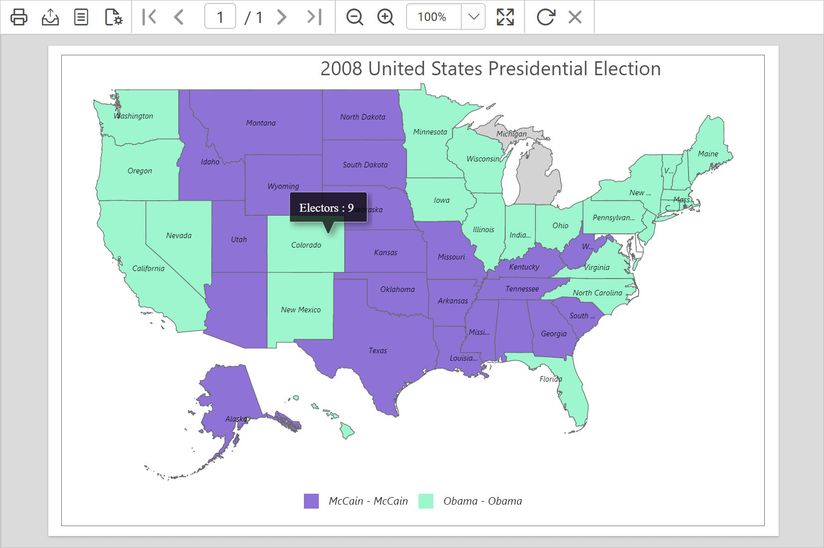
You can preview the report at design time using the built-in Bold Reports® Viewer to ensure the report design is as expected. In the following snapshot, we can observe that the color distribution is applied based on the candidate who won in respective states.
Download the above report design from link.