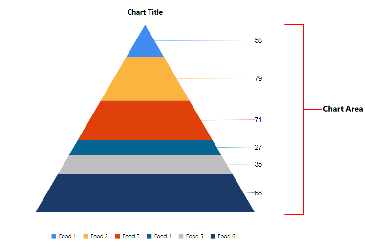
Pyramid Chart
The Pyramid Chart is a triangle diagram, which allows you to make proportional comparisons between values showcased in a progressively increasing manner. It consists of various segments, each representing a data point.
Add chart to the report
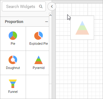
These types of charts are categorized under the Proportion category in the item panel.
Drag and drop the pyramid chart from the item panel into the design area.
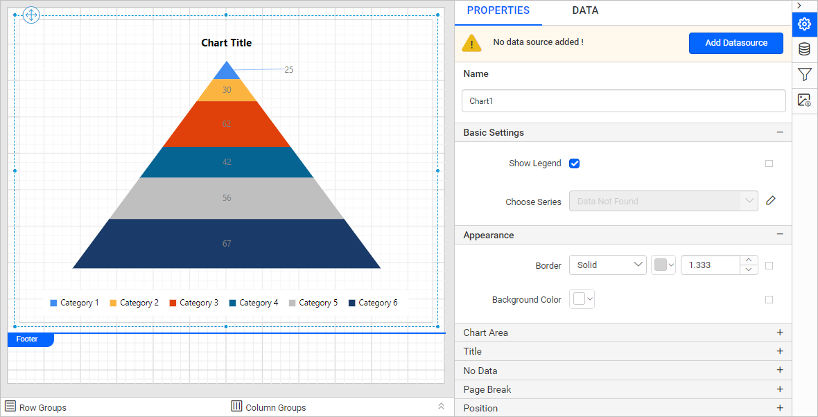
Now, the pyramid chart will be rendered in the design area and the chart properties will be listed in the properties panel.
Create data
To present data in the chart, create a dataset and bind data to the chart data region. In this designing section, the following json data is used for dataset creation.
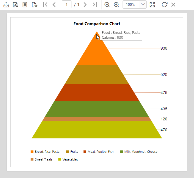
[
  {
    "Food":"Sweet Treats",
    "Calories":"120 cal"
  },
  {
    "Food":"Milk, Youghnut, Cheese",
    "Calories":"435 cal"
  },
  {
    "Food":"Vegetables",
    "Calories":"470 cal"
  },
  {
    "Food":"Meat, Poultry, Fish",
    "Calories":"475 cal"
  },
  {
    "Food":"Fruits",
    "Calories":"520 cal"
  },
  {
    "Food":"Bread, Rice, Pasta",
    "Calories":"930 cal"
  }
]
Refer to the Create Data section for more information. Here, we are going to create a dataset using JSON inline data to design the report.
Assign data
The Pyramid Chart needs a minimum of one value element and one column element to showcase. The measure or expression field that you want to analyze can be dropped into the Y Value(s) section. The dimension for which you want to categorize the measure can be dropped into the Column section. To categorize the measure based on a series, drop the respective dimension into the Row(s) section.
To configure data into a pyramid chart, follow the steps:
-
To bind data to a chart report item placed in the design area, focus on that report item.
-
Click the
Propertiesicon in the configuration panel, the property pane opens. Now, switch to theDATAtab.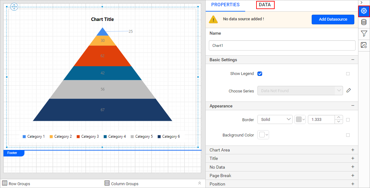
-
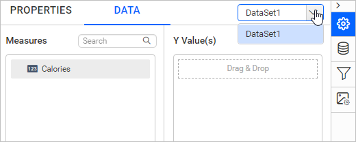
The available data in the report will be listed in the dropdown, choose a data in the dropdown list.
-
The numeric columns and numeric expressions are listed under the
Measuressection; other types of columns and dimension expressions are listed under theDimensionssection.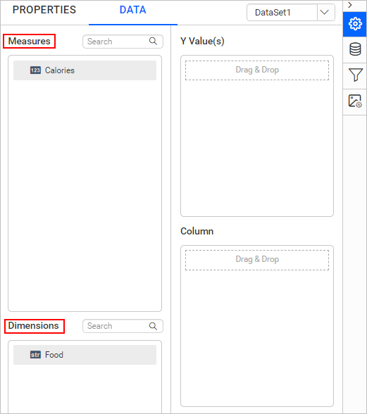
-
Drag and Drop Measure Element:
Select and drag the numeric column (measure element) or the numeric expression column from the
Measuresection and drop it in theY Value(s)section.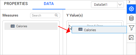
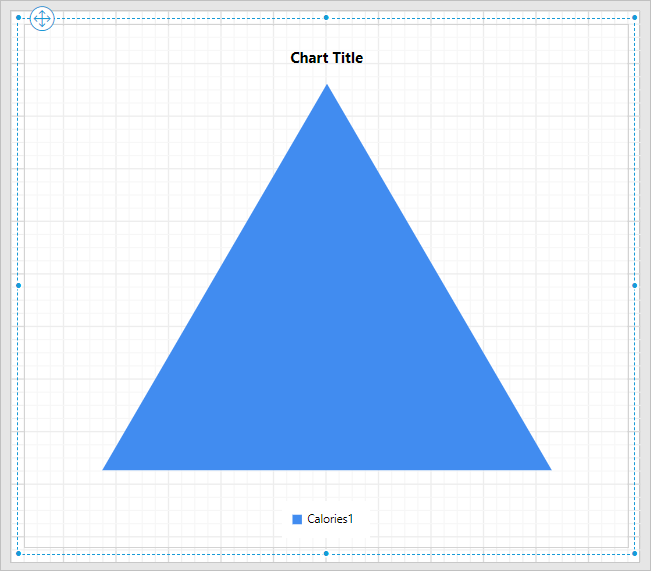
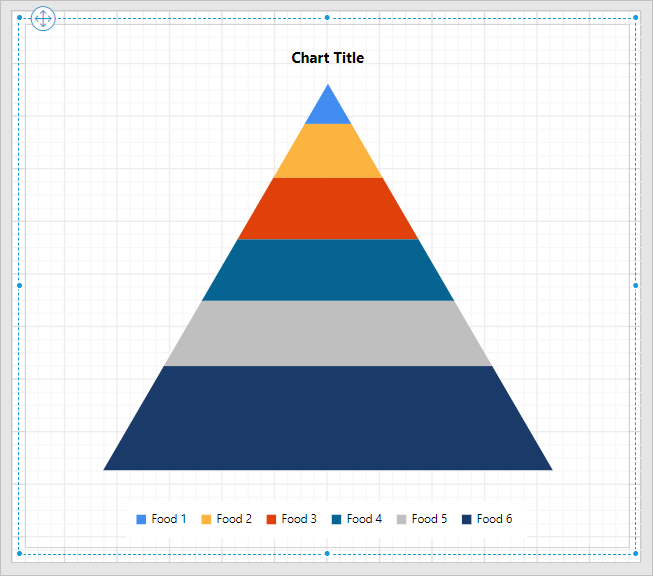
Now, the report item design will look like below:
-
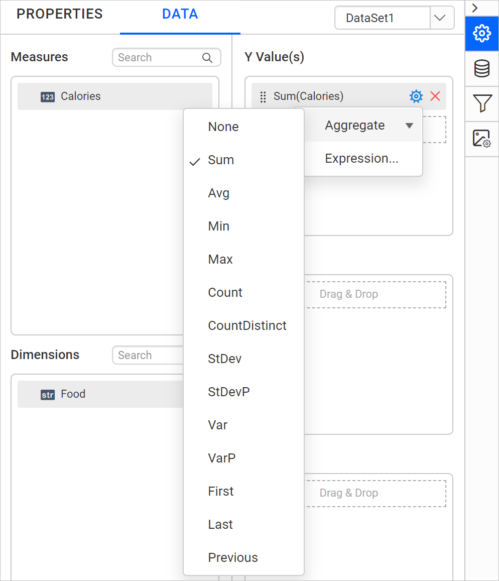
Aggregate Options:
Click the
Settingsicon (highlighted below) to open the aggregation type dropdown list.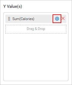
You can set the aggregation type by which you can compute the selected column.
-
Drag and Drop Dimension Element:
Select and drag the dimension element from the
Dimensionssection to measure against any of the selected numeric column(s) inY Value(s)section, and drop it into theColumnsection.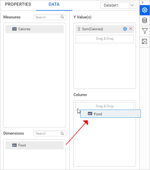
Now, the report item design will look like below:
-
Grouping:
You can also group the added column element with another column, by adding the respective dimension element into the Row(s) section.
-
Formatting Column and Row(s) sections:
You can also Filter, Sort, or Group the Column or Row(s) sections using expressions.
Format Pyramid Chart
You can format the pyramid chart for better illustration of the view that you require, through the settings available in the Properties tab.
To format a pyramid chart, follow the below steps:
-
Drag and drop the pyramid chart into the design area and resize it to the required size.
-
Configure the data for the pyramid chart.
-
Focus on the pyramid chart and click the
Propertiesicon in the configuration panel, the property pane opens.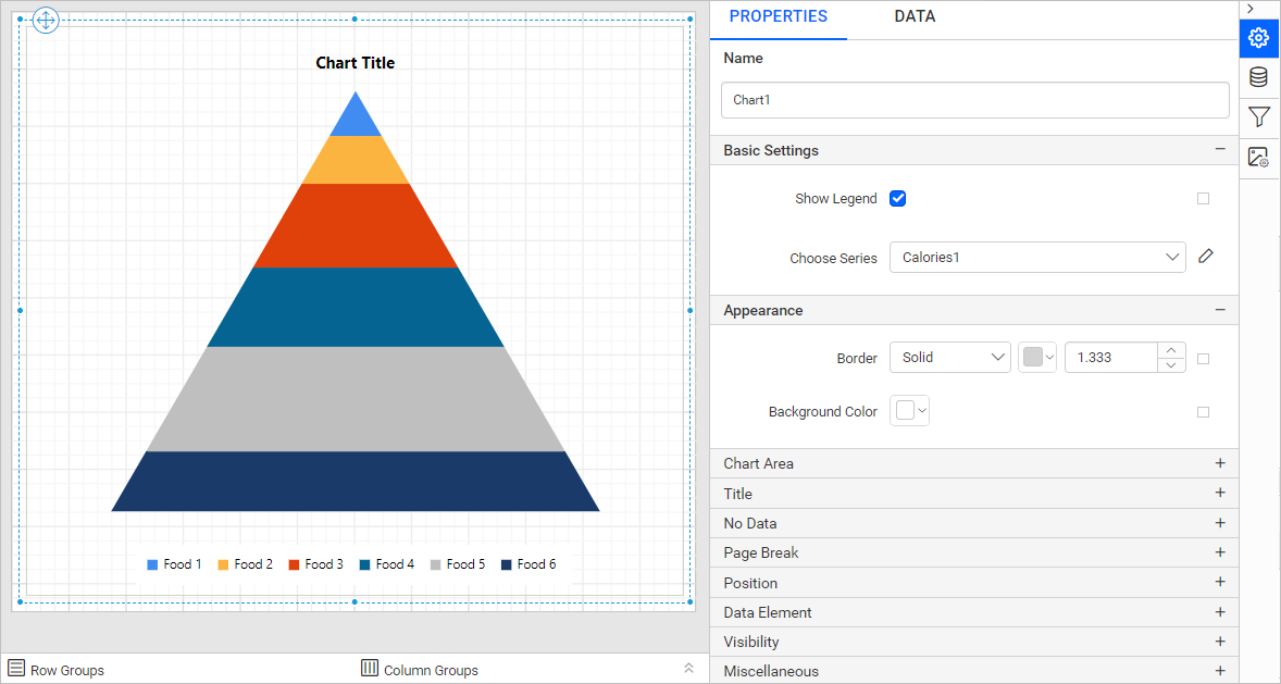
You can see the list of properties available for the widget with the default value.
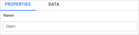
Name
The Name property can be used to provide a unique name for the chart item in the report.
Basic Settings
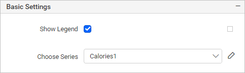
Show Legend
A Legend is a text used to describe the data plotted. This allows you to toggle the visibility of the legend in chart and also customize the legend text appearance. To set/reset legend properties, refer to the Show Legend property.
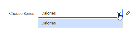
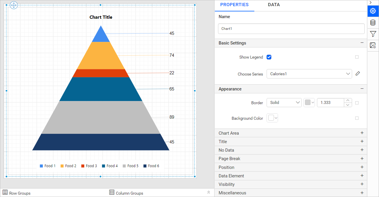
Choose Series
You can add multiple series to the chart and the available series will be listed in the Choose Series dropdown. To customize the series appearance, choose the required series name in the dropdown.
We can edit the selected series by clicking the edit button.
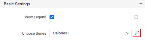
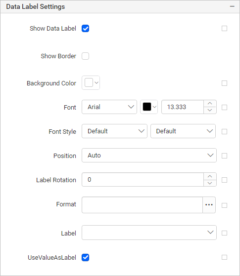
In the Data Label Settings properties, we have enabled the Show Data Label property.
Refer to the Series section, to customize each series using the properties panel.
Appearance
The border style, color, width, and background color properties can be used to style the chart and customize its appearance in the report design. These properties are listed under the Appearance category in the properties panel.
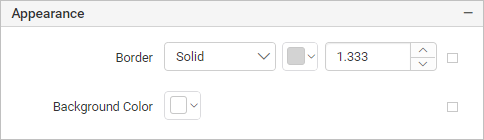
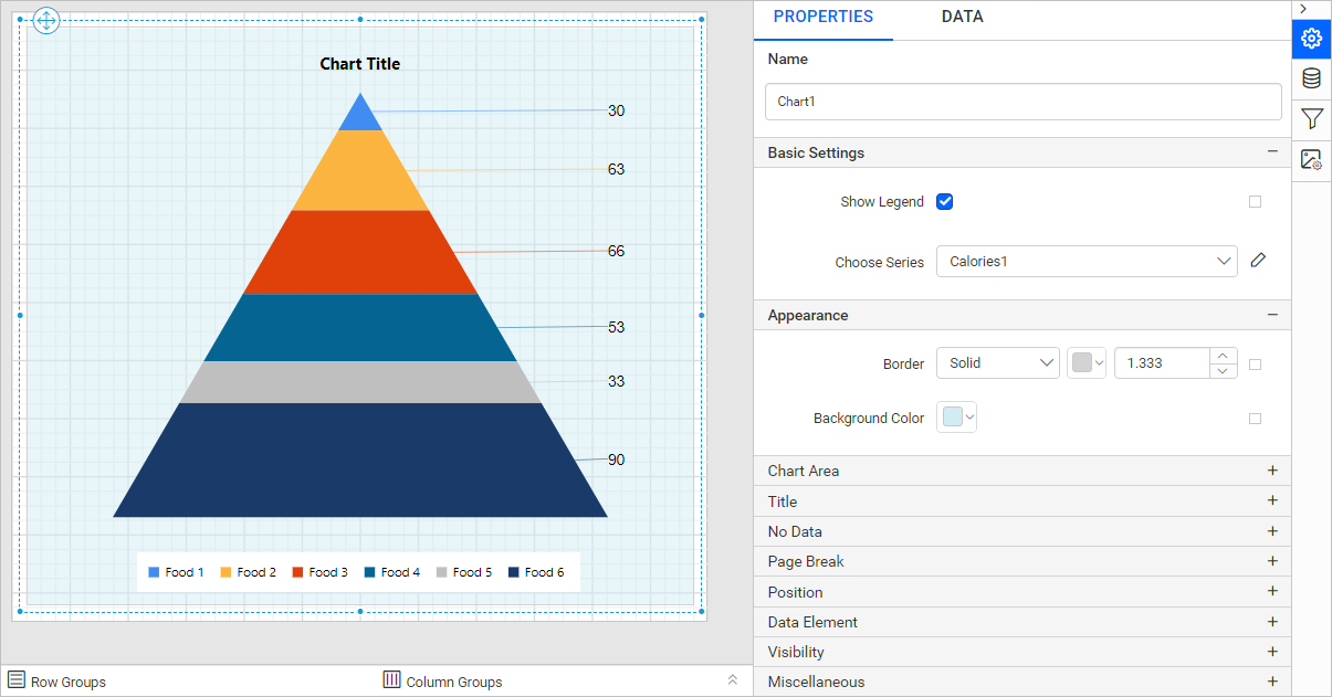
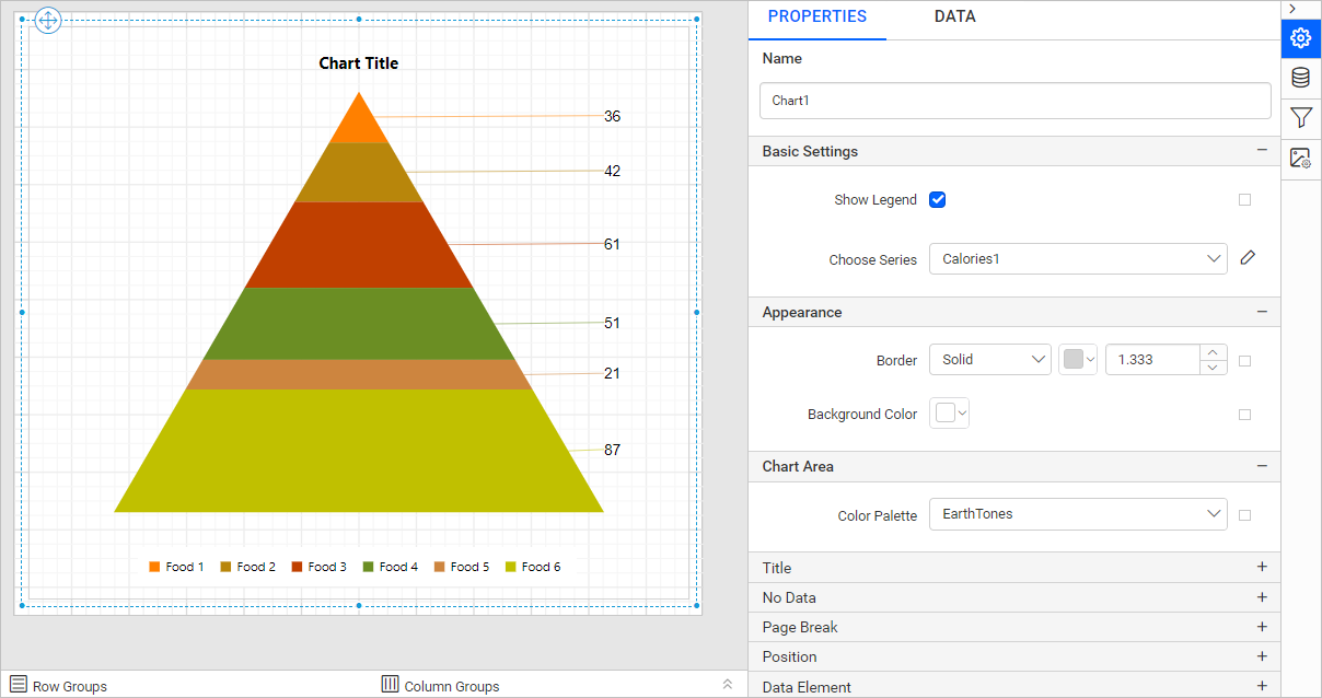
Chart Area
The Chart Area property can be used to customize the area of the chart design.
Use the Color Palette property to customize the color of the chart. Color Palette are listed under the Chart Area category.
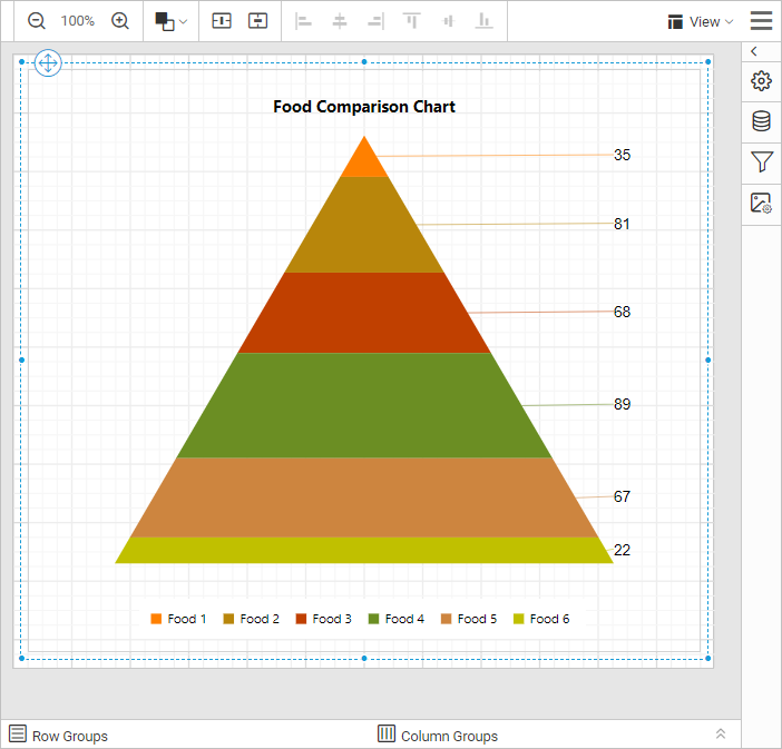
Here, we have set the Color Palette as EarthTones and the design is shown below.
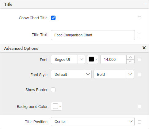
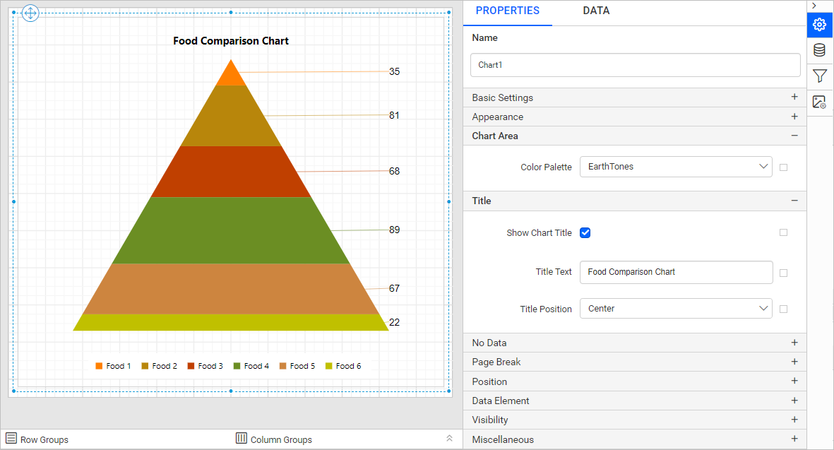
Title
To show/hide the chart title, toggle the Show Chart Title checkbox. The chart title can be customized by editing the Title Text property of the chart. You can customize the font color, font text, font style, border, background, and position of the title.
No Data
The No Data property is used to display static text when a dataset results with empty or zero rows at runtime.
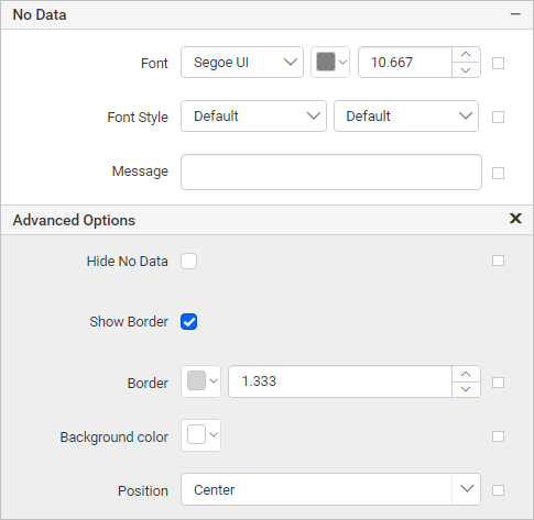
To set/reset no data message properties, refer to the No Data Message property section.
Page break
The page break property can be used to control the amount of information on each page when you preview the report. Follow the below steps to apply the page break property for the chart report item.
-
The Break Location property specifies where the page break should occur. Choose any
Break Locationtype in the drop-down.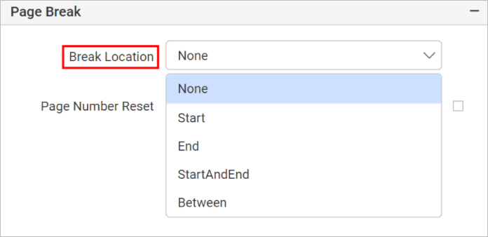
-
To prevent predefined page breaks from being applied during report preview, enable the
Break Disabledproperty checkbox. You can also control the application of page breaks during report preview by using expressions. For details on setting and resetting page breaks dynamically, refer to the Set Expression and Reset Expression sections.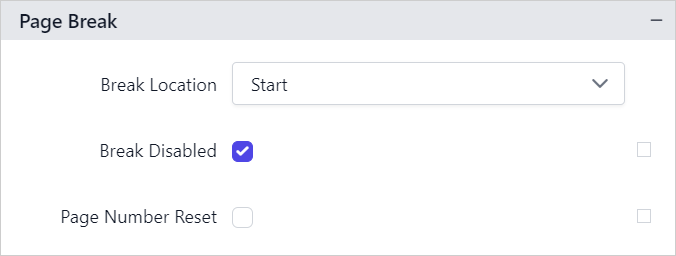
-
To restart page numbering on each page, enable the
Page Number Resetproperty checkbox.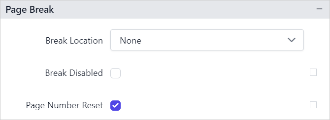
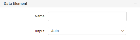
Data Element
Data element can be used to control visibility of a report item when exporting the report in XML format. The Data element properties are listed in the properties panel, under the Data Element category.
Name
You can assign a custom name to the chart element using the Name field. The chart report item will be exported with the provided name.
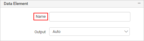
Note: The name cannot contain spaces, and it must begin with a letter followed by letters, numbers, or the underscore character (_).
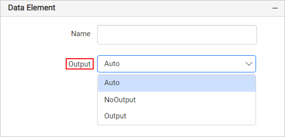
Output
On exporting the report, the visibility of the chart can be controlled using the Output property. Choosing the following options for the Output property will perform the respective operations:
- Auto or Output - Exports the chart report item
- NoOutput - Does not export the chart report item
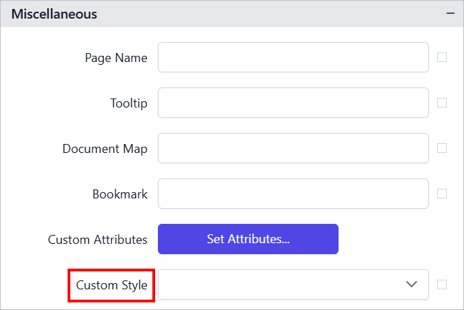
Miscellaneous
Page name
The page name property is used to name the first worksheet of the Excel workbook when exporting the report to excel format.
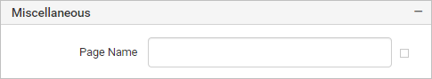
You can set static or dynamic text as the page name. To set and reset dynamic text, refer to the Set Expression and Reset Expression section.
Tooltip
The Tooltip property can be used to display informative text or values, when the user hovers over the report item in the report preview. To set a tooltip for a chart item using the properties panel, refer to the Tooltip section.
Document Map
A document map is a navigational feature that displays a separate side pane with a set of navigational links in a hierarchical structure when you view a report. A user can click the content in the list to navigate to the report page that displays that item. Refer to the Document Map section to configure the document map in the report design.
You can set static or dynamic text as value for the document map property. To set and reset dynamic text, refer to the Set Expression and Reset Expression section.
Bookmark
Bookmark links allow users to navigate to different parts of a SSRS report. You can add bookmarks to each textbox, image, table or chart or to the unique group values displayed in a tablix which can direct the users to specified locations in the report. The value of the bookmark property can be your own strings or an expression. Refer to the Bookmark section to configure bookmarks in the report design.
You can set static or dynamic text as the value for the bookmark property. To set and reset dynamic text, refer to the Set Expression and Reset Expression section.
Custom Style
The Custom Style property enables the use of external CSS for styling report items, providing enhanced flexibility beyond the built-in styling options. This property allows you to meet specific design requirements and maintain consistent styling across multiple reports. For a step-by-step guide on setting up custom styles in your report, check the How To section of this guide.
Preview report
-
The final design view of the report is shown below.
-
Now, the report preview can be visualized as below.
Download the above report design from the link.