Design map using color range rule
The following steps guides you to design a map using color range rule and optimal distribution to display the population of each country and group countries with population ranges to produce a display similar to a heat map.
Create data set
- In the data panel, click
New Data.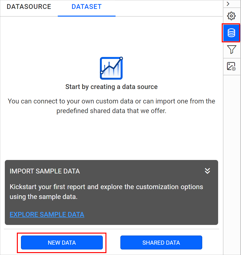
- Choose the
JSONconnection type.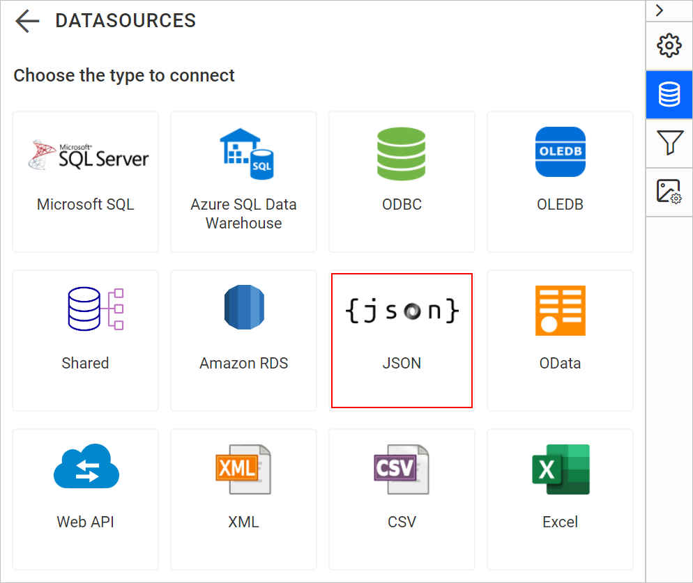
- Choose
FileasType.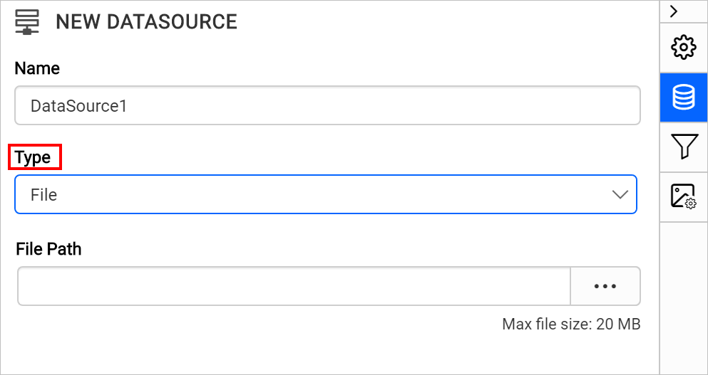
- Click on the upload button, browse and upload the JSON file in
File Pathfield.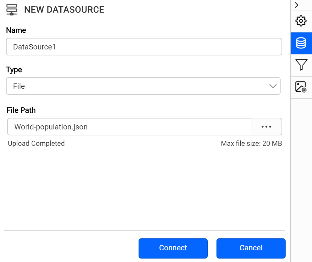
- Click on the
Connectbutton. - In the query builder, the available fields in JSON file will be loaded under default table name,
Result.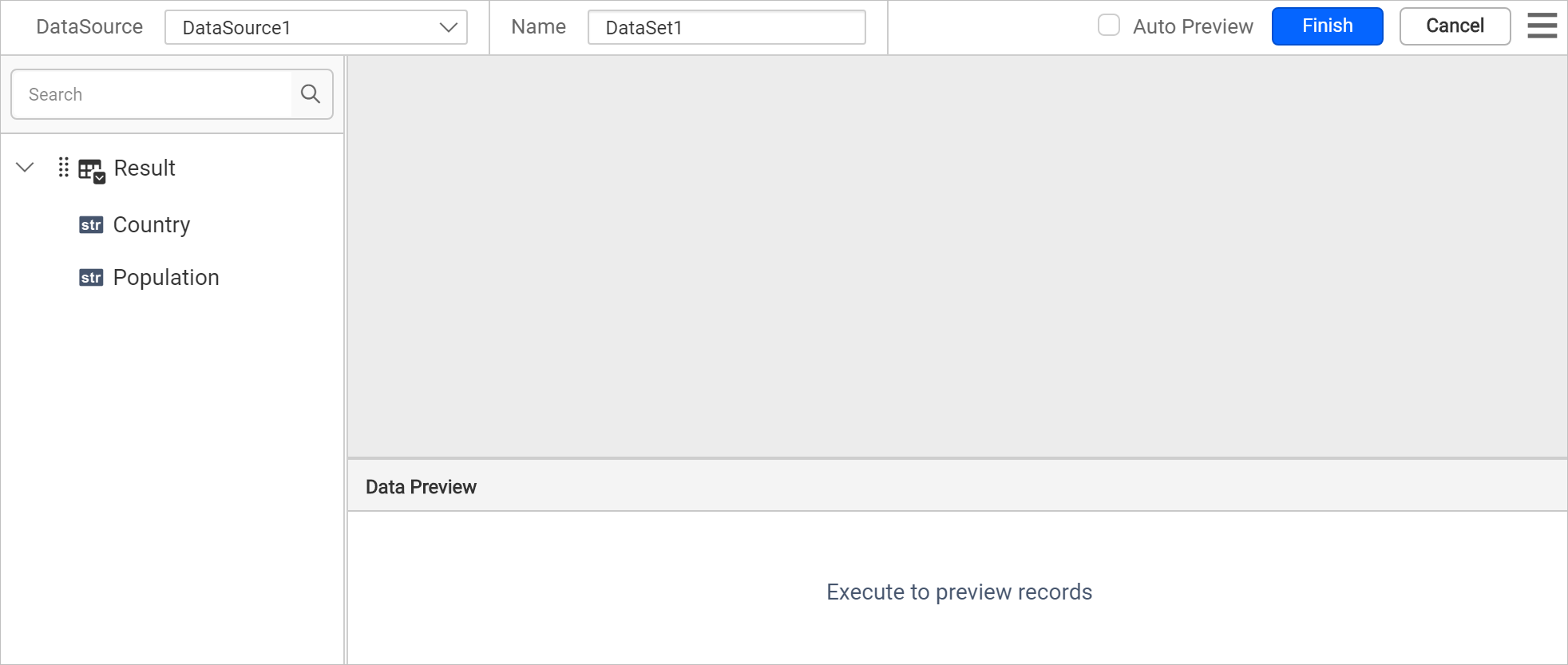
- Drag and drop the
Resulttable and execute.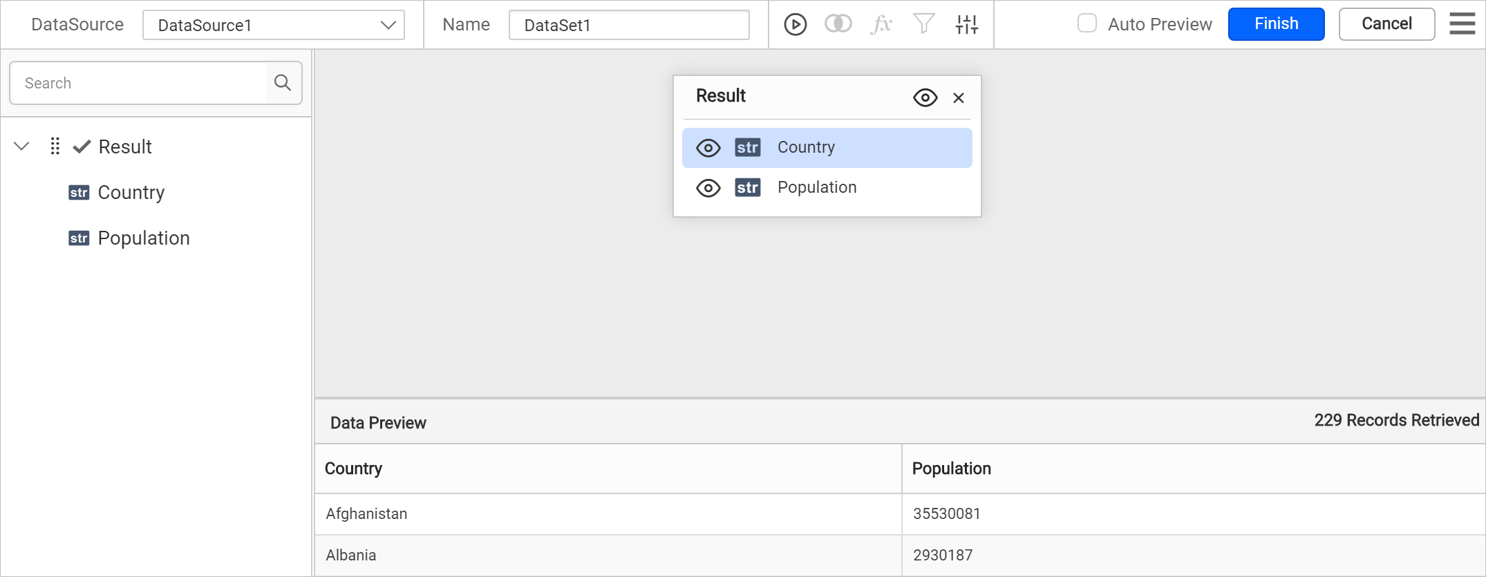
- Modify the data set
Nameand click Finish.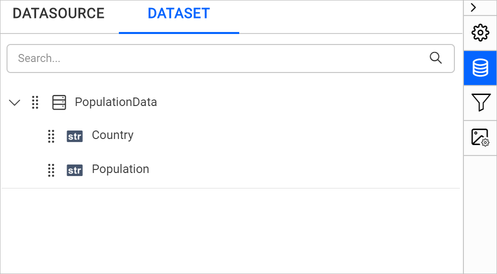
Note: The population data we used here is an approximate measure. The live population data may vary from this. Download the sample JSON file from here.
Add map to the report design
The Map report item is listed under Data Regions category in the item panel.
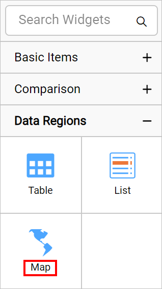
To add a Map report item to the report, drag the map from the item panel into design area.
Now, the map item will be rendered in the design area and the map properties will be listed in properties panel.
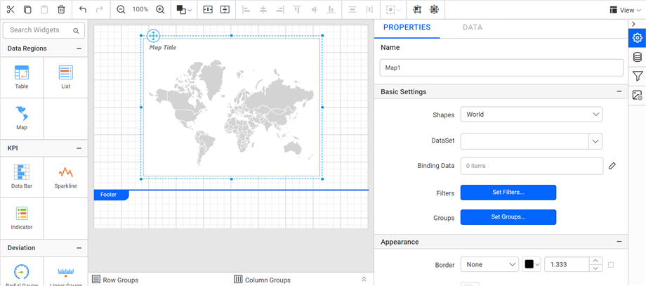
By default map report item renders with world map shapes.
Bind analytical and shape data
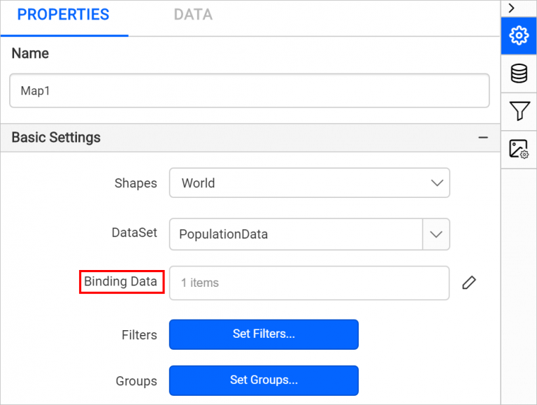
In the Properties panel, under the Basic Settings category, choose the data set in the DataSet property.
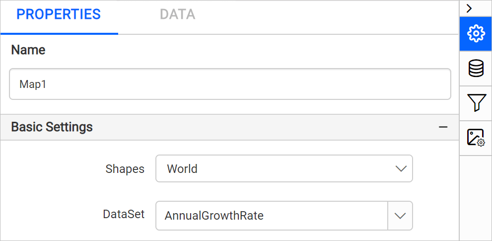
Then click on the edit icon for the Binding Data property under Basic Settings.
![]()
Refer Binding Data section and match analytical and shape data. Choose admin in the Field Name drop-down and choose the =Fields!Country.Value expression in Binding Expression.
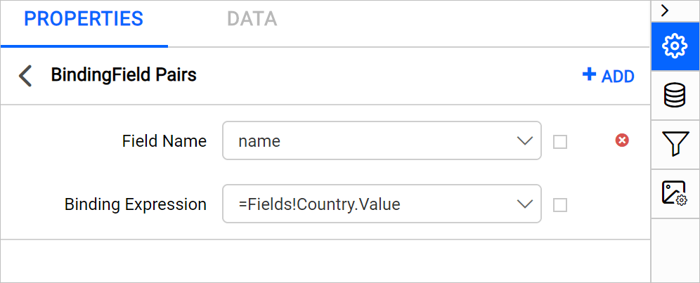
Click on the Update.
Customize map appearance
Let’s customize the map name, title, legend, color settings, and other properties.
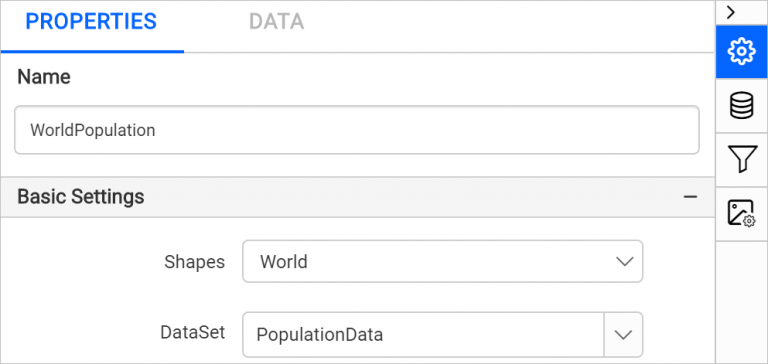
Name
In the Name property, you can provide a unique name for specific map report items.
Appearance
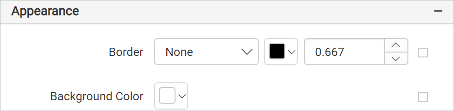
Under the Appearance category, set the border width and color properties as required.
Title
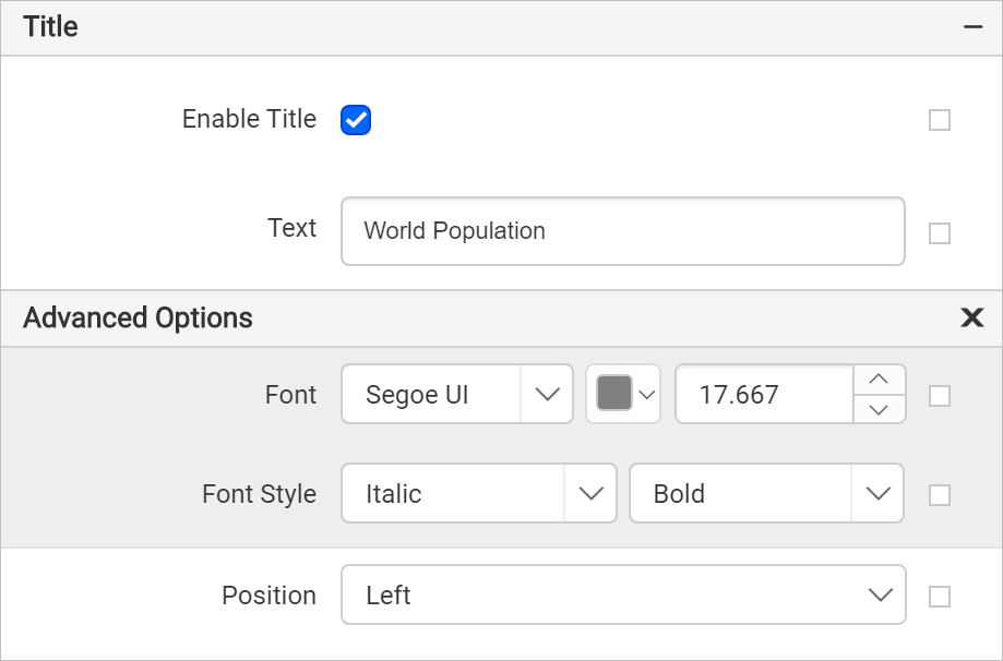
Under the Title category, set the title text, position, and font properties for the map title. First, enable the Enable Title check box. Then, add the title and position.
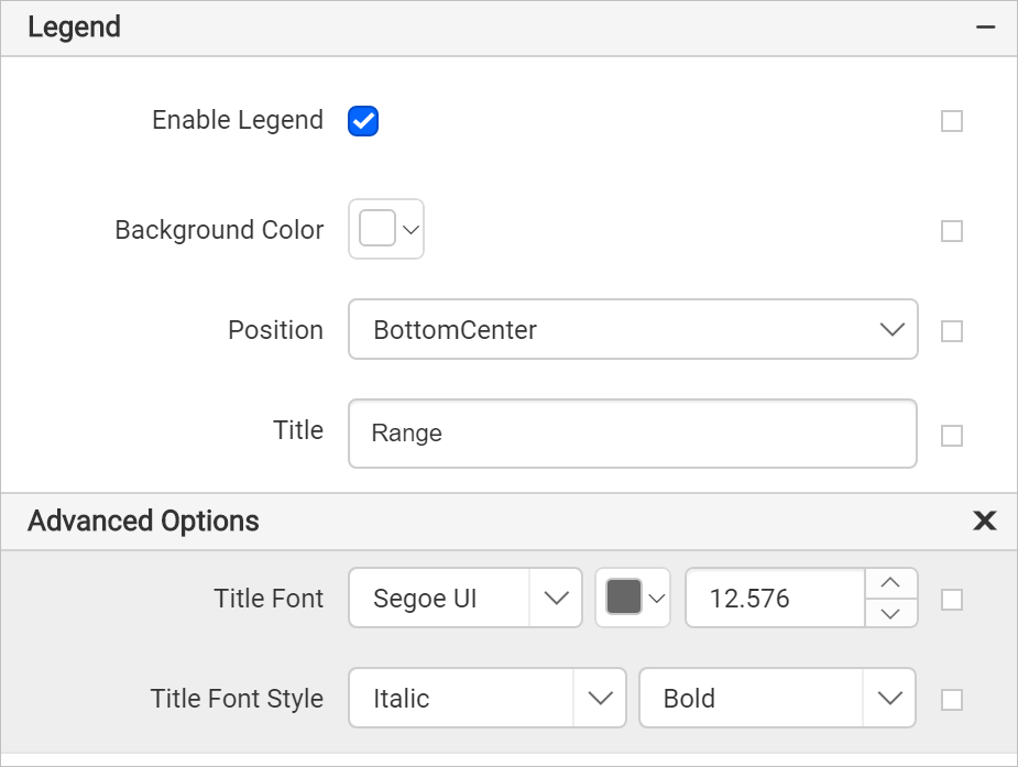
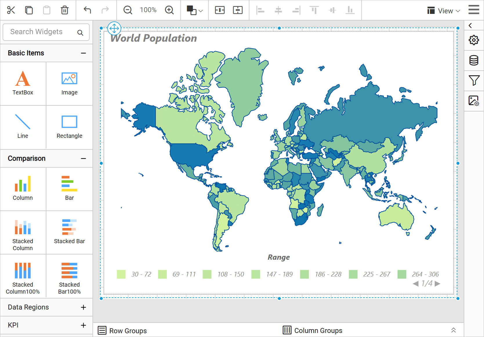
Legend
Under the Legend category, enable the Enable Legend check box. Set the background color as White, position BottomCenter, and set the Range as Title.
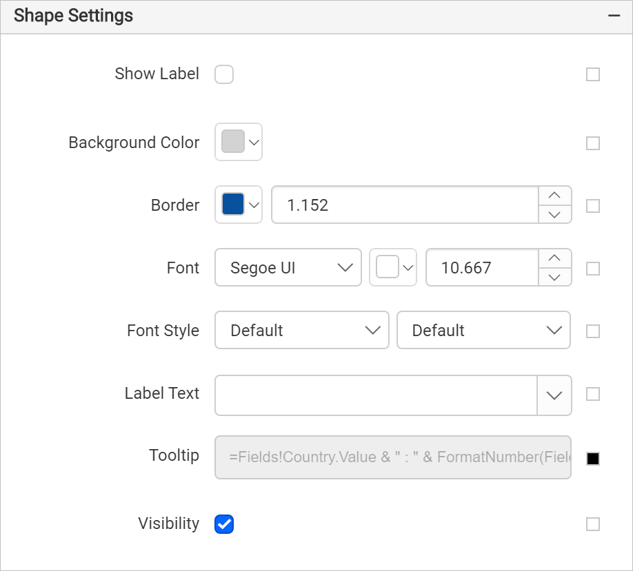
Shape settings
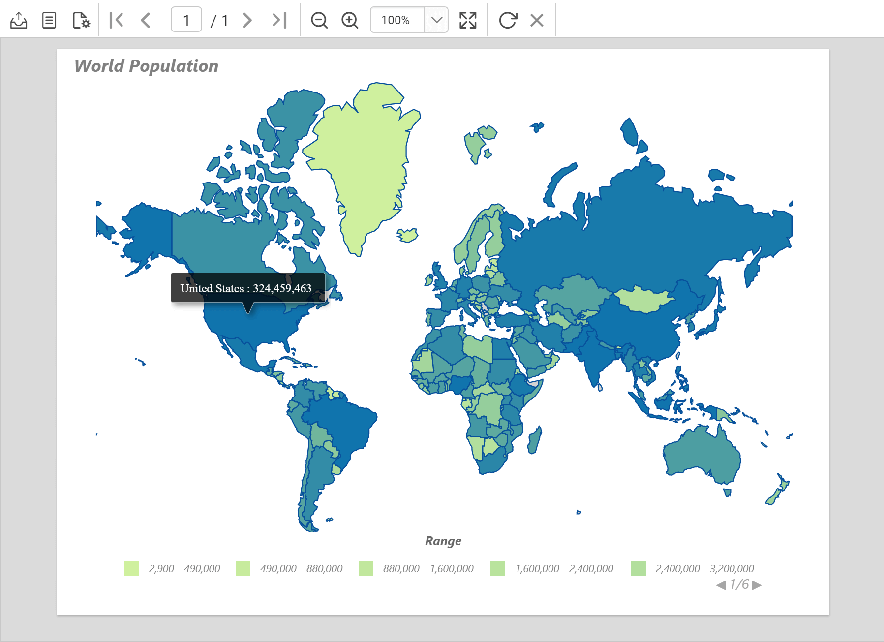
Under the Shape Settings, set the border color as #08519c and width as 1.152px and tooltip as =Fields!Country.Value & " : " & FormatNumber(Fields!Population.Value,0) expression.
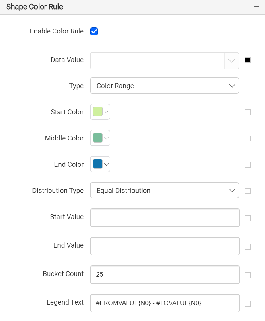
Shape color rule
Under Shape color rule category, enable the Enable Color Rule check box.
- Set
=CDec(Sum(Fields!Population.Value))expression in Data Value. - Choose Color Range as the Type.
- Set the start, middle, and end colors as #CFF09E, #79BD9B, #1074AD, respectively. The start color applies to the low end of the data range and the end color applies to data at the high end of the data range.
- Choose Equal Distribution for Distribution type. This type creates unequally sized data intervals and involves adjustment of the interval limits so that each range has an equal number of items.
- The bucket count property is used to split the available data into a required number of ranges. Specify the Bucket Count as 25. Notice the legend splits into 25 ranges.
The shape color rule configuration should be as below,
Now, the colors are applied to the map shapes but with sample data.
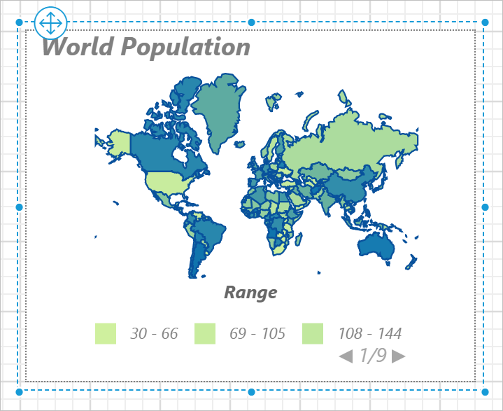
To see the actual data on map surface, preview the report. Before that, resize the width and height of the map, so as to view the information clearly in preview.
Preview report
You can preview the report at design time using the built-in Bold Reports® Viewer to ensure the report design is as expected. Switch to the preview mode to see the country name and population when you hover on each shape of the map surface. In the following snapshot, we can observe that the color distribution is applied based on the population range of countries.
Download the above report design from link.