Bar Chart
The Bar Chart allows you to compare values for a set of unordered items across categories through horizontal bars ordered vertically.
Add chart to the report
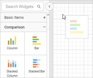
These types of charts are categorized under the Comparison category in the item panel.
Drag and drop the bar chart from the item panel into the design area.
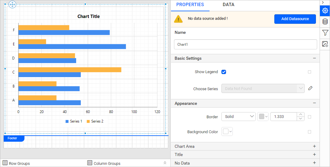
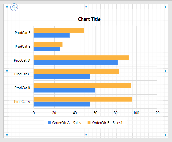
Now, the bar chart will be rendered in the design area and the chart properties will be listed in the properties panel.
Create data
To present data in the chart, create a dataset and bind data to the chart data region. In this designing section, the following dataset query is used for dataset creation.
SELECT PC.Name AS ProdCat, PS.Name AS SubCat, DATEPART(yy, SOH.OrderDate) AS OrderYear, 'Q' + DATENAME(qq, SOH.OrderDate) AS OrderQtr,SUM(SOD.UnitPrice * SOD.OrderQty) AS Sales
FROM Production.ProductSubcategory PS INNER JOIN
Sales.SalesOrderHeader SOH INNER JOIN
Sales.SalesOrderDetail SOD ON SOH.SalesOrderID = SOD.SalesOrderID INNER JOIN
Production.Product P ON SOD.ProductID = P.ProductID ON PS.ProductSubcategoryID = P.ProductSubcategoryID INNER JOIN
Production.ProductCategory PC ON PS.ProductCategoryID = PC.ProductCategoryID
WHERE (SOH.OrderDate BETWEEN '1/1/2002' AND '12/31/2003')
GROUP BY DATEPART(yy, SOH.OrderDate), PC.Name, PS.Name, 'Q' + DATENAME(qq, SOH.OrderDate), PS.ProductSubcategoryID
Refer to the Create Data section and create a dataset using the above query. The
AdventuresWorksdatabase is used here.
Assign data
The Bar Chart needs a minimum of 1 value element and 1 column element to showcase. The measure or expression field that you would like to analyze can be dropped into the Y Value(s) section. The dimension that you would like to categorize the measure can be dropped into the Column section. If you would like to categorize based on a series, then the respective dimension can be dropped into the Row(s) section in addition.
To configure data into a bar chart, follow the steps:
-
To bind data to a chart report item placed in the design area, focus on that report item.
-
Click the
Propertiesicon in the configuration panel, the property pane opens. Now, switch to theDATAtab.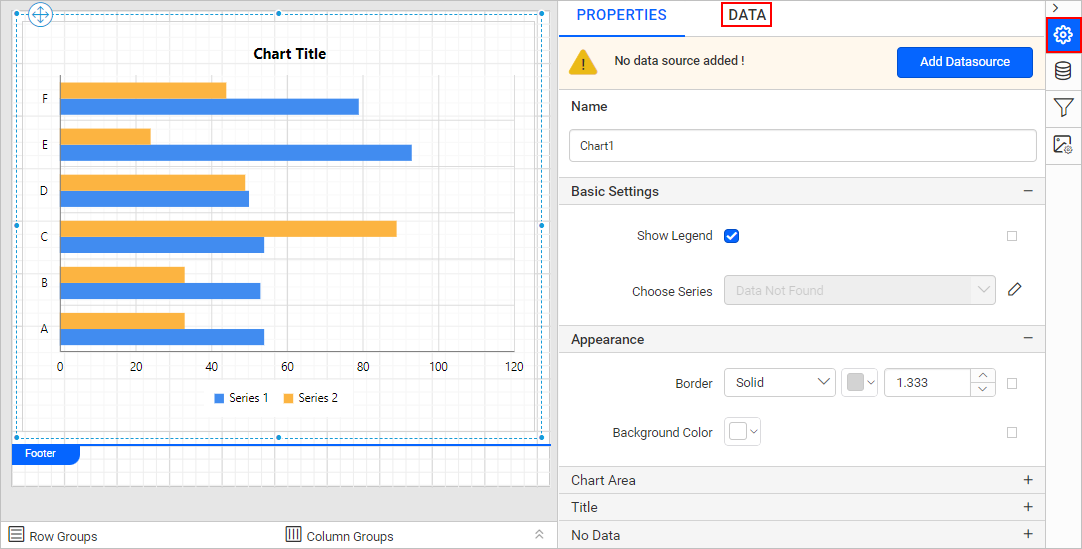
-
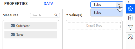
The available data in the report will be listed in the dropdown, choose a data in the dropdown list.
-
The numeric columns and numeric expressions are listed under the
Measuressection; other types of columns and dimension expressions are listed under theDimensionssection.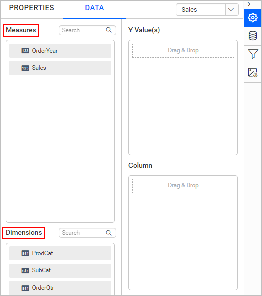
-
Drag and Drop Measure Element:
Select and drag the numeric column (measure element) or the numeric expression column from the
Measuresection and drop it in theY Value(s)section.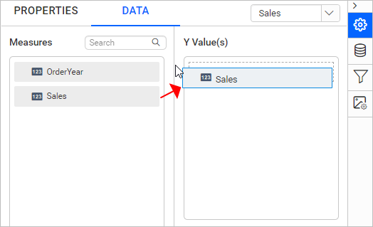
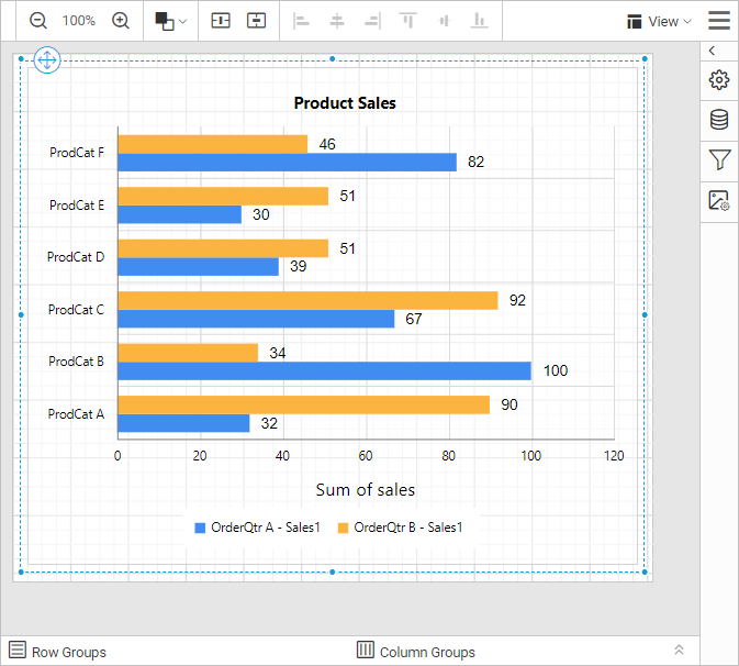
Now, the report item design will look like below:
-
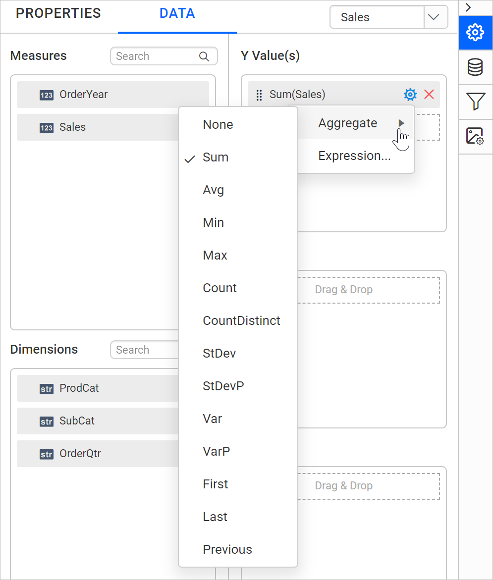
Aggregate Options:
Click the
Settingsicon (highlighted below) to open the aggregation type dropdown list.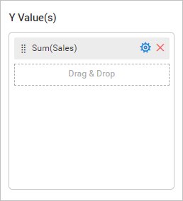
You can set the aggregation type by which you can compute the selected column.
-
Drag and Drop Dimension Element:
Select and drag the dimension element from the
Dimensionssection to measure against any of the selected numeric column(s) inY Value(s)section, and drop it into theColumnsection.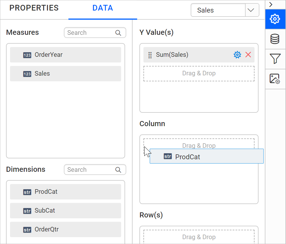
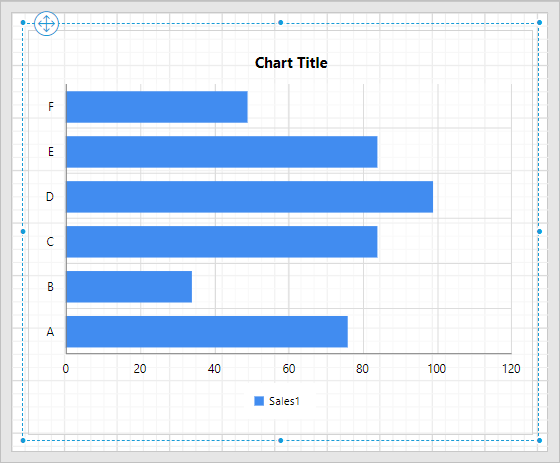
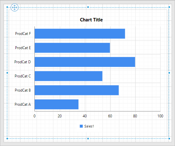
Now, the report item design will look like below:
-
Grouping:
You can group the added column element with another column, by adding the respective dimension element into the Row(s) section.
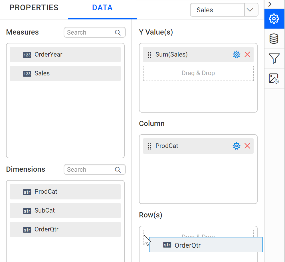
Now, the report item design will look like below.
-
Formatting Column and Row(s) sections:
You can also Filter, Sort, or Group the Column or Row(s) sections using expressions.
Format bar chart
You can format the bar chart for better illustration of the view that you require, through the settings available in the Properties tab.
To format a bar chart, follow the below steps:
-
Drag and drop the bar chart into the design area and resize it to the required size.
-
Configure the data for the bar chart.
-
Focus on the bar chart and click the
Propertiesicon in the configuration panel, the property pane opens.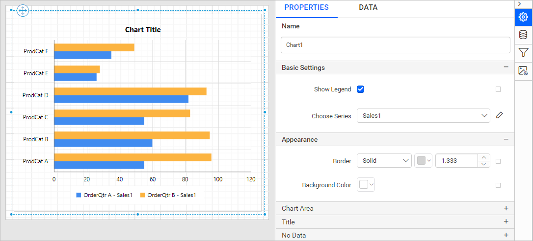
You can see the list of properties available for the widget with the default value.
Name
The Name property can be used to provide a unique name for the chart item in the report.
Basic Settings
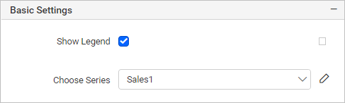
Show Legend
A Legend is a text used to describe the data plotted. This allows you to toggle the visibility of the legend in chart and also customize the legend text appearance. To set/reset legend properties, refer to the Show Legend property.
Choose Series
You can add multiple series to the chart and the available series will be listed in the Choose Series dropdown. To customize the series appearance, choose the required series name in the dropdown.
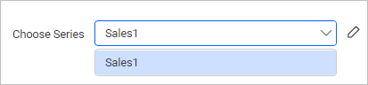
Refer to the Series section, to customize each series using the properties panel.
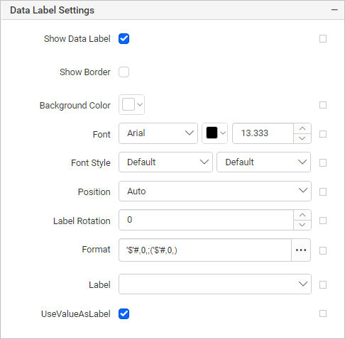
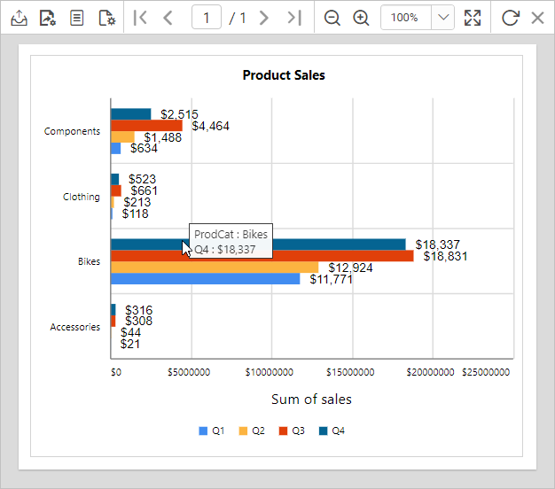
In this case, we have enabled the Show Data Label option and entered the Data Label format value as '$'#,0,;('$'#,0,) in series settings.
Appearance
The border style, color, width, and background color properties can be used to style the chart and customize its appearance in the report design. These properties are listed under the Appearance category in the properties panel.
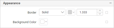
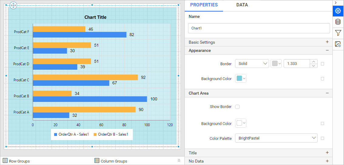
Chart Area
The Chart Area properties such as border width, color, shadow color, shadow offset and background color can be used to customize the area of the chart design.
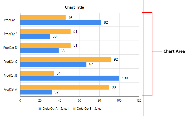
These properties are listed under the Chart Area category.
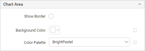
Use the Color Palette property to customize the color of the chart.
Title
To show/hide the chart title, toggle the Show Chart Title checkbox. The chart title can be customized by editing the Title Text property of the chart.
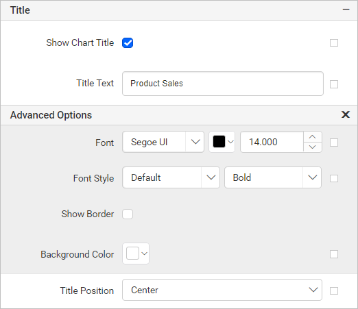
Using these properties the font color, font text, font style, border, background, and position of the title can be customized in the chart design.
No Data
The No Data property is used to display static text when a dataset results with empty or zero rows at runtime.
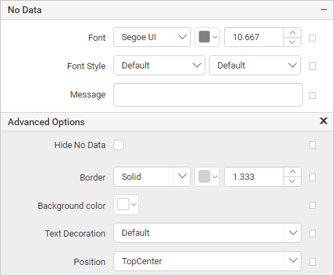
To set/reset no data message properties, refer to the No Data Message property section.
Category Axis
The Category axis displays text labels instead of numbers. To use the categorical axis, toggle the Enable Axis checkbox under the Category Axis category in the chart properties.
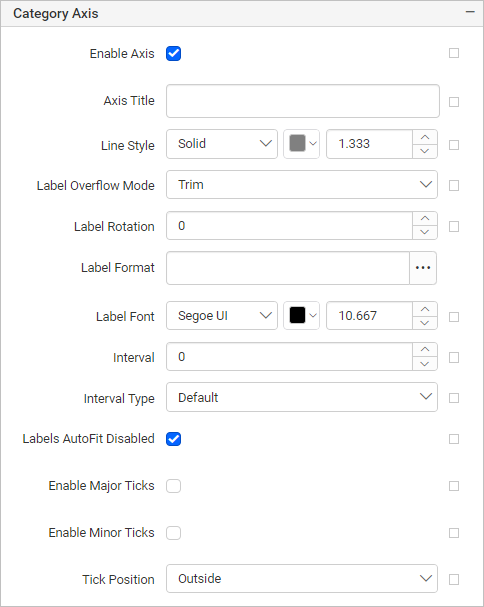
To set/reset axis properties, refer to the Axis Properties property.
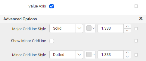
Value Axis
The Value axis uses a numerical scale and displays numbers as labels. To use the value axis, toggle the Enable Axis checkbox under the Value Axis category in the chart properties.
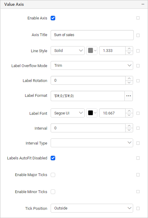
To set/reset axis properties, refer to the Axis Properties property.
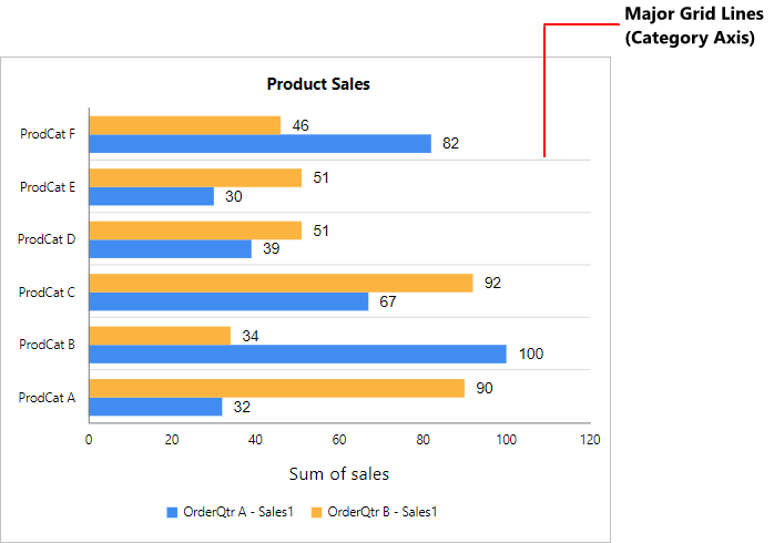
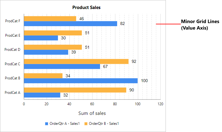
Grid line
The Grid line properties can be set to category and value axis.
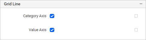
Category Axis
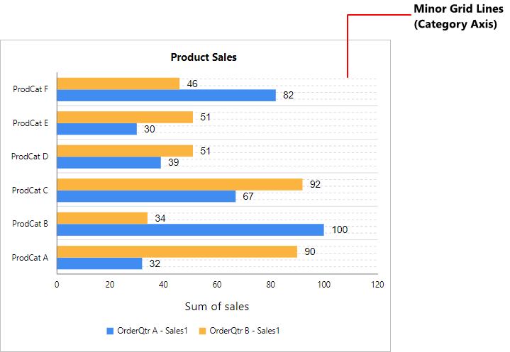
To show the grid line for category axis, enable the Category Axis checkbox.
You can also enable the Minor Grid Lines and customize the major and minor gridline style and color in the Advanced Options menu.
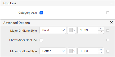
Value Axis
To show the grid line for value axis, enable the Value Axis checkbox.
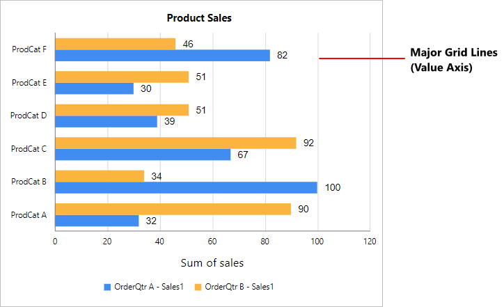
You can also enable the Minor Grid Lines and customize the major and minor gridline style and color in the Advanced Options menu.
Page break
The page break property can be used to control the amount of information on each page when you preview the report. Follow the below steps to apply the page break property for the chart report item.
-
The Break Location property specifies where the page break should occur. Choose any
Break Locationtype in the drop-down.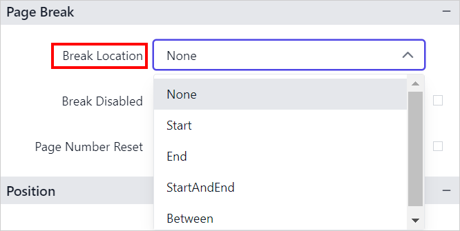
-
To prevent predefined page breaks from being applied during report preview, enable the
Break Disabledproperty checkbox. You can also control the application of page breaks during report preview by using expressions. For details on setting and resetting page breaks dynamically, refer to the Set Expression and Reset Expression sections.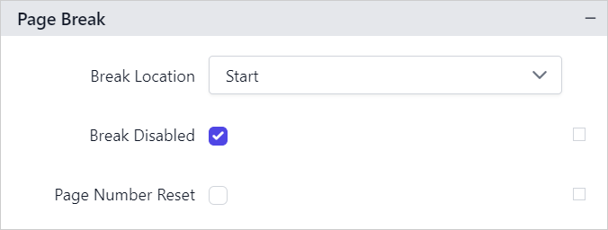
-
To restart page numbering on each page, enable the
Page Number Resetproperty checkbox.
Data Element
Data element can be used to control visibility of a report item when exporting the report in XML format. The Data element properties are listed in the properties panel, under the Data Element category.
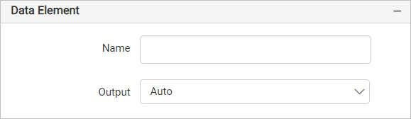
Name
You can assign a custom name to the chart element using the Name field. The chart report item will be exported with the provided name.
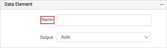
Note: The name cannot contain spaces, and it must begin with a letter followed by letters, numbers, or the underscore character (_).
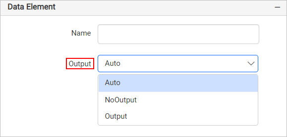
Output
On exporting the report, the visibility of the chart can be controlled using the Output property. Choosing the following options for the Output property will perform the respective operations:
- Auto or Output - Exports the chart report item
- NoOutput - Does not export the chart report item
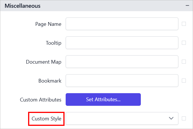
Miscellaneous
Page name
The page name property is used to name the first worksheet of the Excel workbook when exporting the report to excel format.
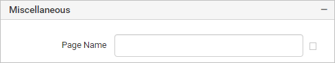
You can set static or dynamic text as the page name. To set and reset dynamic text, refer to the Set Expression and Reset Expression section.
Tooltip
The Tooltip property can be used to display informative text or values, when the user hovers over the report item in the report preview. To set a tooltip for a chart item using the properties panel, refer to the Tooltip section.
Document Map
A document map is a navigational feature that displays a separate side pane with a set of navigational links in a hierarchical structure when you view a report. A user can click the content in the list to navigate to the report page that displays that item. Refer to the Document Map section to configure the document map in the report design.
You can set static or dynamic text as value for the document map property. To set and reset dynamic text, refer to the Set Expression and Reset Expression section.
Bookmark
Bookmark links allow users to navigate to different parts of a SSRS report. You can add bookmarks to each textbox, image, table or chart or to the unique group values displayed in a tablix which can direct the users to specified locations in the report. The value of the bookmark property can be your own strings or an expression. Refer to the Bookmark section to configure bookmarks in the report design.
You can set static or dynamic text as the value for the bookmark property. To set and reset dynamic text, refer to the Set Expression and Reset Expression section.
Custom Style
The Custom Style property enables the use of external CSS for styling report items, providing enhanced flexibility beyond the built-in styling options. This property allows you to meet specific design requirements and maintain consistent styling across multiple reports. For a step-by-step guide on setting up custom styles in your report, check the How To section of this guide.
Preview report
-
The final design view of the report is shown below.
-
Now, the report preview can be visualized as below.
Download the above report design from the link.