Radial gauge
The radial gauges are degrees of circular to represent key performance indication. These can be placed inside the Tablix and Matrix.
Add a radial gauge to the report
- The radial gauge report item is listed in the item panel under the
Deviation category.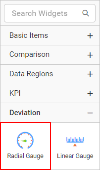
- Drag the radial gauge report item into the design area from the item panel.
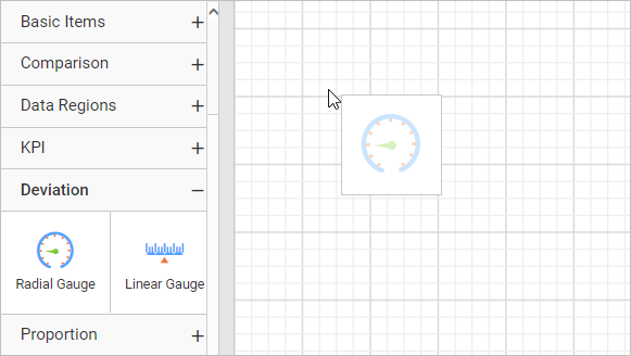
- After dropping the radial gauge item in the design area, the respective item properties will be listed in the properties panel.
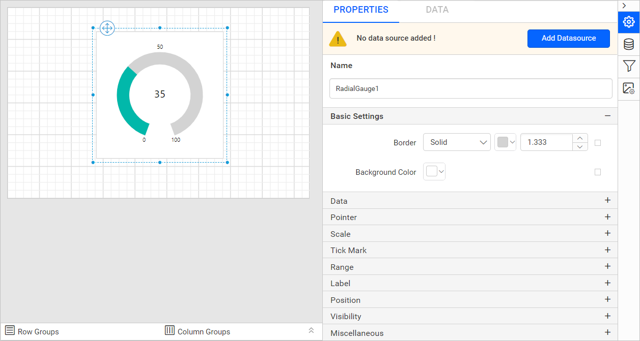
Properties
Refer to the Properties panel section before proceeding with the following properties:
Basic settings
The border style, color, width, and background color properties are used to customize the appearance of a radial gauge in the report design. These properties are listed under the Basic settings category in the properties panel.
Border
The border properties are used to add or customize the border around a radial gauge item to visually separate items in the report design. To set border properties to the radial gauge item using properties panel, refer to the Border Properties section.
Background color
Using the background color property, you can customize background color of a radial gauge. To set the background color using properties panel, refer to the Background color section.
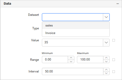
Data
Dataset
This property is used to assign the dataset to a radial gauge report item. The available datasets in the report will be listed in the Dataset property dropdown. You can choose the desired dataset from the dropdown.
Refer to the Create Data section to add dataset to your report.
Type
This property is used to select the type of a radial gauge report item. You can select Radial, Half Circle, or Auto from the dropdown.
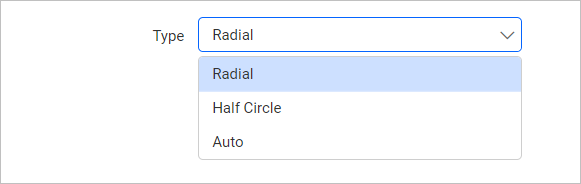
-
Radial: Displays the radial gauge of start-angle(0) and sweep-angle(320). -
Half Circle: Displays the radial gauge of start-angle(90) and sweep-angle(180). -
Auto: Displays the radial gauge with custom start-angle and sweep-angle.
Value
This property is used to assign the pointer value of a radial gauge. You can also set the pointer value based on dynamic values using expressions.
Range
This property is used to assign minimum and maximum values of a radial gauge. You can also set the values for minimum and maximum properties based on dynamic values using expressions.
Interval
This property is used to assign interval value between the scale labels. You can also set the interval property value based on dynamic values using expressions.
Pointer
Using this property, the pointer placement, type, marker style, marker length, cap, width and color can be customized in the radial gauge design.
Enable pointer
To show or hide the pointer in radial gauge, toggle the Enable Pointer checkbox.
Placement
Pointer placements can be Inside, Outside, or Cross. You can select any placement option from the dropdown.
Type
You can select the pointer type as Needle, Marker or Bar from the dropdown. If You select Marker option, Marker Style, and Marker Length properties will be visible in the property panel.
Marker style
You can select a marker style from the dropdown. The different styles are Circle, Rectangle, Triangle or Diamond from the dropdown.
The following diagram represents the radial gauge with the Marker pointer type, Diamond marker style, and Cross pointer placement.
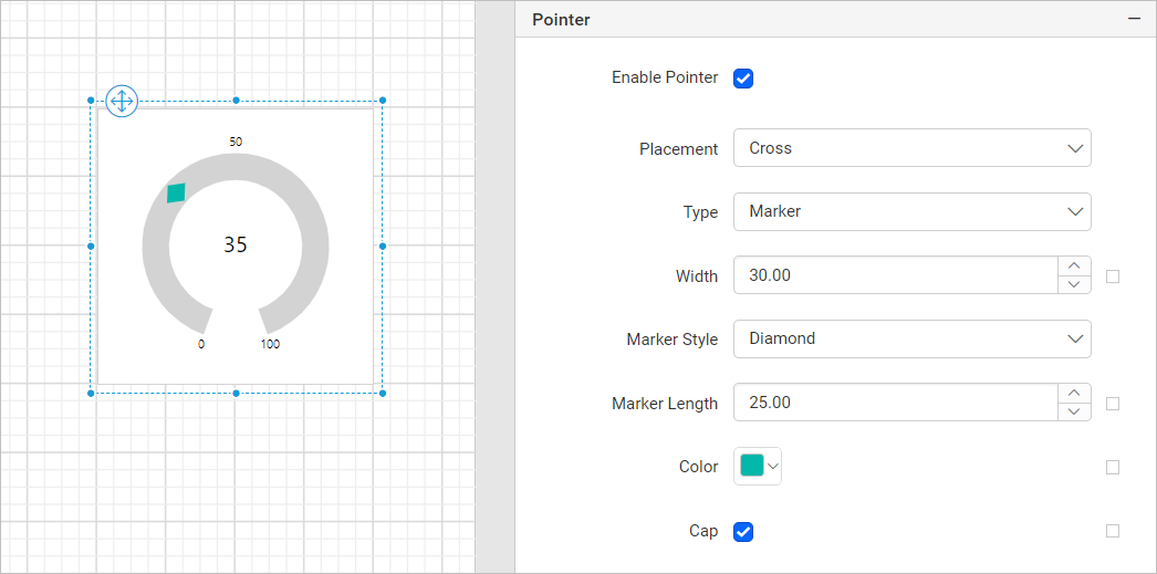
Marker length
This property is used to assign the pointer marker length value. You can also set the marker length property value based on dynamic values using expressions.
Enable cap
To show or hide the pointer cap in radial gauge, toggle the Enable Cap checkbox, the pointer cap is supported only for pointer of type Needle.
You can customize the Cap in the Advanced Options menu. To open and handle the nested properties of Pointer Cap, refer to the Advanced Properties section.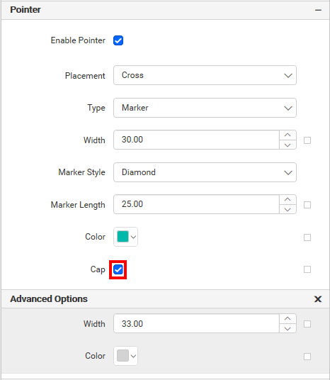
Using these properties, the pointer cap width, pointer cap color can be customized in the radial gauge design.
Width
This property is used to assign the pointer width value. You can also set the width property value based on dynamic values using expressions.
Color
Using the color property, you can customize the pointer color of a radial gauge.
Scale
Angle
This property is used to set the values of start angle, sweep angle of the radial gauge. You can also set the start angle and sweep angle property value based on dynamic values using expressions.
Width
This property is used to assign the scale width value. You can also set the width property value based on dynamic values using expressions.
Color
Using the color property, you can customize the scale color of the radial gauge.
Reverse direction
By clicking the Reverse Direction checkbox, you can reverse the scale direction from maximum to minimum.
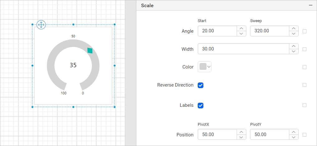
Labels
To show or hide the scale labels in radial gauge, toggle the Label checkbox.
You can customize the scale label in the Advanced Options menu. To open and handle the nested properties of labels, refer to the Advanced Properties section.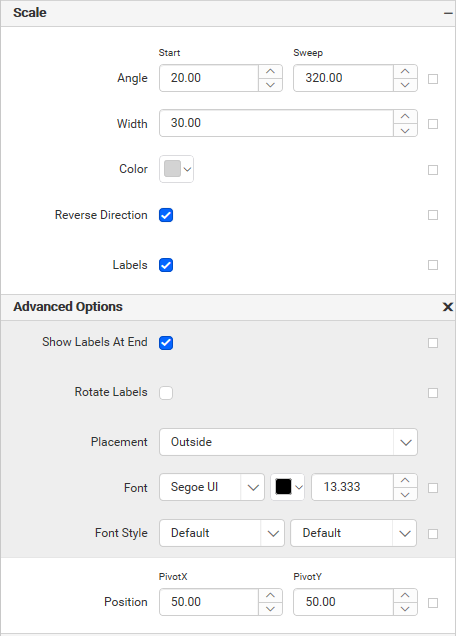
Using these properties, the scale label font color, font family, font size, and font style can be customized in the radial gauge design.
Show labels at the end
To show or hide the scale labels at the end of the scale, toggle the Show Labels At End checkbox.
Rotate labels
To Rotate the scale labels, toggle the Rotate Lables checkbox.
Placement
Scale label placement can be Inside, Outside, or Cross. You can select an from the dropdown.
Position
This property is used to set the PivotX and PivotY of radial gauge. You can also set the pivot property value based on dynamic values using expressions.
Tick mark
This property is used to customize the major and minor ticks of the radial gauge.
Major tick and minor tick
To show or hide major and minor ticks in a scale, toggle the Major Tick and Minor Tick checkbox.
You can customize major and minor ticks in the Advanced Options menu. To open and handle the nested properties of major and minor ticks, refer to the Advanced Properties section.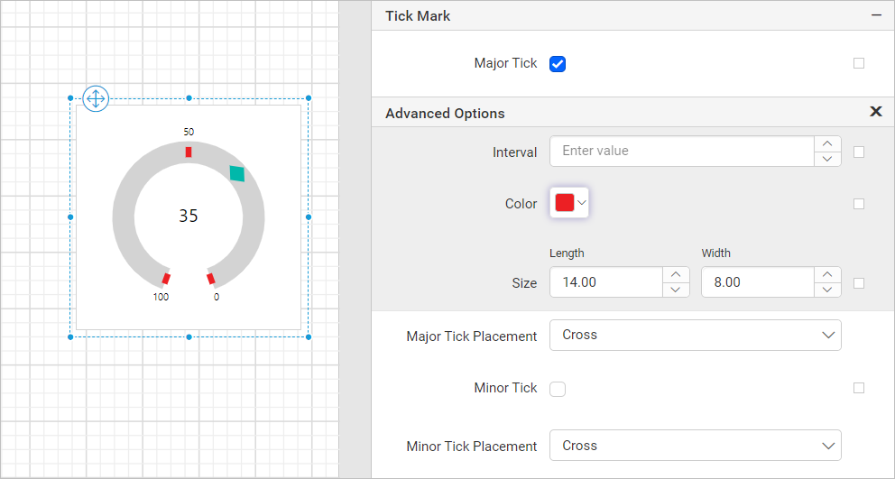
Using this property, you can customize major and minor ticks interval, color, length and width.
Major tick placement and minor tick placement
Major tick and minor tick placement can be Inside, Outside, or Cross. The placement can be selected from the dropdown.
Range
Using this property, the range placement, start value, end value, start width, end width, and color can be customized in the radial gauge design.
Enable range
To show or hide the range in radial gauge, toggle the Enable Range checkbox.
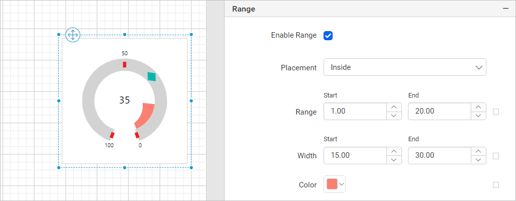
Placement
Range placement can be Inside, Outside, or Cross. You can select any option from the dropdown.
Range
This property is used to assign the range start and end values of the radial gauge. You can also set the start and end properties value based on dynamic values using expressions.
Width
This property is used to assign the range start width and end width values of the radial gauge. You can also set the start and end width properties value based on dynamic values using expressions.
Color
Using the color property, you can customize the range color of a radial gauge.
Position
The position property is used to set the width, height, left and top position of the radial gauge in the report design. To handle these properties using properties panel, refer to the Position section.
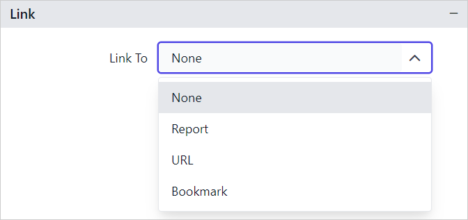
Link
The Linking property in reports enables you to create interactive and user-friendly reports by adding actions such as Hyperlink and Report Linking. Refer Linking section to know more about linking.
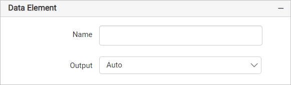
Data Element
Data element can be used to control visibility of a report item when exporting the report in XML format. The Data element properties are listed in the properties panel, under the Data Element category.
Name
You can assign a custom name for the radial gauge element using the Name field. The radial gauge will be exported with the provided name.
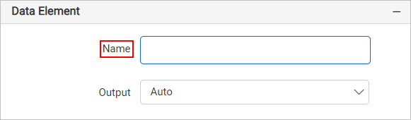
Note: The name cannot contain spaces, and it must begin with a letter followed by letters, numbers, or the underscore character (_).
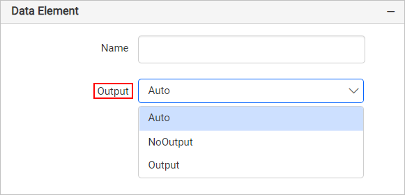
Output
On exporting the report, the visibility of the radial gauge can be controlled using the Output property. Choosing the following options for the Output property will perform the respective operations:
- Auto or Output - Exports the radial gauge report item
- NoOutput - Does not export the radial gauge report item
Visibility
The visibility property is used to conditionally show or hide the radial gauge report item on report preview or export action. To set visibility of radial gauge item using properties panel, refer to the Visibility section.
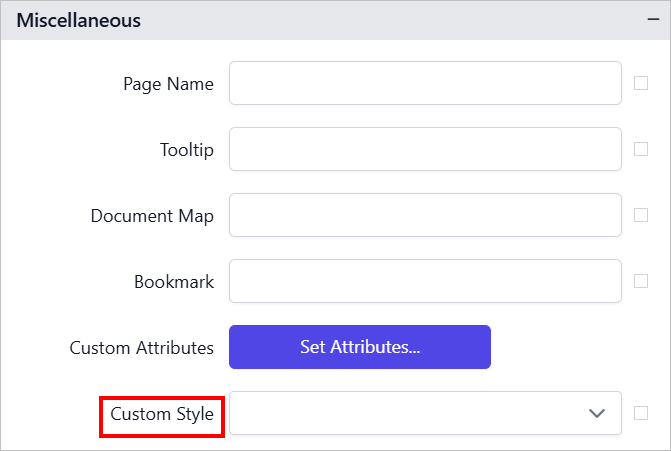
Miscellaneous
Page name
The page name property is used to name the first worksheet of the Excel workbook, when exporting the report to excel format.
You can set the static or dynamic text as page name. To set and reset dynamic text, refer Set Expression and Reset Expression section.
Document Map
A document map is a navigational feature that displays a separate side pane with set of navigational links in hierarchical structure when you view a report. A user can click the content in the list, to navigate to the report page that displays that item. Refer Document Map section to configure document map in the report design.
You can set the static or dynamic text as value for document map property. To set and reset dynamic text, refer Set Expression and Reset Expression section.
Bookmark
Bookmark links allows the users to navigate to different parts of a SSRS report. You can add bookmarks to each textbox, image, table or chart or to the unique group values displayed in a tablix which can direct the users to specified locations in the report. The value of bookmark property can be your own strings or an expression. Refer Bookmark section to configure bookmark in the report design.
You can set the static or dynamic text as value for bookmark property. To set and reset dynamic text, refer Set Expression and Reset Expression section.
Custom attributes
This property can be used to set the values for radial gauge custom properties. To assign values for custom properties using properties panel, refer to the Custom Properties section.
Tooltip
The Tooltip property can be used to display informative text or value, when the user hovers over on the report item in report preview. To set a tooltip for gauge report item using the properties panel, refer Tooltip section.
Custom Style
The Custom Style property enables the use of external CSS for styling report items, providing enhanced flexibility beyond the built-in styling options. This property allows you to meet specific design requirements and maintain consistent styling across multiple reports. For a step-by-step guide on setting up custom styles in your report, check the How To section of this guide.