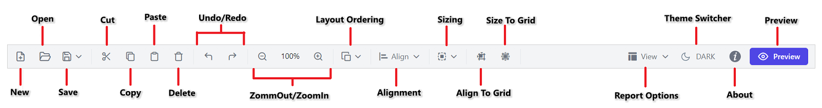
Toolbar
The Report Designer toolbar contains a set of icons or buttons that allow you to perform common report designing operations.
New
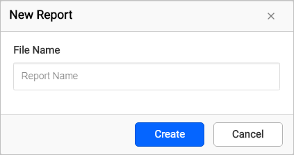
To create a new blank report, click the New icon on the toolbar. The New Report dialog opens, as shown in the following image. In the File Name field, specify the report name and click the Create button.
Open
Opens an existing report from a device or server. Refer to the Open report section to open a report.
Save
Saves the report to a device or server. Refer to the Save report section to save a report.
Cut
The Cut action removes the currently selected report item, and it can be pasted anywhere on the design surface.
Copy
The Copy action creates a copy of the selected report item, and it can be pasted anywhere on the design surface.
Paste
The Paste action can be used to paste the cut or copied report item onto the design surface. Paste is enabled only after you perform a Cut or Copy operation.
Delete
The Delete option removes the currently selected report item from the design surface.
Undo
The Undo action records recent actions such as add, delete, insert, property changes, and other design actions performed in a report.
Redo
The Redo action reverses the last undo action performed in a report.
Zoom out
The Zoom out option decreases the document’s current zoom factor.
Zoom in
The Zoom in option increases the document’s current zoom factor.
Layout ordering
Layout ordering can be used to change the layout order of report items on the design surface. Refer to the Layout Ordering section to learn about ordering modes.
Alignment
Alignment has a set of alignment options that enable you to align the selected report items on the design surface.
Distribute
The Distribute option can be used to place the selected report items on the design surface at equal intervals from each other.
Sizing
Sizing can be used to size selected report items equally on the design surface.
Align to grid
Snaps the top-left of the selected report items to the closest gridline.
Size to grid
Snaps the selected report item to the closest gridline by resizing the report item on all four sides.
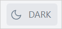
Theme Switcher
To switch to the dark theme in the Standalone Report Designer, click the Theme Switcher icon on the toolbar.
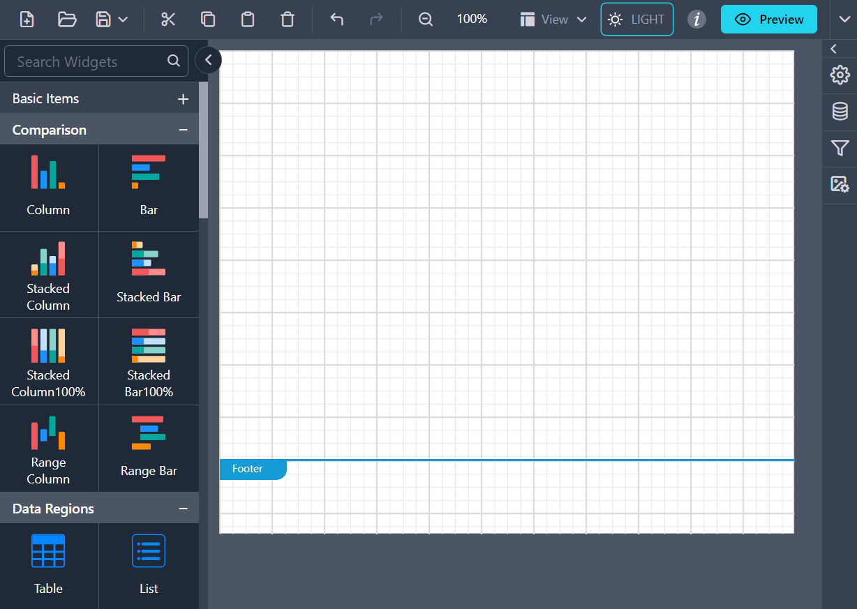
The designer in dark theme appears as shown below:
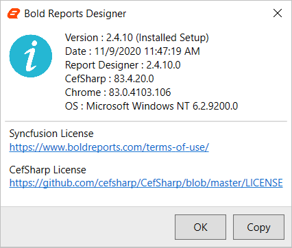
About
Click the About icon to view the Bold Reports® Designer setup configuration details.
View
The View menu contains options to show or hide the Header, Footer, Grid Lines, Snap To Shape, and Full Screen in the report design.
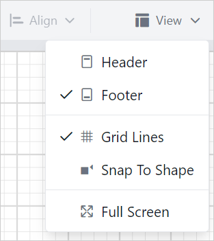
Header: Enables or disables the header area in the report. Refer to the Header section to add or remove the header on the design surface.
Footer: Enables or disables the footer area in the report. Refer to the Footer section to add or remove the footer on the design surface.
Grid Lines: Gridlines are a pattern of lines drawn behind the report items. They provide visual guidance while dragging or arranging objects on the design surface. Click Grid Lines in the View menu to show or hide gridlines in the report.
Snap To Shape: When you drag a report item onto the design surface, snapping guidelines indicate the alignment position to help you align it with the closest report item. Click Snap To Shape in the View menu to enable or disable snapping guidelines in the report design.
Full Screen: The Standalone Report Designer can expand to fill your entire screen with the Full Screen feature.
Preview
After designing a report, click the Preview button to preview the report. Refer to the Preview section to preview the designed report.