Report Explorer
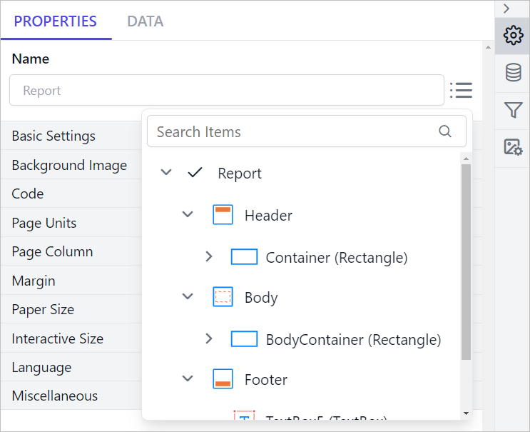
The Report Explorer panel presents the report layout in a hierarchical format, allowing easy navigation between report items. It has built-in search, selection indicators, and action options, users can efficiently manage and remove report items.
Prefer watching over reading? Check out this video for Report Explorer:
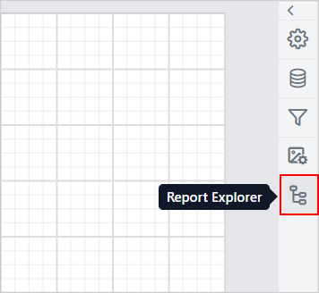
To open the Report Explorer, click on the Report Explorer icon in the Data Configuration panel.
Key Features
Persistent Panel
The Report Explorer panel remains open until manually closed, ensuring an uninterrupted workflow.
Hierarchical Display
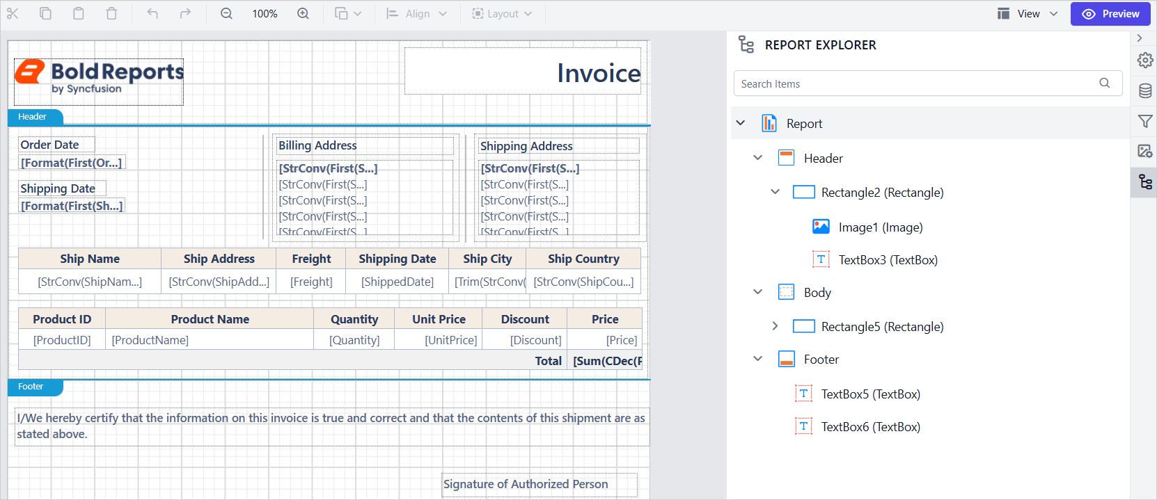
Displays a tree view of a report’s RDL structure, organizing elements under sections like Report, Header, Body, and Footer for easy navigation.
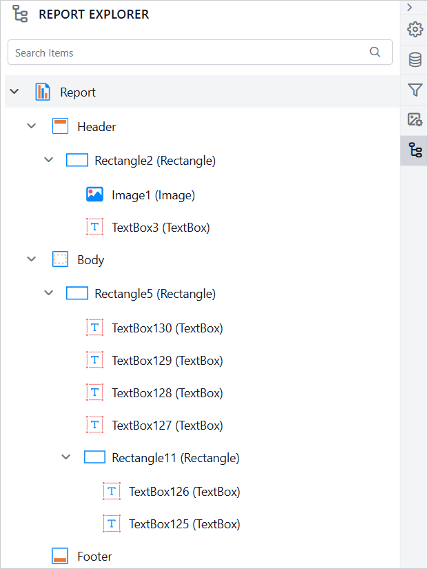
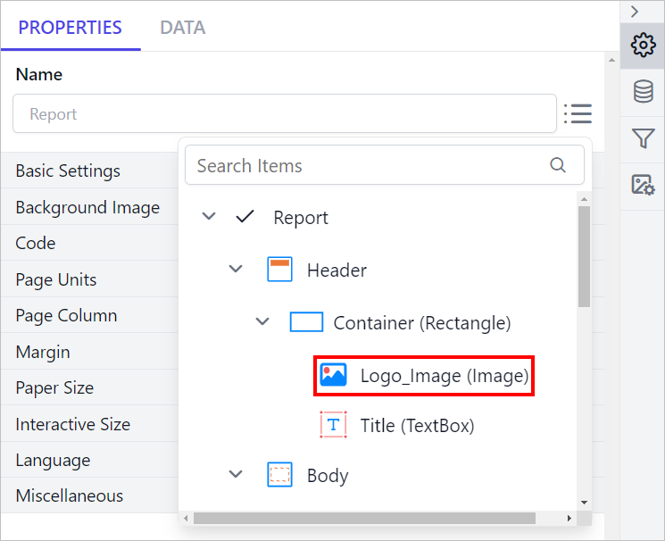
Each report element is identified by its name and type. In the image below, the image icon and the label (Image) indicate the type of the report item, while Logo_Image represents its name.
Dynamic Updates
The Report Explorer panel updates dynamically in real time as you modify the report in the design area.
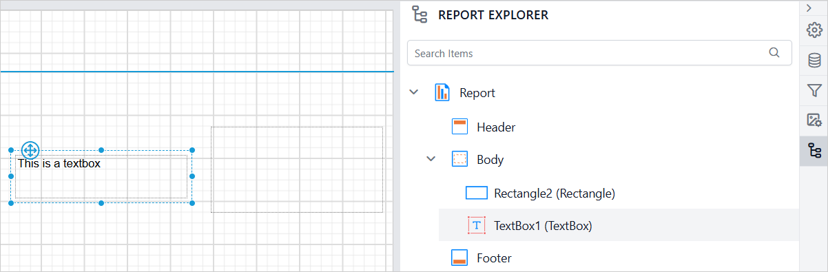
When a new report item is added, it immediately appears in the hierarchical structure of the Report Explorer, reflecting its position within sections such as Header, Body, or Footer.
In the image below, a Rectangle and a TextBox report item have been added. These items are listed under the Body section in the panel.
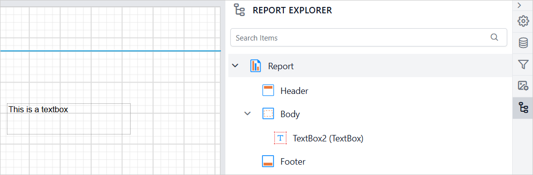
Similarly, when a report item is removed from the design surface, it is instantly removed from the Report Explorer. This ensures that the panel always reflects the current structure of the report.
In the image below, the Rectangle report item has been deleted from the design surface and is no longer visible in the panel.
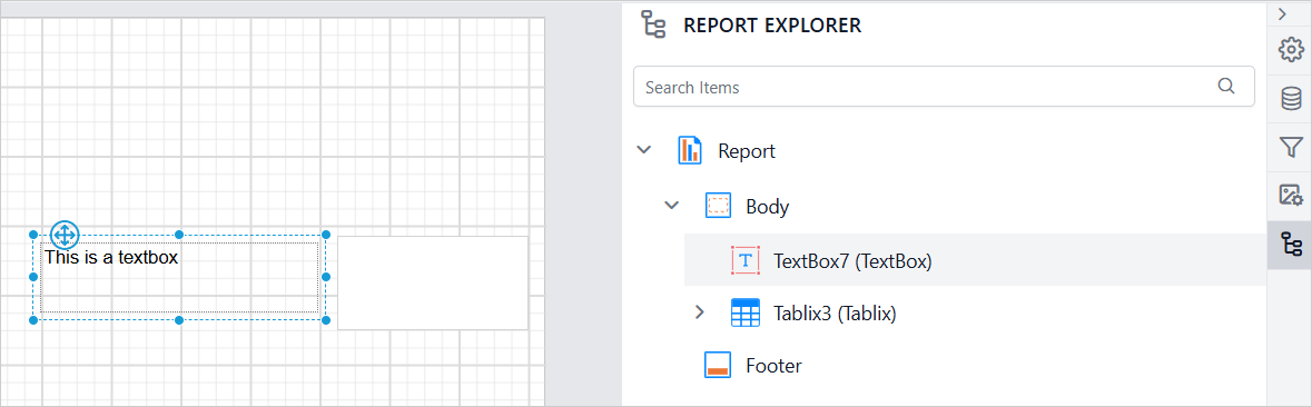
Selecting a report item in the design area automatically highlights the corresponding item in the Report Explorer. A background color indicate the selection, enabling seamless interaction between the design surface and the panel.
In the image below, the Textbox report item is selected in the design area, so the background highlight is applied to the Textbox node in the panel.
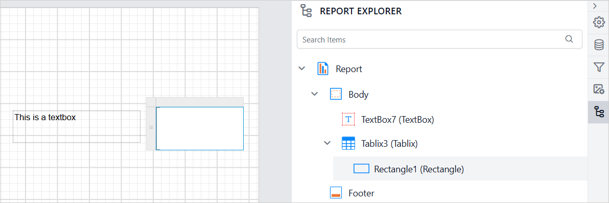
When a child item is selected in the design area, the parent node in the hierarchical structure automatically expands to reveal the selected child item. In the image below, the Rectangle item inside the Tablix is selected. As a result, the Tablix node is expanded in the panel.
Search Functionality
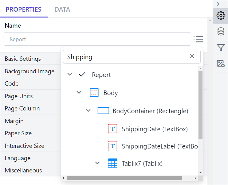
The search feature in the Report Explorer panel helps you quickly find specific report elements. When you search for a report item by name, the results appear in a parent-child hierarchy, making it easy to identify the item’s exact position within the report structure.
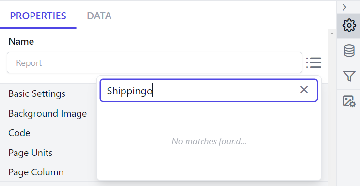
If no results are found, a No matches found message will appear in the Report Explorer panel.
Edit Item Properties
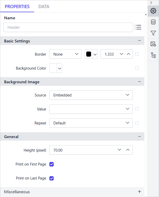
The Edit option provides quick access to the properties of the selected report item, eliminating the need to manually locate the item on the design surface. The Edit icon appears when an item is hovered in the tree view.
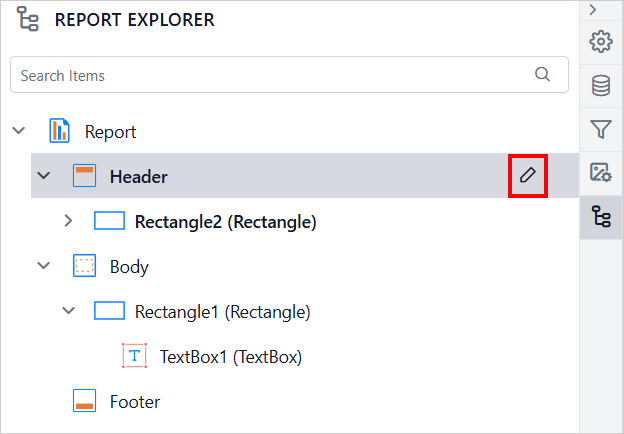
Clicking the Edit icon displays the respective item properties in the property panel. This enables seamless editing of respective item properties without requiring additional navigation steps.
Delete Item
The Delete option can be used to remove respective report item from the design surface. The delete option is not applicable for Report, Header, Body, and Footer. The Delete icon appears when an item is hovered in the tree view.
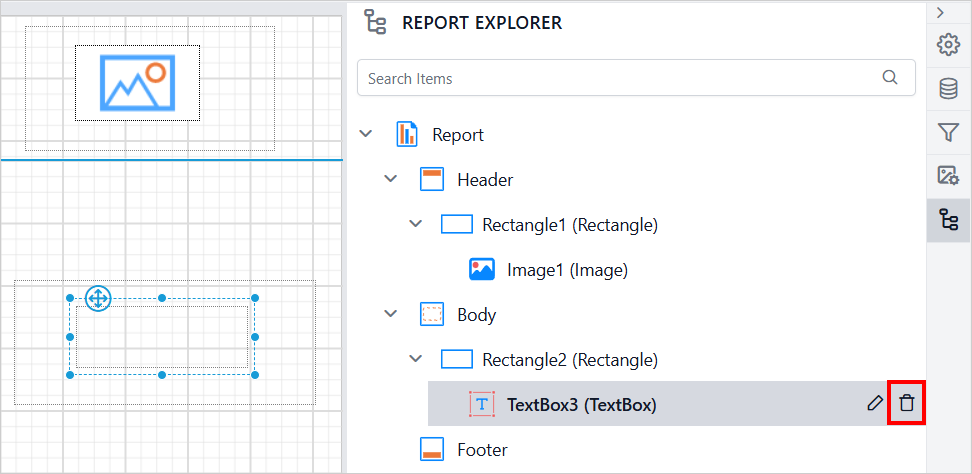
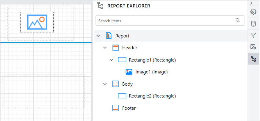
Clicking the Delete icon removes the respective item from both the design surface and the Report Explorer, keeping them synchronized. This ensures that the panel always reflects the current structure of the report after deletion.
To close the Report Explorer panel, click the Report Explorer icon again.