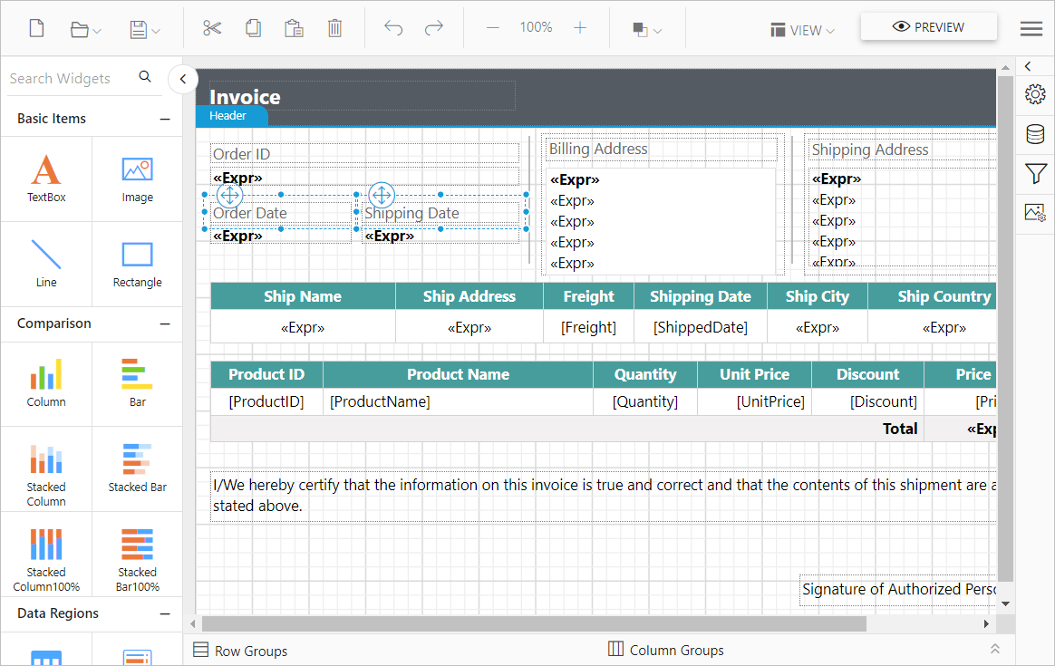
Responsive layout rendering of Angular Report Designer
The Bold Reports® Angular Report Designer adaptively renders itself with optimal user interfaces for tablet or desktop form factors. The Report Designer has built-in responsive support, so it adjusts automatically based on the browser viewport. Setting the width to 100% is enough to make the Report Designer responsive, which helps your application scale on all form factors.
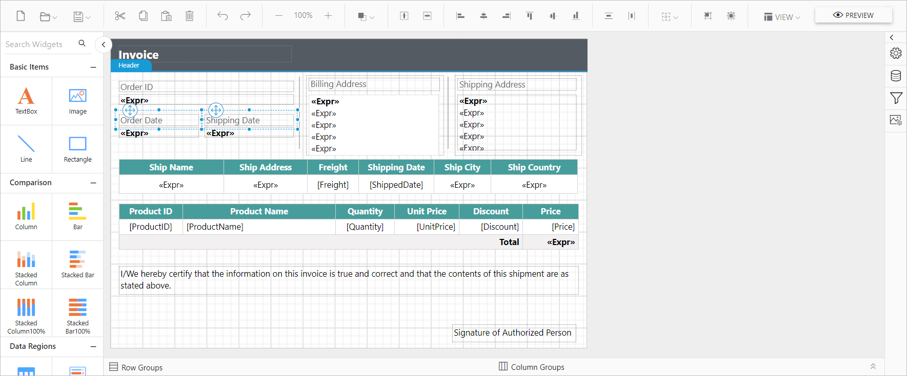
Normal layout
The following output shows the normal layout rendering of Report Designer tool bar items.
Responsive layout
The following output shows the responsive layout rendering of Report Designer tool bar items.