Chart custom properties
This topic explains about the list of chart custom properties that are supported to render in the ASP.NET Core Report Viewer.
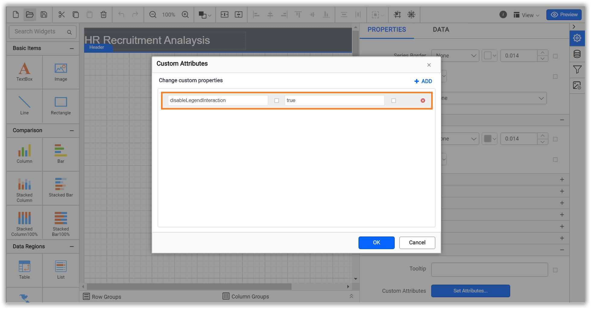
Disable legend item interaction
Set DisableLegendInteraction custom property value as true to stop the legend item interaction. The property value should be boolean. You can set the property value, as shown in the below.
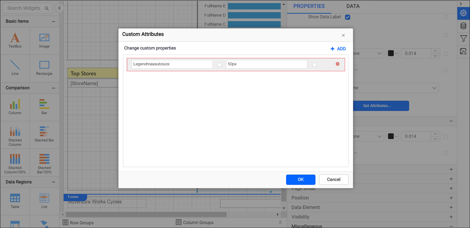
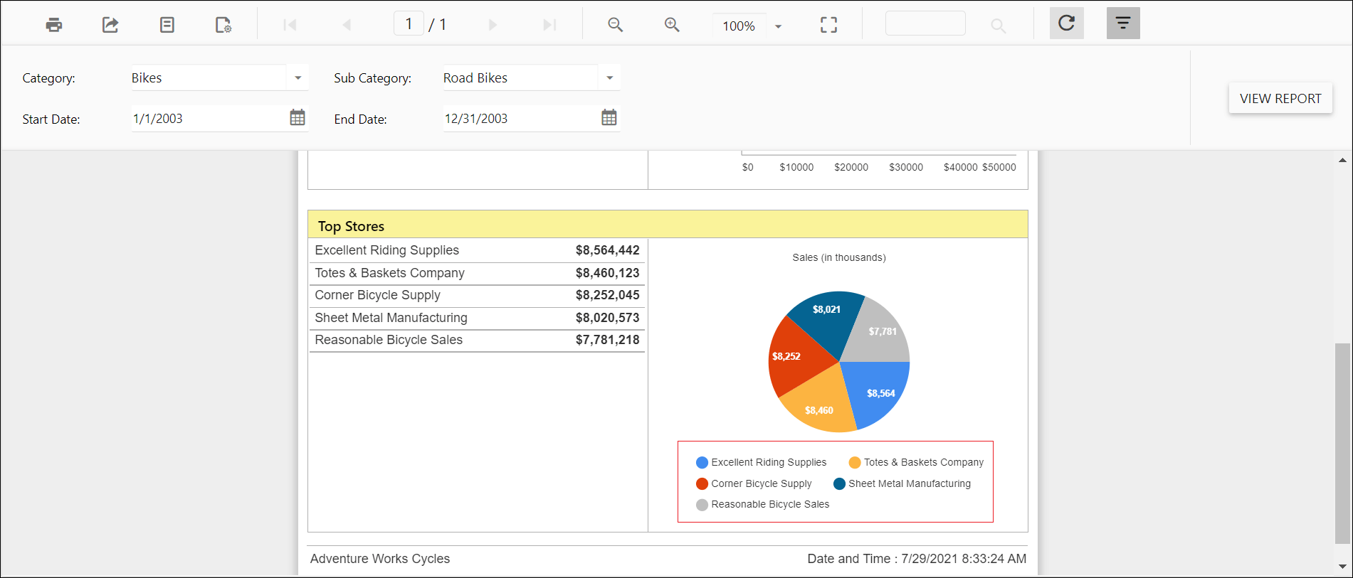
Set maximum size for chart legend
The LegendMaxAutoSize custom property specifies the maximum size of the legend container in the report.
You can set the LegendMaxAutoSize property value, as shown in the below.
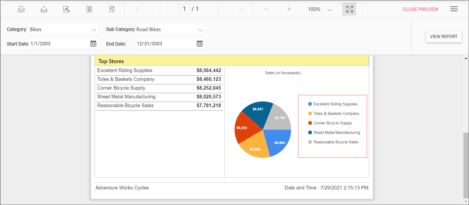
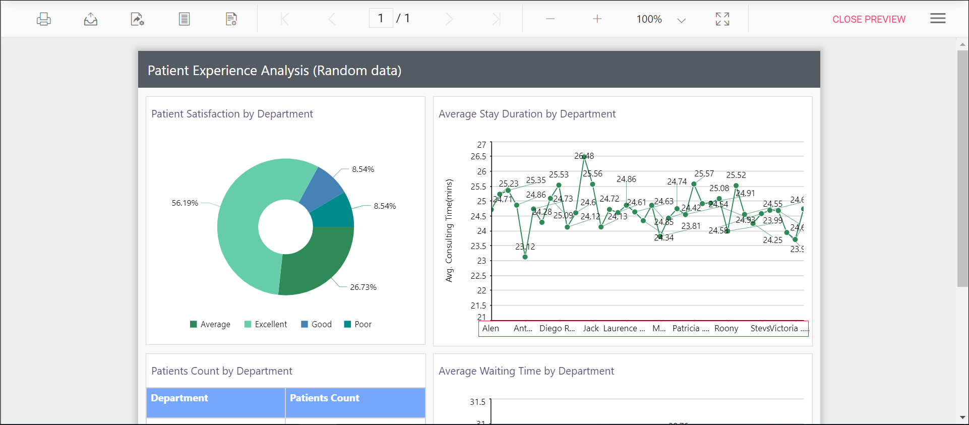
Preview the report and the see legend container size in chart report.
## Change chart legend shape
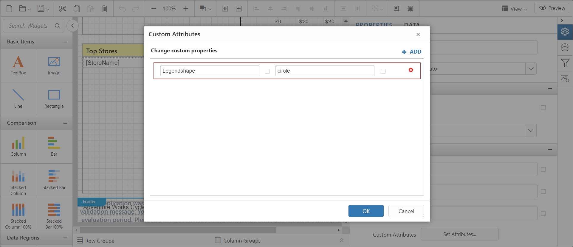
The LegendShape custom property allows changing the shape of the legend in the chart report item. By default, the LegendShape value is rectangle.
- Rectangle - legend shapes displayed in
rectangle. - Circle - legends are displayed in
circle. - Thumbnail - legends are displayed in
seriestype.
You can set the LegendShape property value, as shown in the below.
Preview the report and the see legend shape in chart report.
## Show or hide chart legend scroller
The EnableChartLegendScroller custom property controls whether legend has to use scrollbar or not. The scrollbar appears depending upon size and position properties of legend. By default, the EnableChartLegendScroller value is false.
You can set the EnableChartLegendScroller property value, as shown in the below.

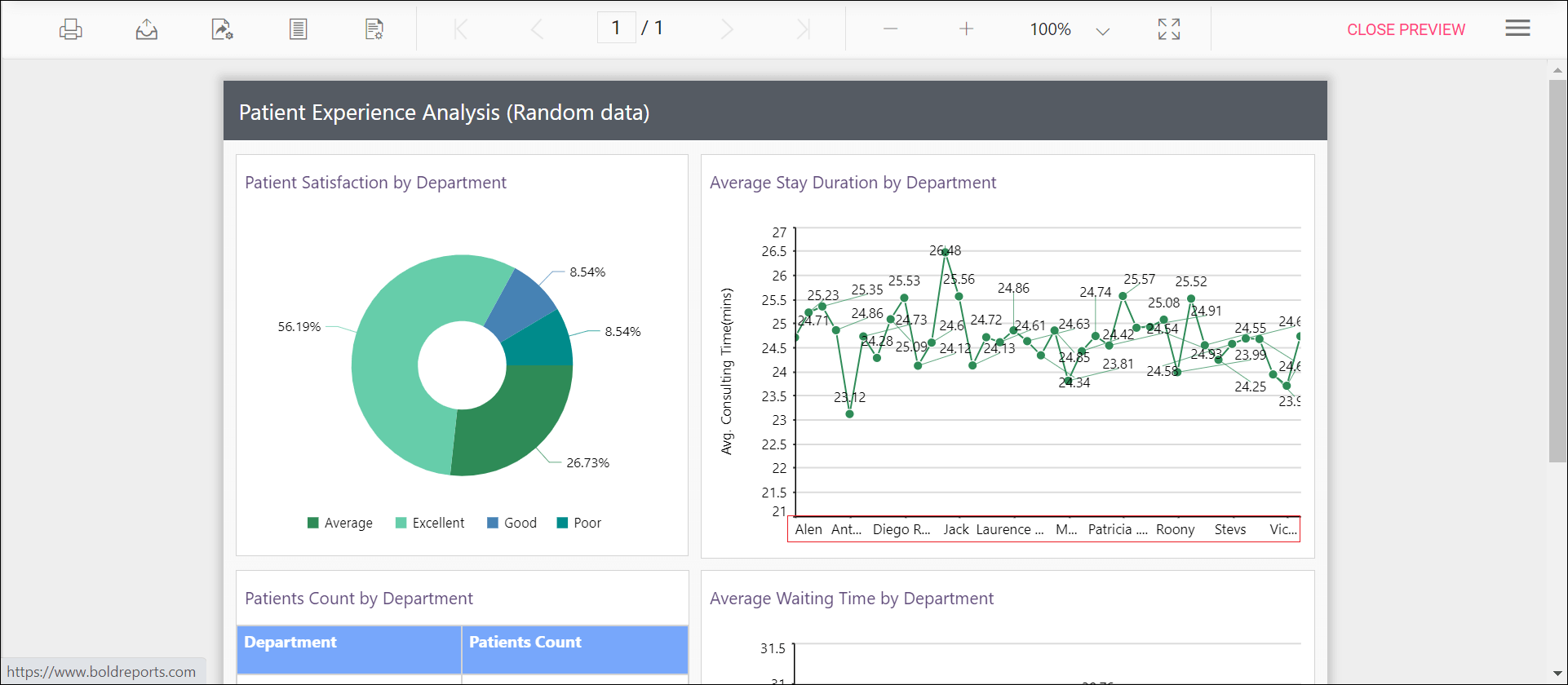
Preview the report and the see the legend scrollbar in chart report.
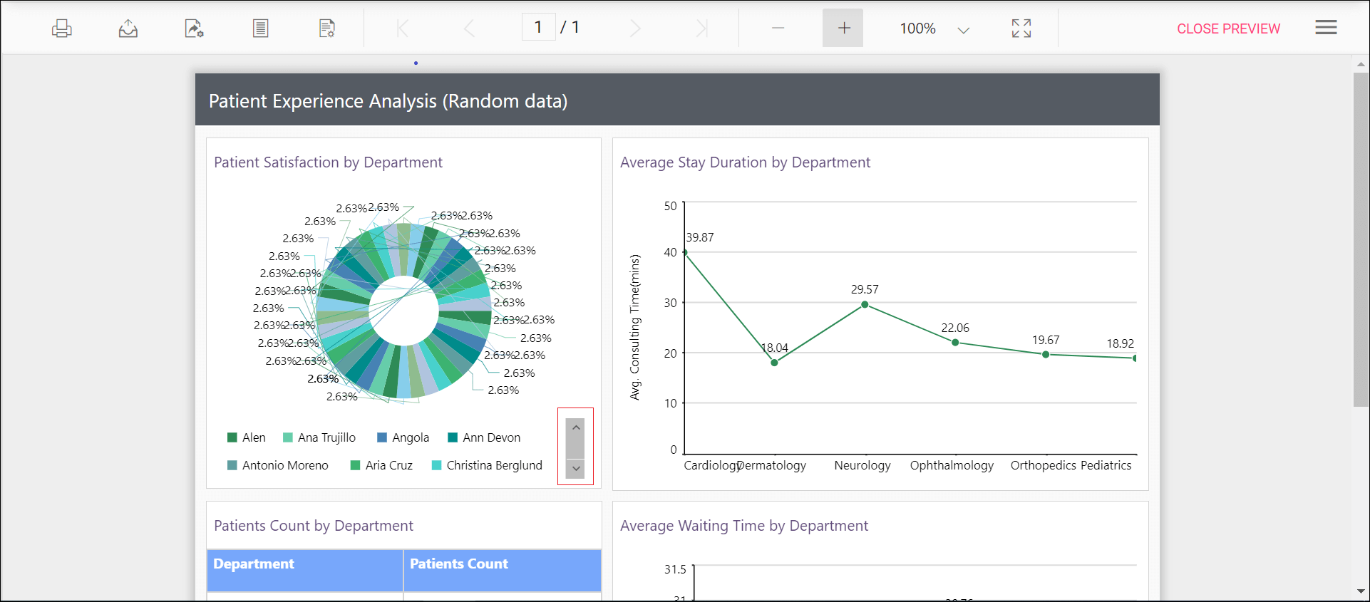
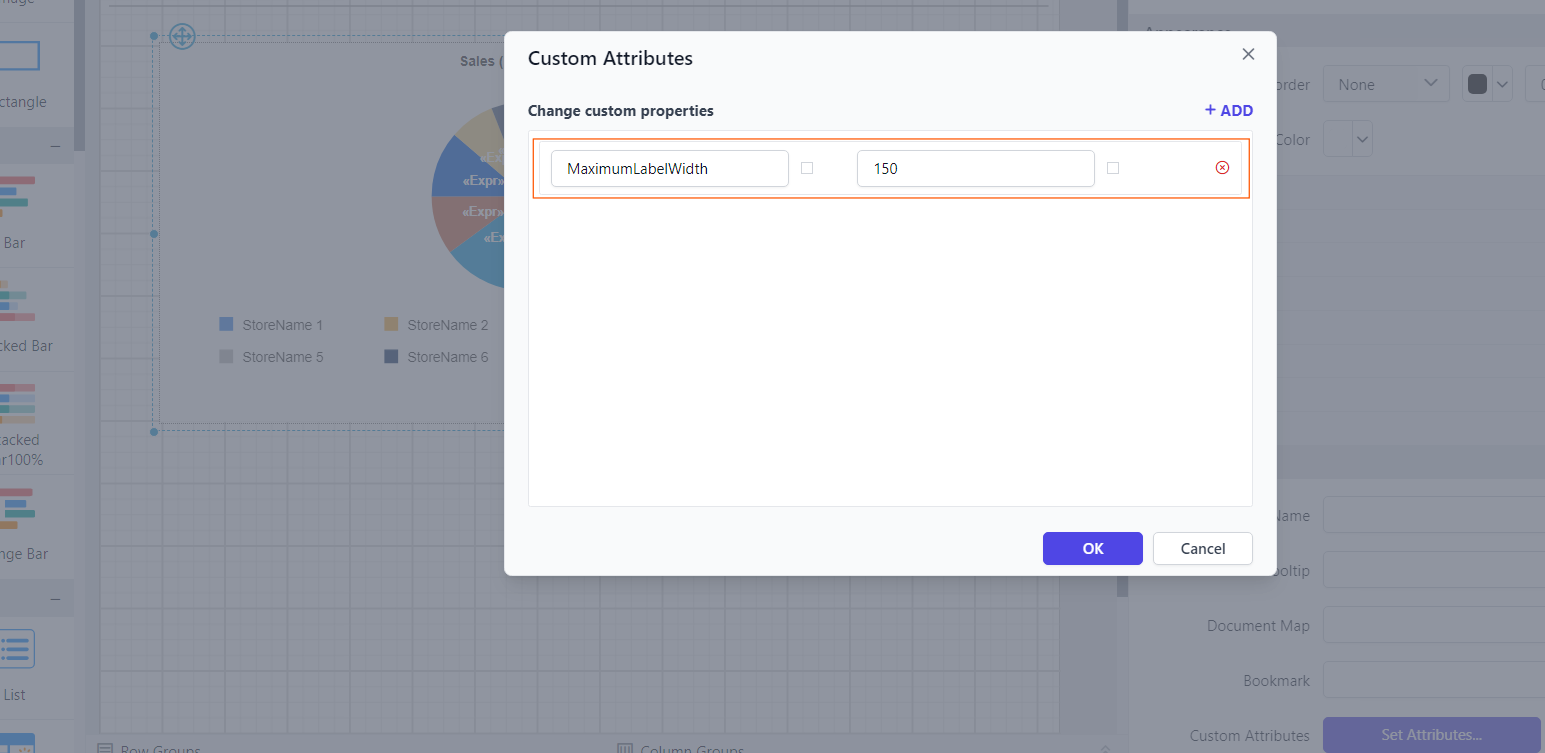
## Chart legend items formatting
The MaximumLabelWidth custom property formats the legend items to resemble a properly aligned table structure. You can set the MaximumLabelWidth property value according to your requirements, as shown below.
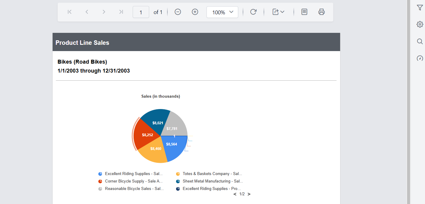
Before setting the Maximum label width, the legend items will be displayed as below.
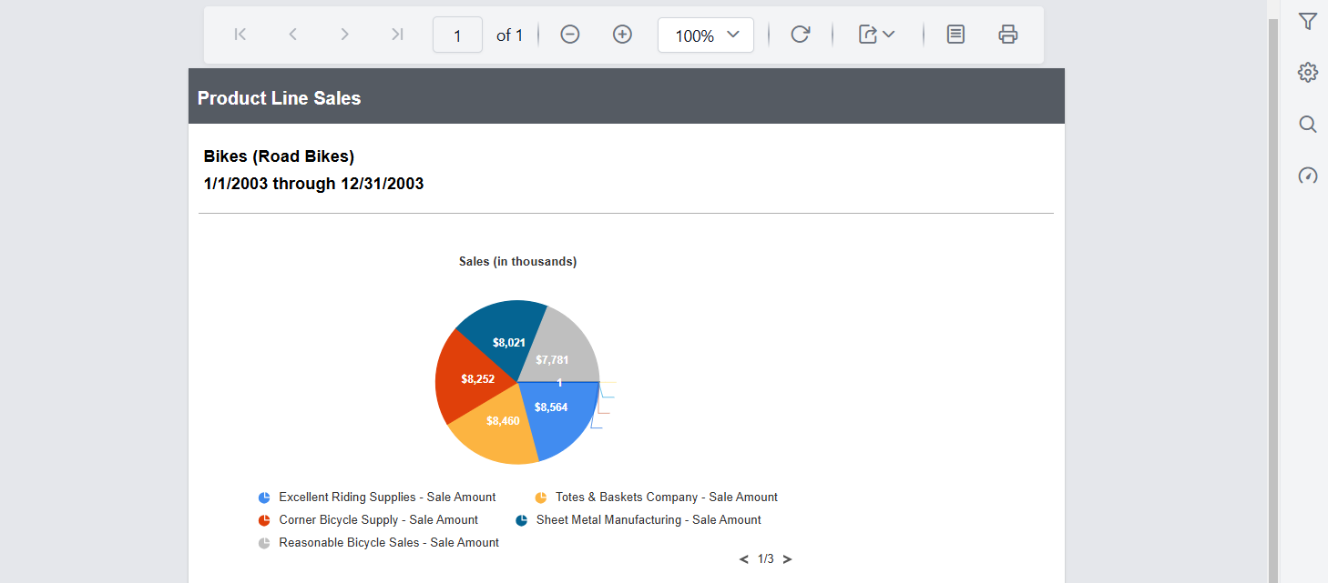
Preview the report to see the legend items aligned in a tabular format in the chart.
Set range padding for X-axis and Y-axis
Padding can be applied to the minimum and maximum extremes of the axis range by using the XAxisRangePadding and YAxisRangePadding property. The default value isnone.
Numeric axis supports the following types of padding.
| Name | Description |
|---|---|
| Additional | Interval of the axis is added as padding to the minimum and maximum values of the range |
| Normal | Padding is applied to the axis based on the range calculation |
| None | Padding cannot be applied to the axis |
| Round | Axis range is rounded to the nearest possible value divided by the interval |
You can set the XAxisRangePadding and YAxisRangePadding property value, as shown in the below.
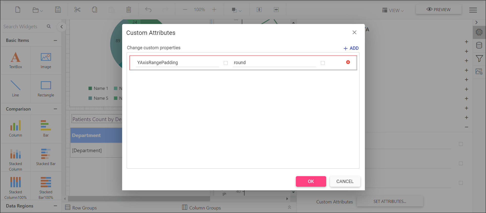
Before setting the range padding, the default value will be displayed as below.
Set the padding range and see the changes in chart report as below.

Control edge label placement in chart axis
Labels with long text at the edges of an axis may appear partially outside the chart. The XAxisEdgeLabelPlacement and YAxisEdgeLabelPlacement custom property can be used to avoid the partial appearance of the labels at the corners. The default value is none.
You can set the XAxisEdgeLabelPlacement property value, as shown in the below.
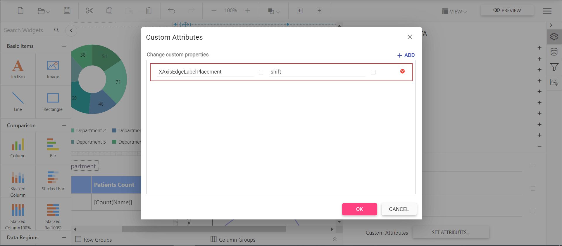
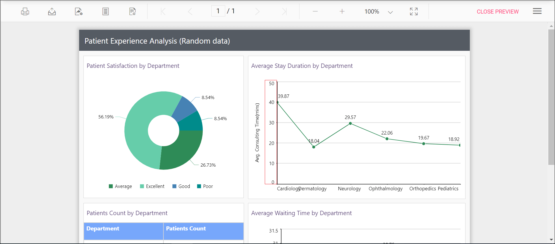
Before setting the edge label placement, the default value will be displayed as below.
Set the edge label placement and see the changes in chart report as below.
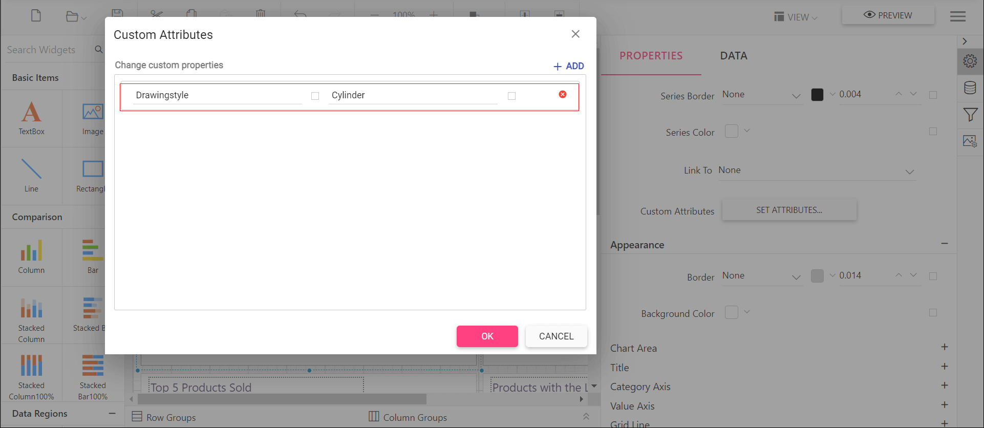
Change the drawing style of a chart column or bar series
The shape of the chart column or bar can be changed using this Drawingstyle custom property. By default, the Drawingstyle property value is rectangle.
You can set the Drawingstyle property value, as shown in the below.
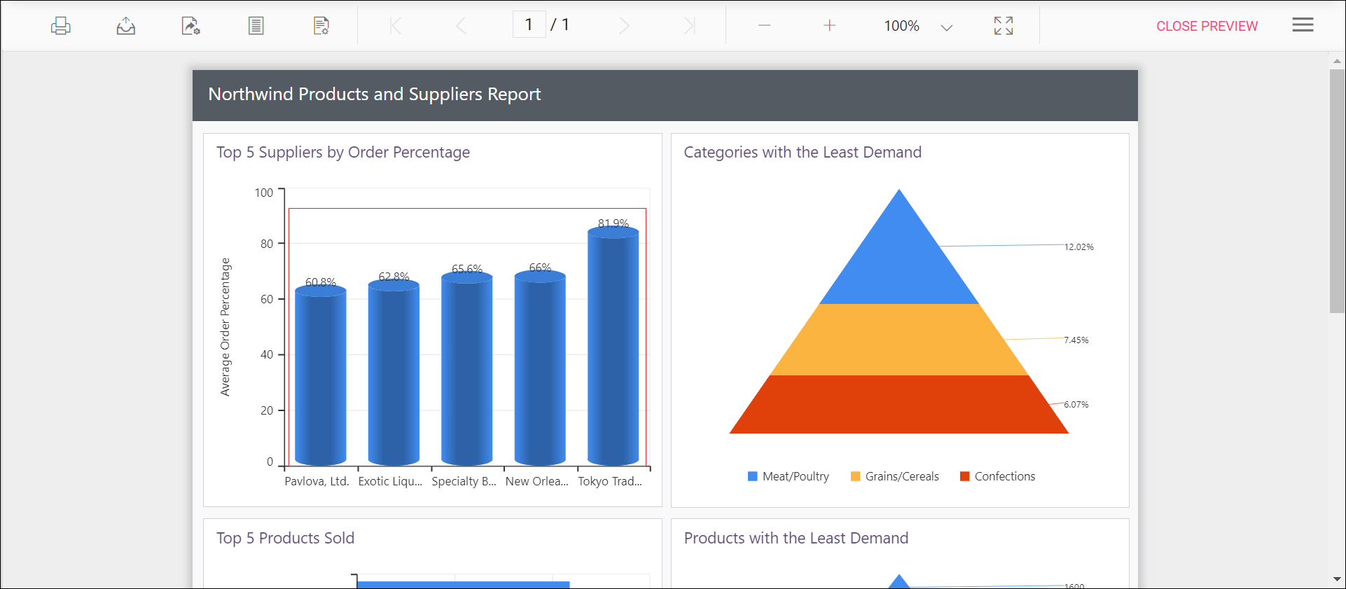
Preview the report and the see the column or bar shape in chart report.
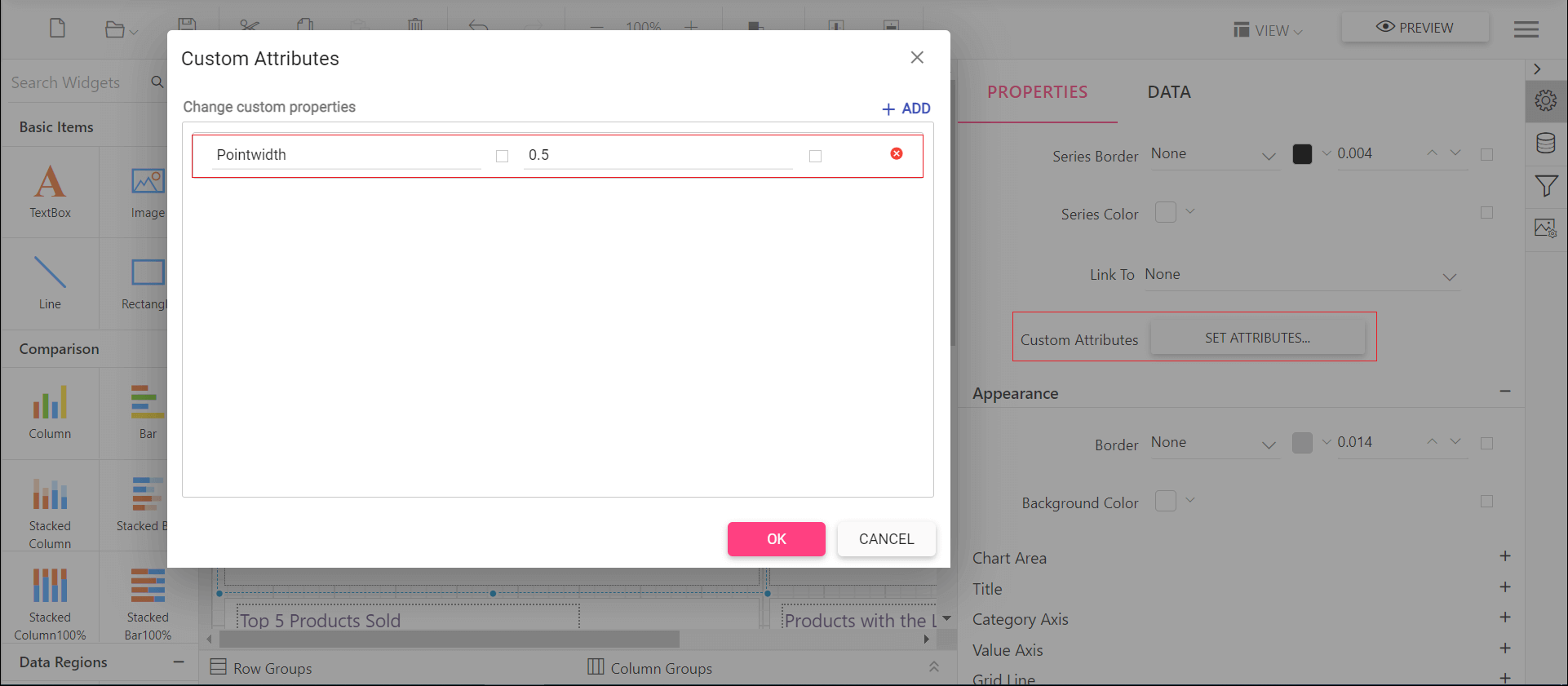
Change width of the column type series in chart
Width of the column type series can be customized by using the Pointwidth property. Default value of Pointwidth is 0.7. Value ranges from 0 to 1. Here 1 corresponds to 100% of available width and 0 corresponds to 0% of available width.
You can set the Pointwidth property value, as shown in the below.
Before setting the point width, the default value will be displayed as below.
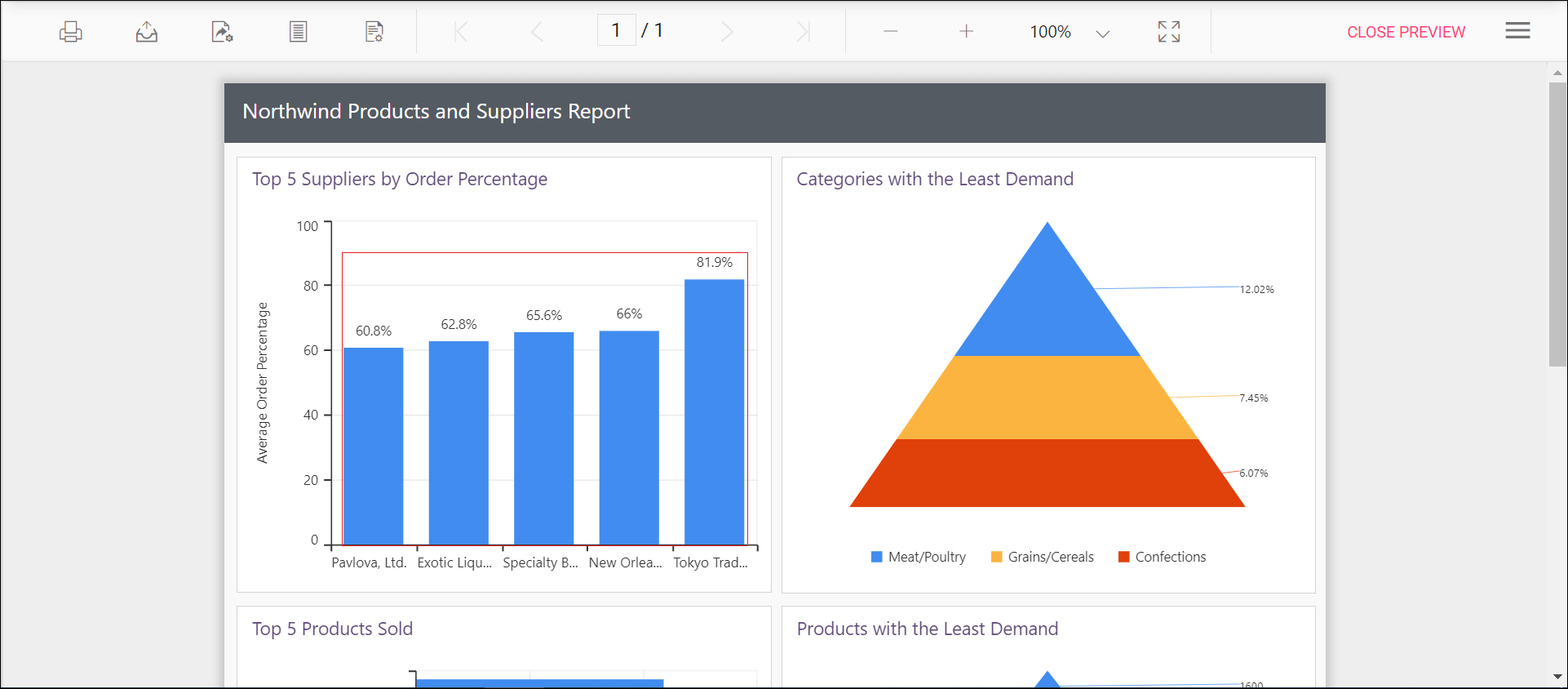
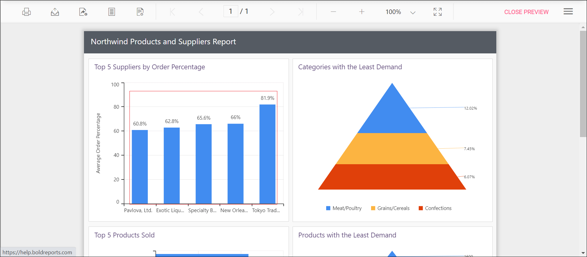
Preview the report and the see the column width in chart report.
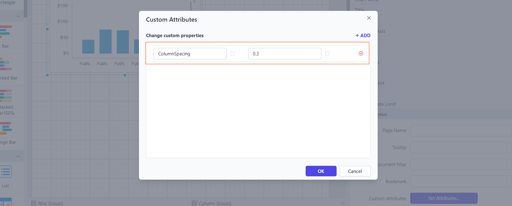
Setting space between the columns of the chart
You can use the ColumnSpacing property to adjust the spacing between columns, and it accepts values ranging from 0 to 1. By default, it is set to 0.
You can set the ColumnSpacing property value, as shown in the below.
Before setting the column spacing, the column chart will be displayed as below.
Preview the report and observe the space between the columns in the chart.

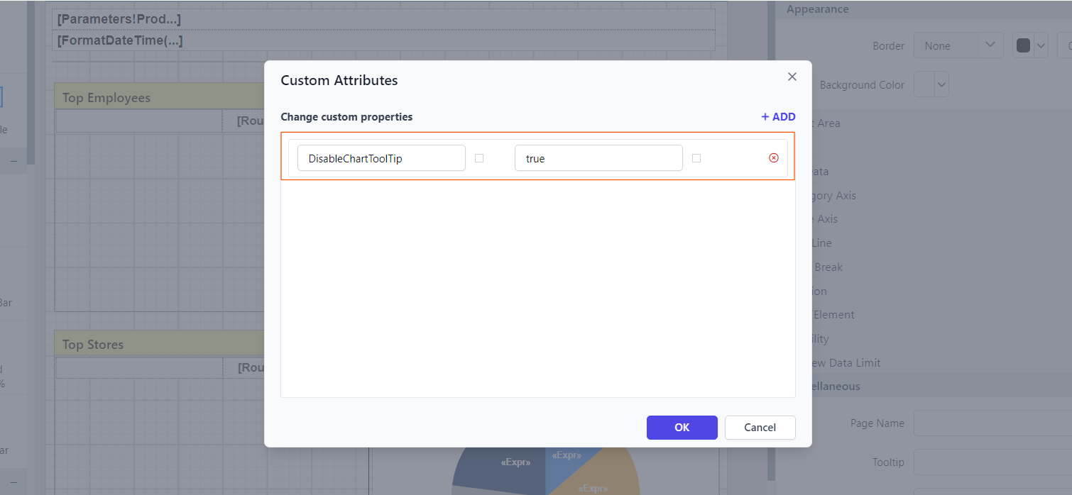
Customizing Chart Tooltip display in preview
The DisableChartToolTip property disables both the default chart tooltip and any custom tooltip set in the preview.
You can set the property value as shown below:
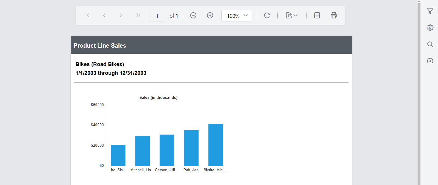
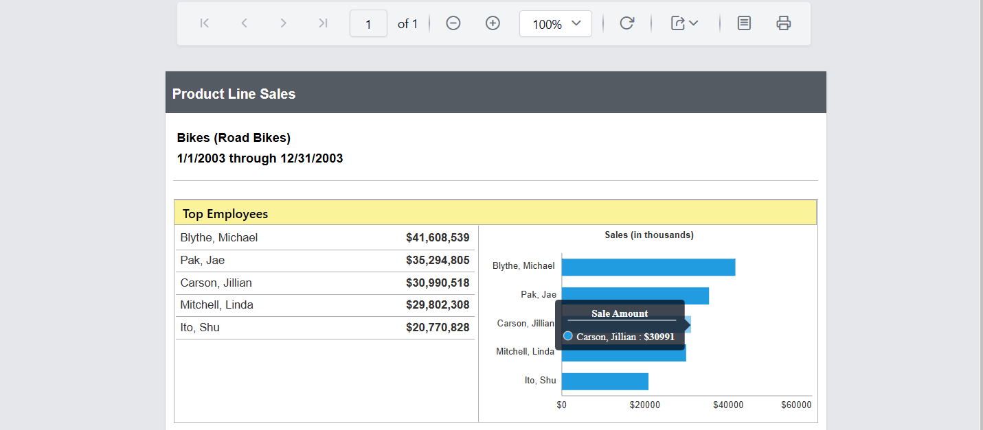
Before disabling the chart tooltip, it will be displayed when hovering over the chart series, as shown below.
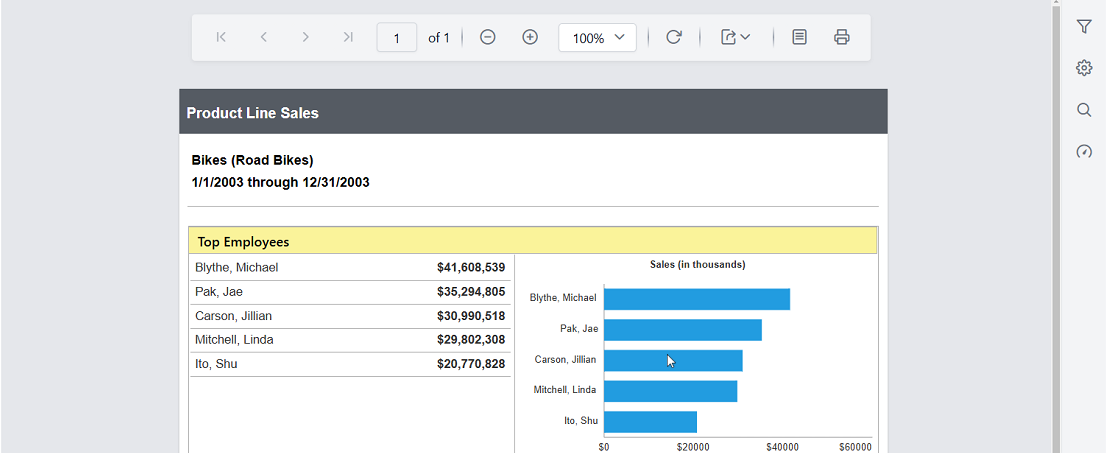
Preview the report to see that the tooltip is not visible even when hovering over the chart series.
- Disable legend item interaction
- Set maximum size for chart legend
- Set range padding for X-axis and Y-axis
- Control edge label placement in chart axis
- Change the drawing style of a chart column or bar series
- Change width of the column type series in chart
- Setting space between the columns of the chart
- Customizing Chart Tooltip display in preview