Design map using marker color range rule
The following steps guides you to design a map using marker color range rule and equal distribution to display the sales done by the sales person of USA states.
Create data
In this designing section, the following dataset query is used for dataset creation.
SELECT
  p.FirstName,
  p.LastName,
  p.City,
  RTRIM(sp.StateProvinceCode) AS StateCode,
  p.SalesLastYear
FROM
  Sales.vSalesPerson p
  INNER JOIN Person.BusinessEntityAddress ea
    ON p.BusinessEntityID = ea.BusinessEntityID
  INNER JOIN Person.Address a
    ON ea.AddressID = a.AddressID
  INNER JOIN Person.StateProvince sp
    ON a.StateProvinceID = sp.StateProvinceID
WHERE
CountryRegionName = 'United States'
Refer Create Data section and create dataset using the above query.
AdventuresWorks2012database is used here.
Add map to the report design
The Map report item is listed under Data Regions category in the item panel.
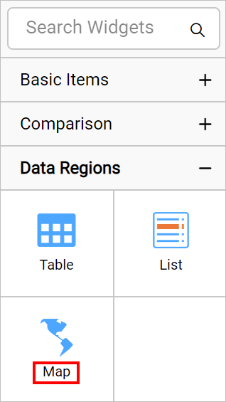
To add a Map report item to the report, drag the map from the item panel into design area.
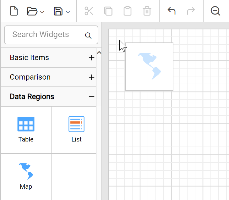
Now, the map item will be rendered in the design area and the map properties will be listed in properties panel.
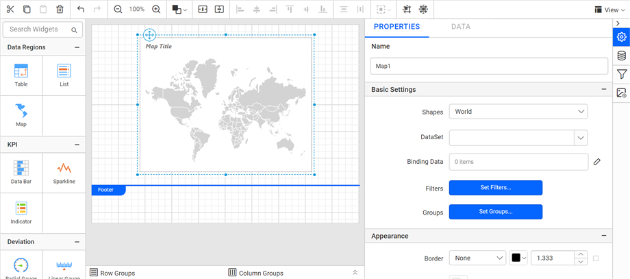
By default map report item renders with world map shapes.
Bind analytical and shape data
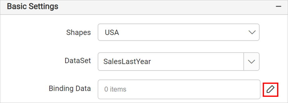
In the Properties panel, under the Basic Settings category, set the USA in Shapes property and choose the data set in the DataSet property.
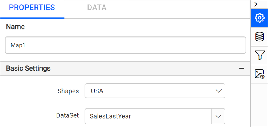
Then click on the edit icon for the Binding Data property under Basic Settings.
Refer Binding Data section and match analytical and shape data. Choose iso_3166_2 in the Field Name drop-down and choose the =Fields!StateCode.Value expression in Binding Expression.
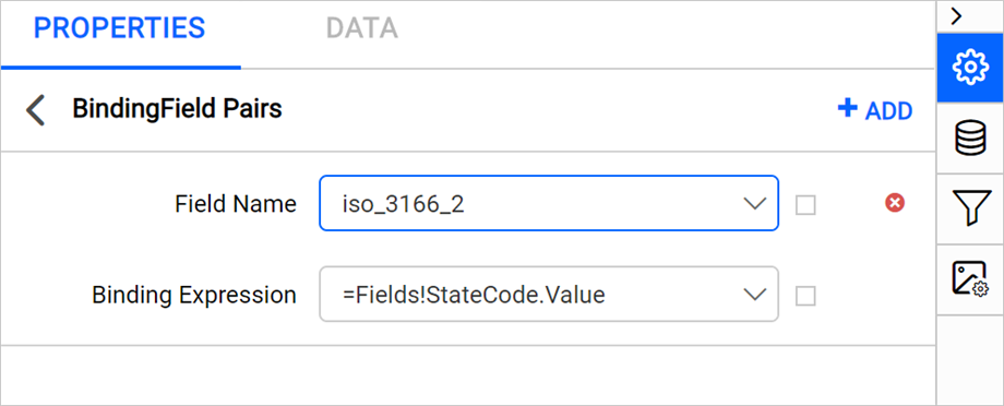
Click on the Update.
Customize map appearance
Let’s customize the map title, color settings, and other properties.
Appearance
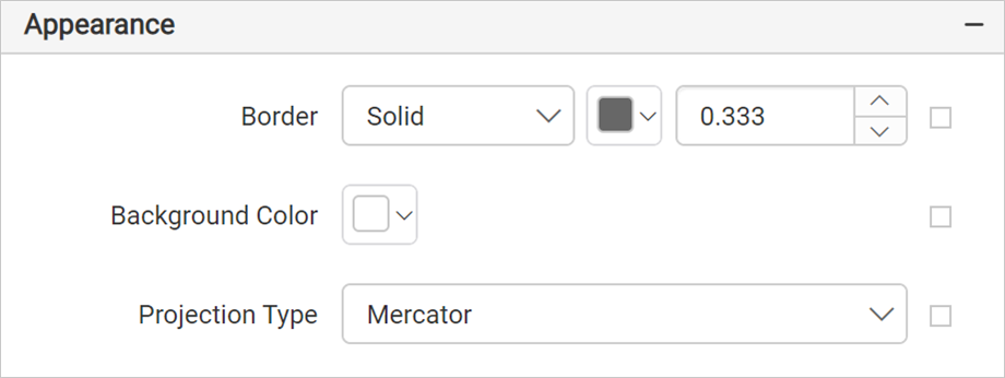
Under the Appearance category, set the border width and color properties as required.
Title
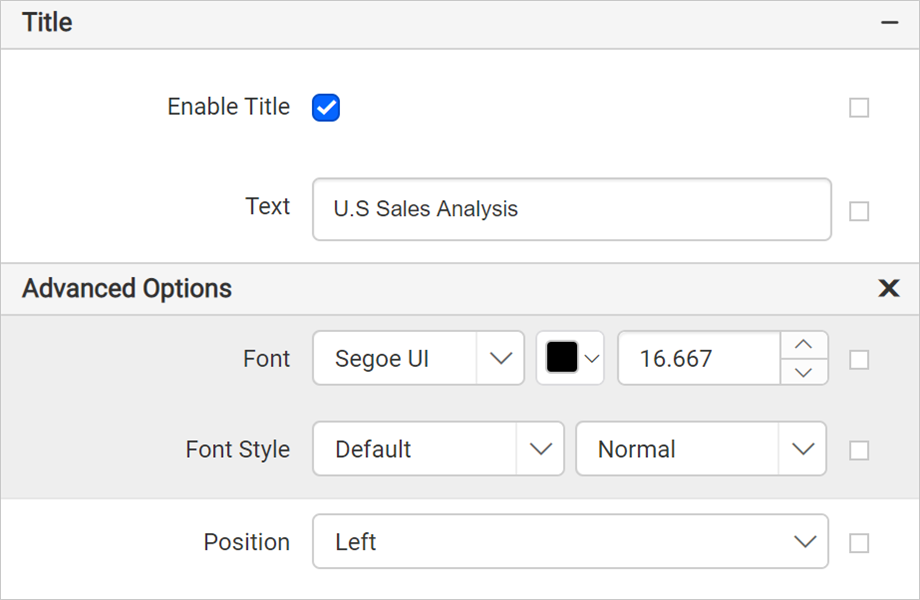
Under the Title category, set the title text, position, and font properties for the map title. First, enable the Enable Title check box. Then, add the title and position.
Shape settings
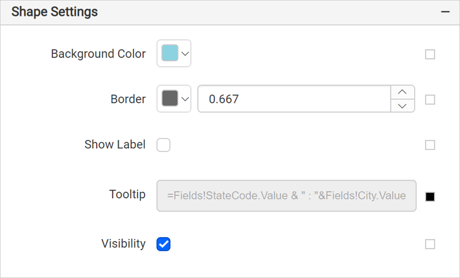
Under the Shape Settings, set the background color as #8bd3e1, border color as #676767, border width as 0.667px, and tooltip as =Fields!StateCode.Value & " : "&Fields!City.Value.
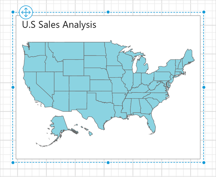
The map design will look like below,
Define marker color rule
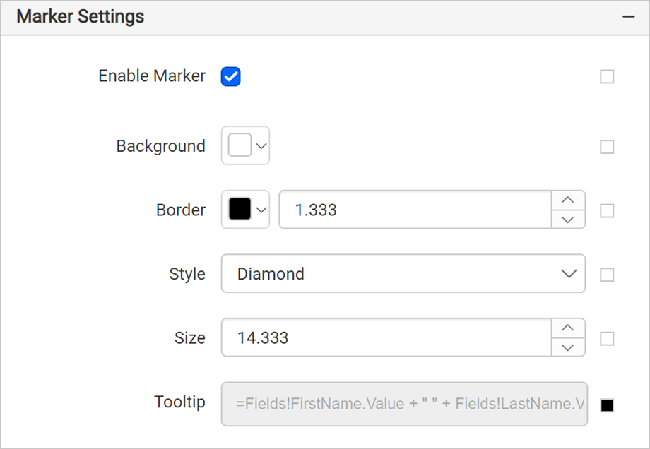
Under Marker Settings category enable the Enable Marker checkbox. Set the background color as #ffffff, border color as #000000 and width as 1.333px,marker style as Diamond, marker size as 14.333 and tooltip as =Fields!FirstName.Value + " " + Fields!LastName.Value + " - " + FormatCurrency(Fields!SalesLastYear.Value) expression.
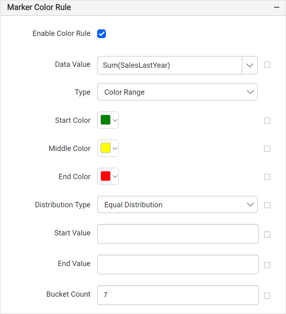
Under Marker color rule category, enable the Enable Color Rule check box.
- Choose the Sum(SalesLastYear) in Data Value.
- Choose
TypeasColor Range. - Set the start, middle, and end colors as #008000, #ffff00, #ff0000, respectively. The start color applies to the low end of the data range and the end color applies to data at the high end of the data range.
- Choose Equal distribution for Distribution type.
- Set Bucket Count as seven.
The marker color rule configuration should be as below,
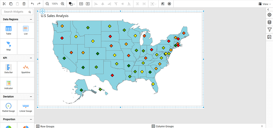
Now, the marker are applied to the map shapes but with sample data.
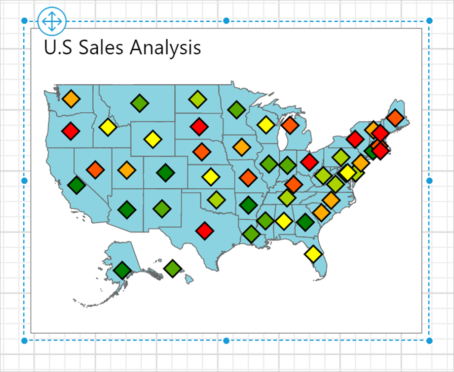
To see the actual data on map surface, preview the report. Before that, resize the width and height of the map, so as to view the information clearly in preview.
Preview report
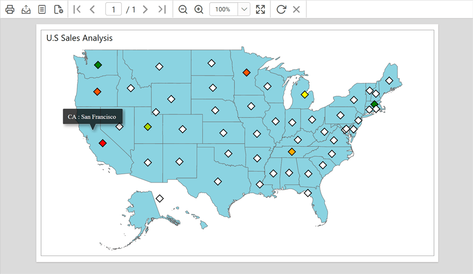
You can preview the report at design time using the built-in Bold Reports® Viewer to ensure the report design is as expected. In the following snapshot, we can observe that the background color for markers is distributed based on the sales amount done by sales person in respective state. Hover on each shape to see the details like state code and the city where sales happened.
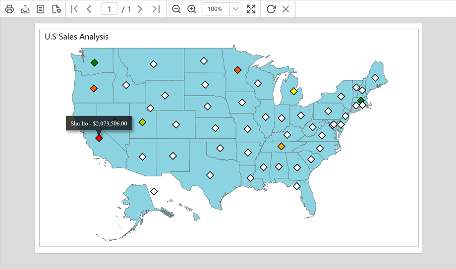
Hover on each marker filled with colors to see the details like sales person name and sales amount.
Download the above report design from link.