Chart types
The supported chart types are listed in the itempanel under the following categories:
- Comparison
- Proportion
- Distribution
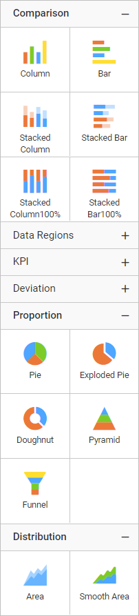
Choose an appropriate chart type, based on the type of data you are presenting.
Comparison
Column
| Types | Description |
|---|---|
| Column | Column Chart allows you to compare values for a set of unordered items across categories through vertical bars ordered horizontally. |
| StackedColumn | Stacked Column Chart allows you to compare multiple measures through bars stacked one after the other vertically. |
| StackedColumnPercent | 100% Stacked Column Chart allows you to compare multiple measures through bars stacked one after the other vertically. |
| RangeColumn | Range Column Chart displays information as a range of data by plotting two Y-values (low and high) per data point. |
Bar
| Types | Description |
|---|---|
| Bar | Bar Chart allows you to compare values for a set of unordered items across categories through horizontal bars ordered vertically. |
| StackedBar | Stacked Bar Chart allows you to compare multiple measures through bars stacked one after the other horizontally. |
| StackedBarPercent | 100% Stacked Bar Chart allows you to compare multiple measures through bars stacked one after the other horizontally. |
| RangeBar | Range Bar Chart allows you to describe start and end value in a bar chart. |
Proportion
Pie
| Types | Description |
|---|---|
| Pie | Pie Chart allows you to showcase proportionality of each item to the total in the form of pie-slices. |
| ExplodedPie | ExplodedPie Chart allows you to separate one or more sectors from the rest of the disk. This effect is used to either highlight a sector, or to highlight smaller segments of the chart with small proportions. |
| Doughnut | Doughnut Chart allows you to showcase proportionality of each item to the total in the form of doughnut-slices. To plot a doughnut chart, a minimum requirement of 1 value and 1 column is needed. |
Shape
| Types | Description |
|---|---|
| Pyramid | Pyramid Chart allows you to make proportional comparison between values showcased as progressively increasing manner. To plot a pyramid chart, a minimum requirement of 1 value and 1 column is needed. |
| Funnel | Funnel Chart shows values across multiple stages in a process by highlighting different stages with different colors. It allows you make proportional comparison among values showcased in progressively decreasing manner. |
Distribution
Area
| Types | Description |
|---|---|
| Area | Area Chart allows you to compare values for a set of unordered items across categories through filled curves ordered vertically. |
| SmoothArea | An area chart where the data points are connected by a smooth line instead of a regular line. Compares the distribution of values over a time period connected using the smooth lines. |
| StackedArea | Stacked Area Chart allows you to compare multiple measures through filled curves stacked one after the other vertically. |
| StackedAreaPercent | 100% Stacked Area Chart allows you to compare multiple measures through filled curves stacked one after the other vertically. |
| RangeArea | Range Area Chart displays information as a range of data by plotting two Y-values (low and high) per data point. |
| SmoothRangeAreaChart | Smooth Range Area Chart is a range area chart in which data points are connected by smooth curves. It displays information as a range of data by plotting two Y-values (low and high) per data point. |
Line
| Types | Description |
|---|---|
| Line | Line Chart allows you to showcase trends for analysis over a time period with data points connecting using straight lines. |
| SmoothLine | SmoothLine Chart allows you to showcase trends for analysis over a time period with data points connected using splines. |
| SteppedLine | SteppedLine chart allows you to compare the distribution of values over a time period connected using the stepped lines. |
| LineWithMarkers | LineWithMarkers chart allows you to compare changes over the same period of time for more than one group. |
| SmoothLineWithMarkers | Plotted values are represented with a marker point and those points are connected using a smooth line. |
Scatter
| Types | Description |
|---|---|
| Bubble | Bubble Chart allows you to compare large number of data points represented as bubbles and showcase the difference through its size. |
| Scatter | Scatter Chart allows you to compare large number of data points represented as dots irrespective of time. |
Polar
| Types | Description |
|---|---|
| Radar | Radar chart allows you to display multivariate data in the form of a two-dimensional chart of three or more quantitative variables represented on axes starting from the same point. |
| Polar | Displays a series as a set of points that are grouped by category on a 360-degree circle. |