Chart Axis
Charts typically have two axes that are used to measure and categorize data: a vertical (y) primaryYAxis, and a horizontal (x) primaryXAxis. You can customize the axis appearance through the properties provided under the Category Axis and Value Axis category of chart properties. To customize category axis change the properties under the Category Axis property and for value axis change the properties under the Value Axis category.
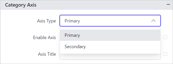
Axis Type
The Axis Type dropdown displays options for both Primary and Secondary axes.
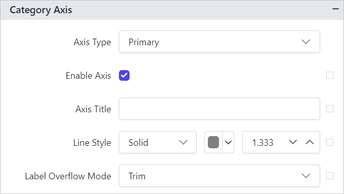
If you choose the Primary option in the Axis Type dropdown, the values designated for the properties below will be applied uniformly to all series marked as primary axes in the chart.
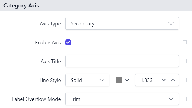
Similarly, if you choose the Secondary option in the Axis Type dropdown, the values designated for the properties below will be applied uniformly to all series marked as secondary axes in the chart.
Note: Axis properties are not applicable for
ProportionandKPIchart types.
The steps outlined above detail the configuration of the category axis, and the process remains consistent for the value axis as well.
Show or hide axis
To show/hide axis in the chart surface, toggle the Enable Axis checkbox in the properties panel.

If you enable the Enable Axis checkbox, the chart axis will be displayed in the chart area.
You can also enable or disable the chart axis based on dynamic values, by using the Expressions. Refer Set Expression and Reset Expression section to open set/reset expression menu in properties panel.
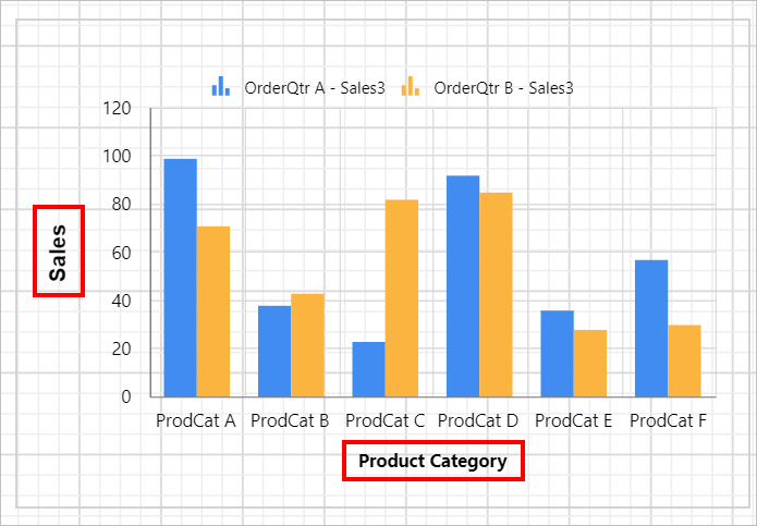
Axis Title
The title property in the axis provides options to customize the text and font of the axis title. You can customize the font family, font style, font weight, alignment and size. Axis does not display the title, by default.
To display title text for axis, provide the text in Axis Title textbox.

Now, the text will be displayed in the respective axis of chart design.
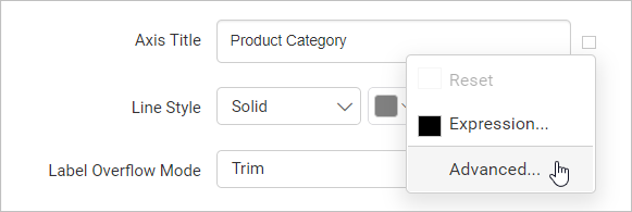
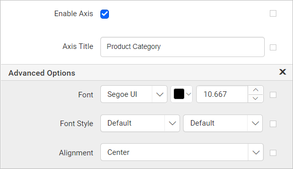
To set font weight, color, style, size and alignment, open the Advanced Menu of axis title property.
Now, the font properties will listed in the Advanced Options menu,
You can also set the chart axis title text based on dynamic values, by using the Expressions. Refer Set Expression and Reset Expression section to open set/reset expression menu in properties panel.
Line Style
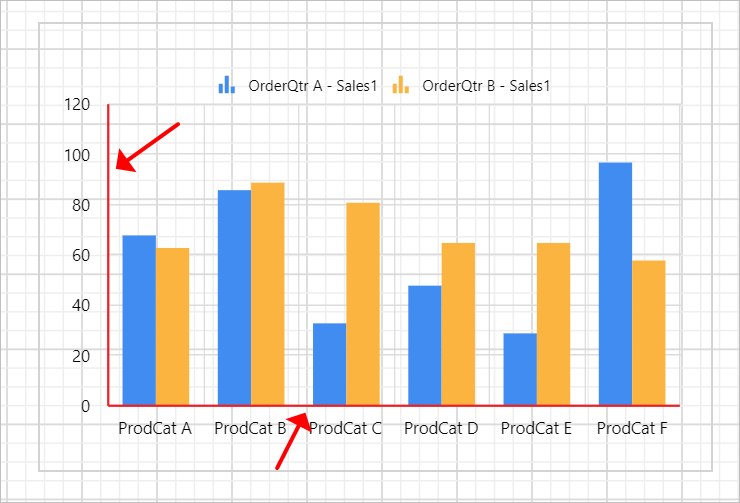
The Line Style property can be used to set the line style, width, and color of the axis line.

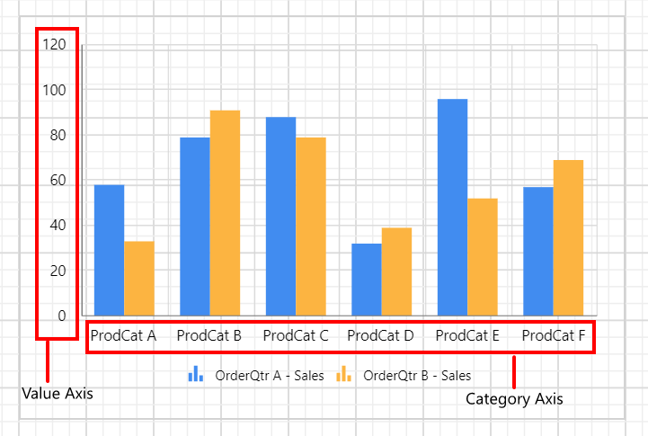
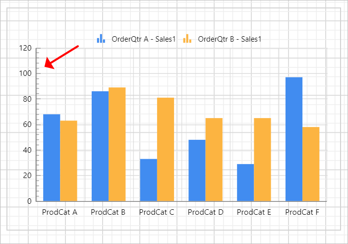
In the below snap, line style, color and width properties are applied to chart axes.
You can also apply the line style, color and width properties based on dynamic values, by using the Expressions. Refer Set Expression and Reset Expression section to open set/reset expression menu in properties panel.
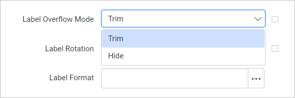
Label Overflow Mode
The Label Overflow Mode property can be used to handle the display mode of the overlapping labels.
Trim
This option trims the end of overlapping label in the axis.
Hide
This option hides the overlapping label in the axis.
You can also apply the label overflow mode based on dynamic values, by using the Expressions. Refer Set Expression and Reset Expression section to open set/reset expression menu in properties panel.
Label Rotation
The Label Rotation property can be used to define the rotation angle for the axis labels to display in the chart design.

Increase or decrease the rotation angle in the label rotation numeric textbox,
You can also set the label rotation property based on dynamic values, by using the Expressions. Refer Set Expression and Reset Expression section to open set/reset expression menu in properties panel.
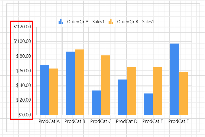
Label Format
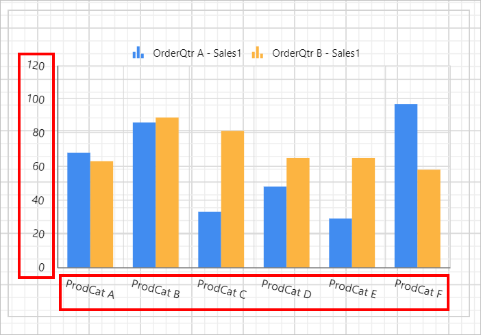
The Label Format property can be used to handle different formatting options like display type, denominations, decimal places, currency culture and negative value display format to the value axis labels.

Refer Format Data section to set different formats to the axis label. Here, the Currency format is applied to the Sales values in Value axis.
You can also set the label format based on dynamic values, by using the Expressions. Refer Set Expression and Reset Expression section to open set/reset expression menu in properties panel.
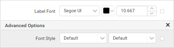
Label Font
The font family, font size, and font color properties can be used to customize the label text.
You can also apply font properties based on dynamic values, by using the Expressions. Refer Set Expressions and Reset Expressions section to open set/reset expression menu in properties panel.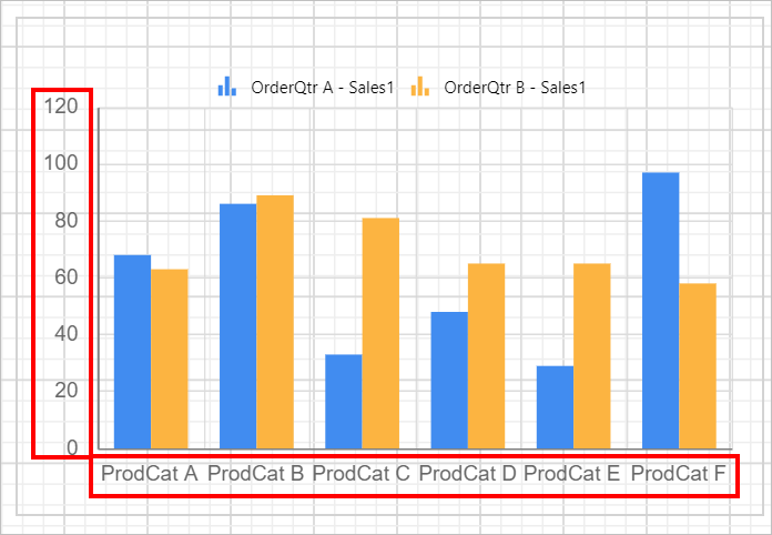
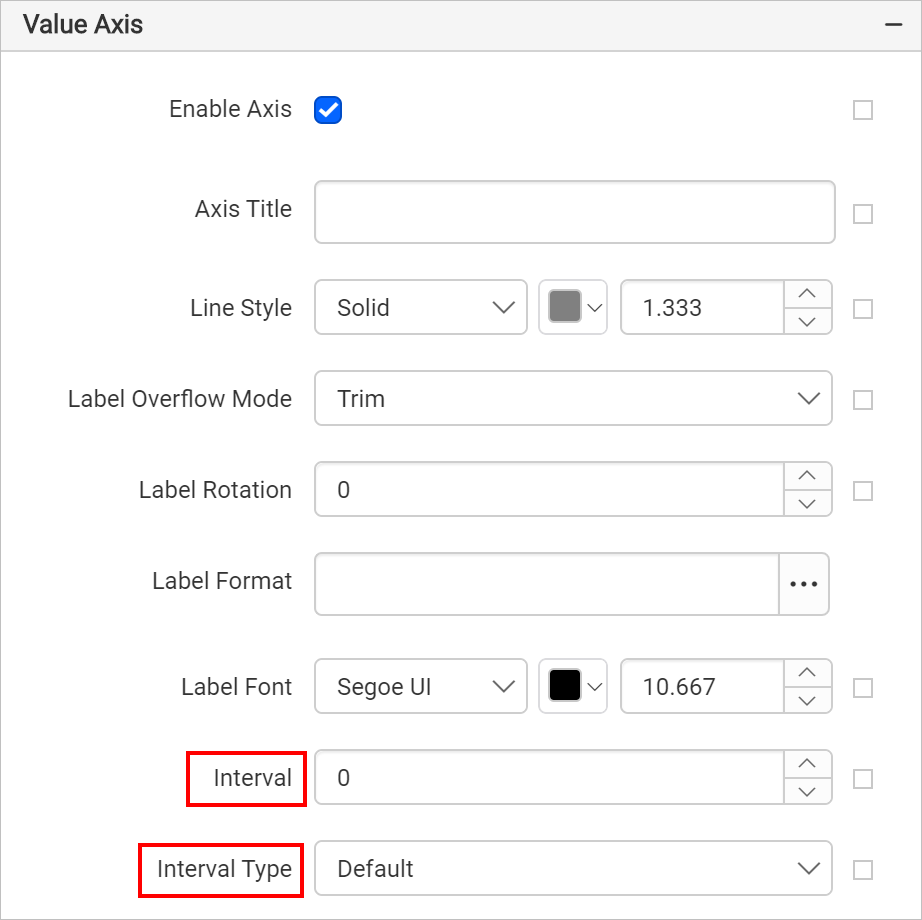
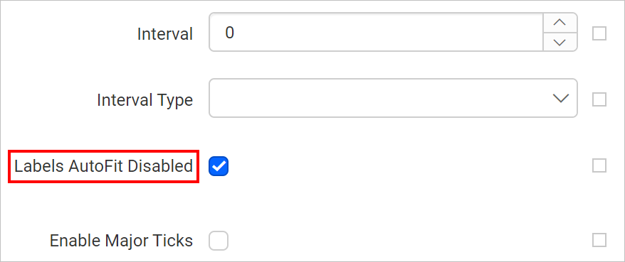
Interval
The Interval and Interval Type properties can be used to to set the interval for category and value axes. The interval property allows you to define the number of intervals you want in the category (x) and value (y) axes and it provides the consistent measurement of the data points in the chart report.
You can also set the interval and interval type properties based on dynamic values, by using the Expressions. Refer Set Expression and Reset Expression section to open set/reset expression menu in properties panel.
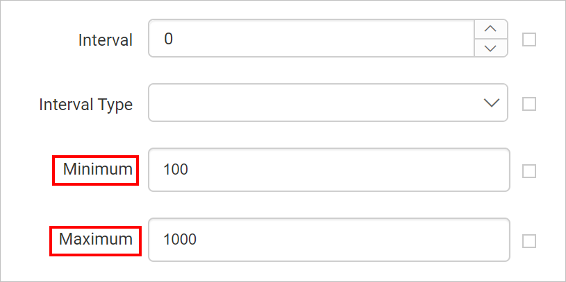
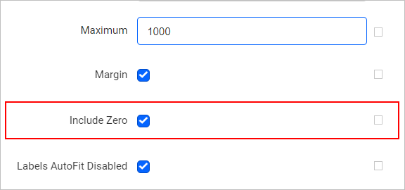
Maximum and Minimum
The Maximum and Minimum properties can be used to define the minimum and maximum values on a chart axis.
You can also set the maximum and minimum properties based on dynamic values, by using the Expressions. Refer Set Expression and Reset Expression section to open set/reset expression menu in properties panel.
Margin
The Margin property specifies the size of the chart’s margins. Margins are calculated inward from the specified chart size; increasing the margin size does not increase the total chart size, but rather shrinks the chart area, if necessary.
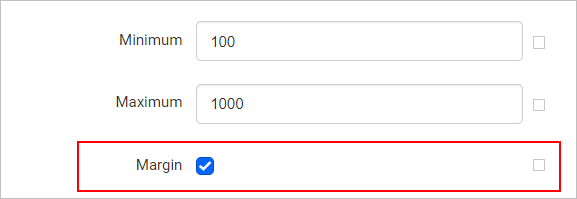
This property does not apply to pie, doughnut, funnel, or pyramid chart types.
You can also set the margin property based on dynamic values, by using the Expressions. Refer Set Expression and Reset Expression section to open set/reset expression menu in properties panel.
Include Zero
When the Include Zero property is enabled, the y-axis configures the range so that zero is included. But, whenever y values are big and differences among data points are hard to judge, then disable the Include Zero property. It makes the y-axis to set a range that provides the differences prominently visible.
You can also set the include zero property based on dynamic values, by using the Expressions. Refer Set Expression and Reset Expression section to open set/reset expression menu in properties panel.
Labels AutoFit Disabled
By default, the Interval Auto setting for the chart axis can cause the labels of X/Y axis to show only every second interval. This property can be used to avoid skipping labels at runtime. Enable or disable this property based on the label rendering behaviour of chart design.
You can also enable or disable the label autofit based on dynamic values, by using the Expressions. Refer Set Expression and Reset Expression section to open set/reset expression menu in properties panel.
Tick
Tick properties can used to set style, width, color, and length of the axis tick, and to set the visibility of the major and minor tick marks.
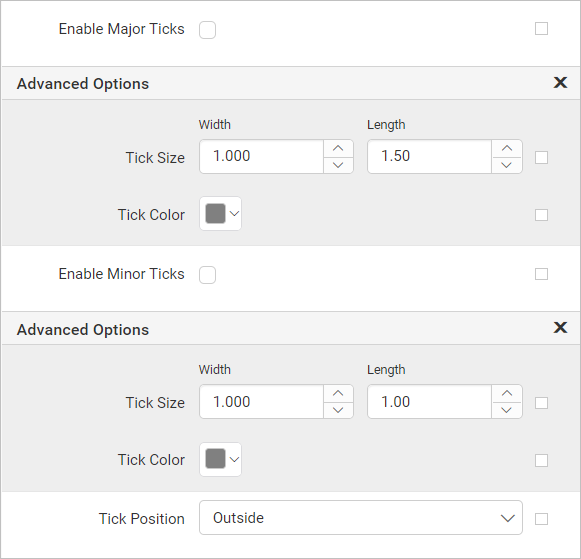
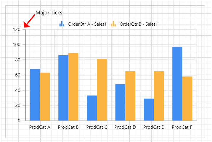
Major Ticks
To enable major ticks in the chart axis, toggle the Enable Major Ticks checkbox.

Now, the major ticks will be enabled in the respective chart axis.
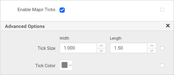
To customize the tick color, width and length, open the Advanced... menu.
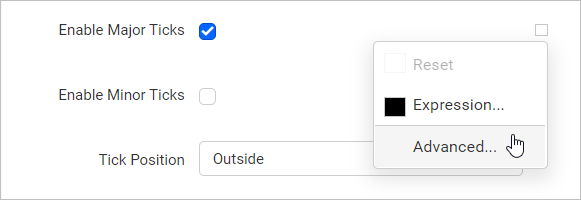
Click on Advanced... option, now the properties will be listed in the Advanced Option pane.
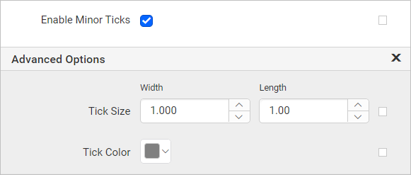
Minor Ticks
To enable minor ticks in the chart axis, toggle the Enable Minor Ticks checkbox.

Now, the minor ticks will be enabled in the respective chart axis.
To customize the tick color, width and length, open the Advanced... menu.
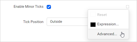
Click on Advanced... option, now the properties will be listed in the Advanced Option pane.
You can also enable or disable ticks based on dynamic values, by using the Expressions. Refer Set Expressions and Reset Expressions section to open set/reset expression menu in properties panel.
Tick Position
Tick position property can be used to position the ticks outside or inside of the chart axis.
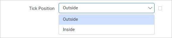
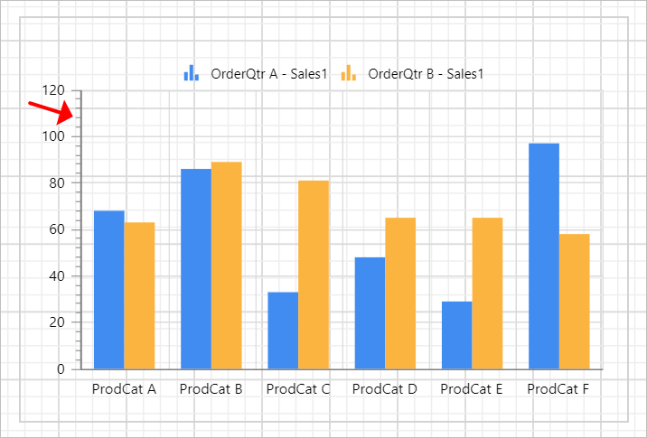
By default, ticks will be positioned outside of the chart axis, in the below snap position is changed as Inside.
You can also apply tick position based on dynamic values, by using the Expressions. Refer Set Expressions and Reset Expressions section to open set/reset expression menu in properties panel.
Axis properties are not applicable for
Proportionchart types.