Parameter custom properties
This topic explains about the list of parameter custom properties that are supported to customize the reports preview in Report Viewer.
Show only distinct values in parameter
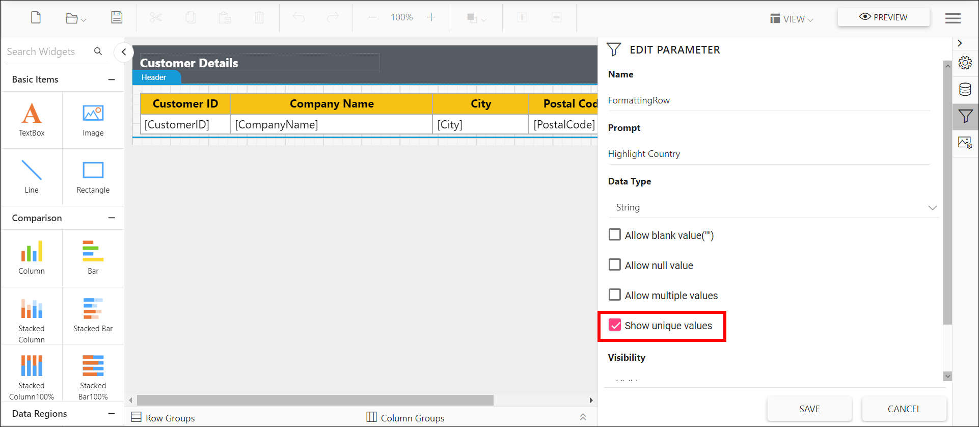
A parameter created with data set query values may contain duplicate values. The Report Viewer supports UniqueValueParameters custom property that helps show only unique values in the parameter drop-down while viewing the report, without creating new a data set. Refer to the below image for property setting option.
You can also provide the parameter names with comma (,) separator to set for multiple parameters.
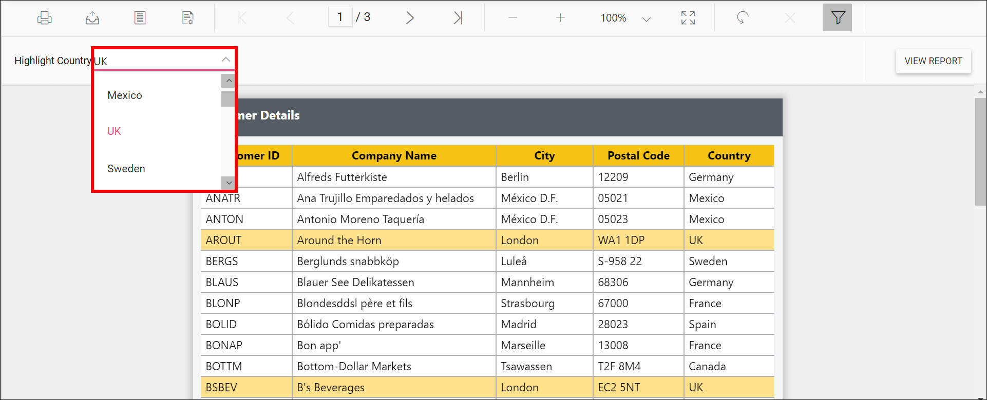
Preview the report and the unique values showed in the parameter drop down.
Change the dropdown parameter pop up height value
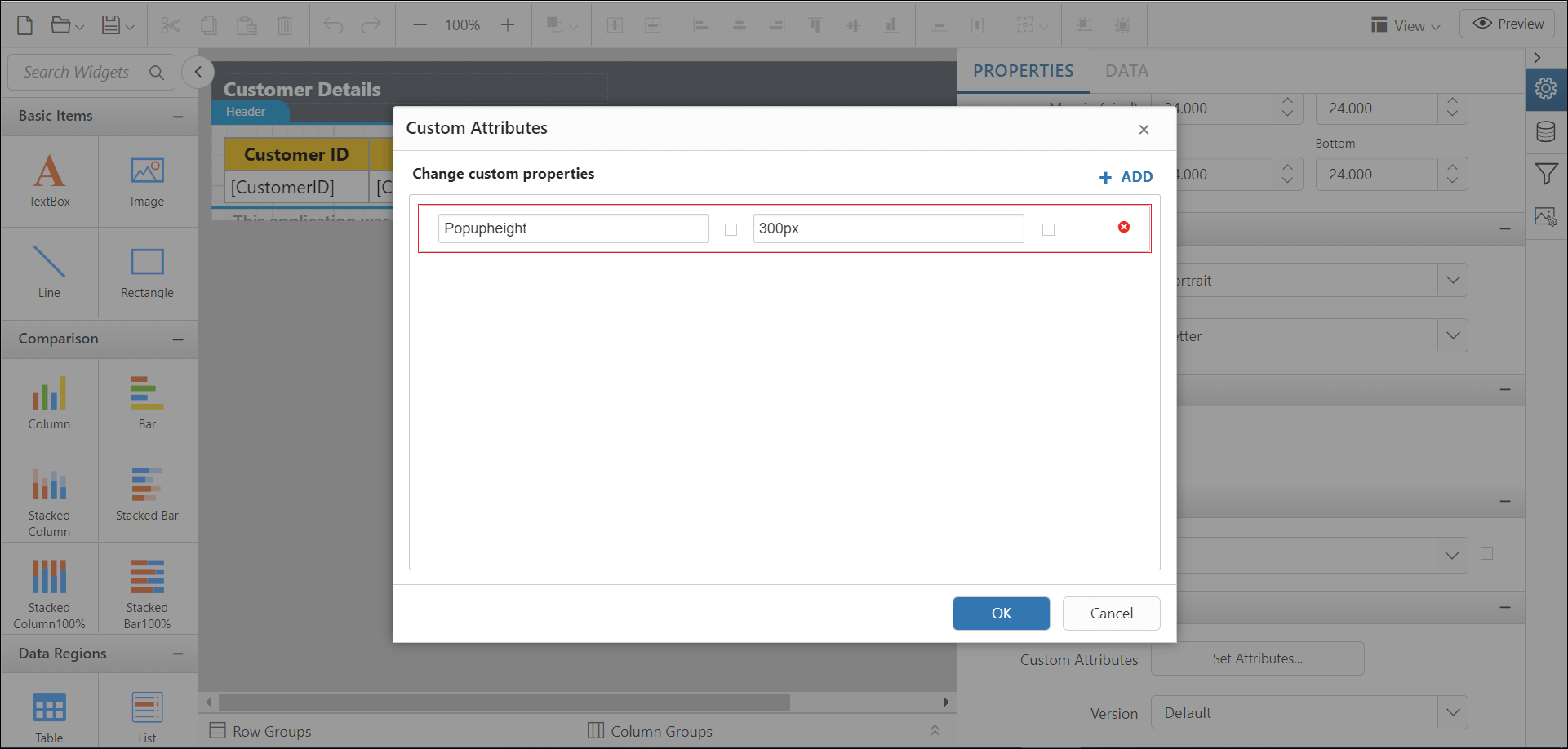
The PopupHeight custom property specifies the height of the parameter combobox popup list in the report. By default, the PopupHeight value is 152px.
You can set the PopupHeight property value, as shown in the below.
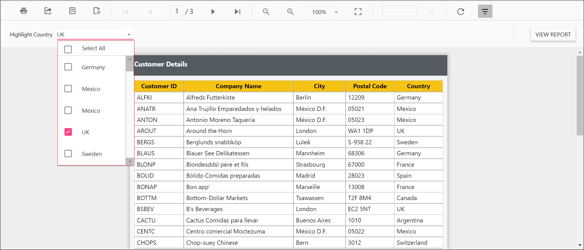
Preview the report and the pop up height showed in the parameter drop down.
Change the dropdown parameter pop up width value
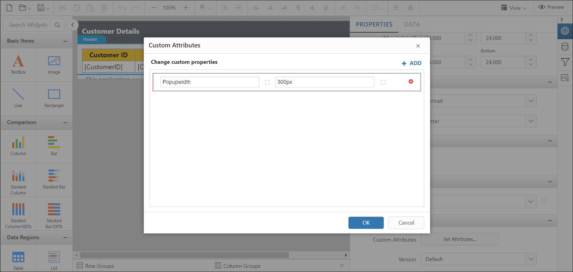
The PopupWidth custom property specifies the width of the parameter combobox popup list in the report. By default, the popup width sets based on the width of the component.
You can set the PopupWidth property value, as shown in the below.
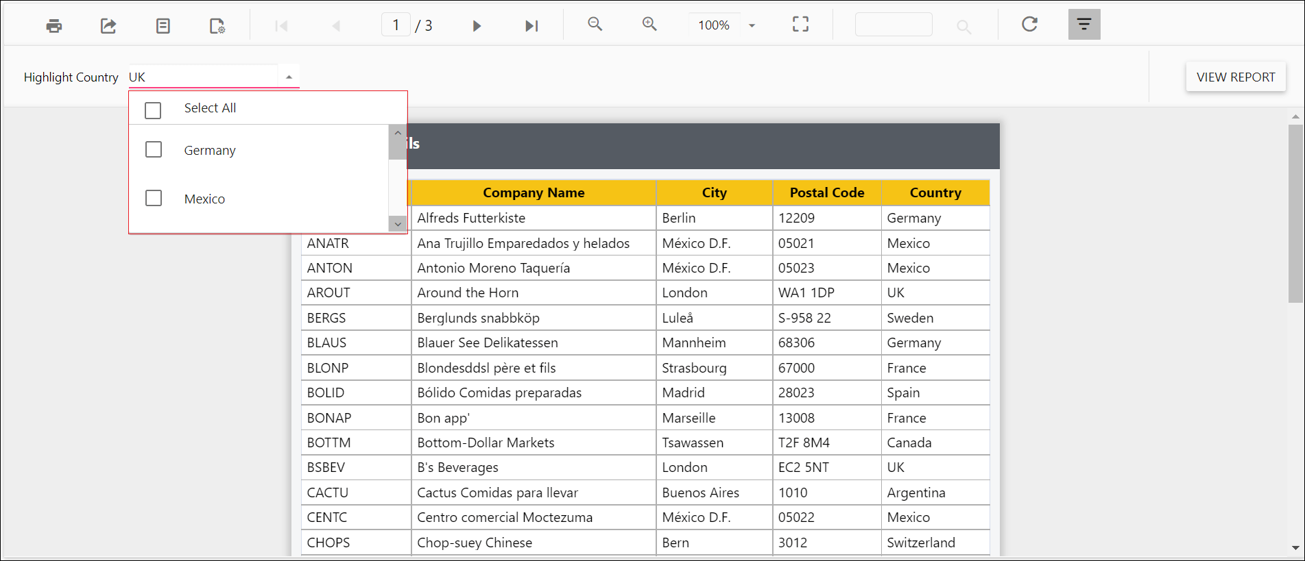
Preview the report and the pop up width showed in the parameter drop down.
Set the minimum date range for the date report parameter
The MinDateTime custom property specifies the minimum date in the datetime parameter item. By default, the MinDateTime value is set as null.
You can set the MinDateTime property value, as shown in the below.

Preview the report and the minimum date showed in the datetime parameter drop down.

Set the maximum date range for date report parameter
The MaxDateTime custom property specifies the maximum date in the datetime parameter item. By default, the MaxDateTime value is set as null.
You can set the MaxDateTime property value, as shown in the below.

Preview the report and the maximum date showed in the datetime parameter drop down.

Hide the report parameter block
The HideParameterBlock custom property is used to hide the parameter block on report initial rendering. The property value should be boolean. By default, the HideParameterBlock value is false.
You can set the HideParameterBlock property value, as shown in the below.

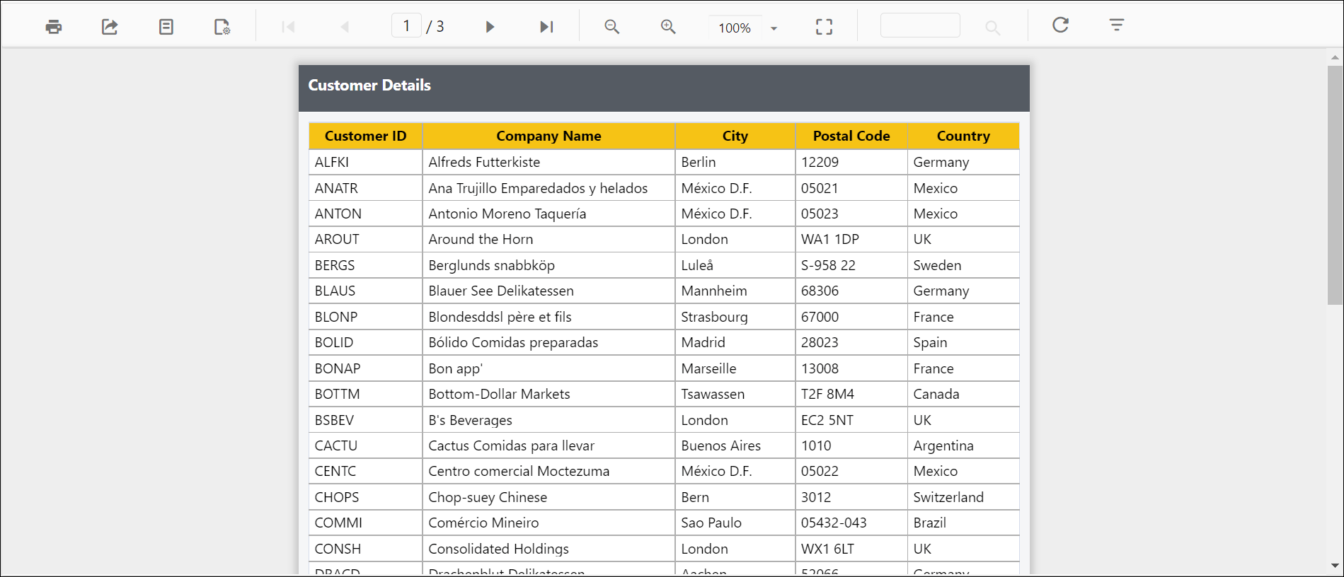
Preview the report and the see the parameter block is hidden.
Set date and time format for parameter
The DateTimeFormat custom property defines the date time format to be displayed in the DateTimePicker popup. By default, the DateTimeFormat value is set as empty.
You can set the DateTimeFormat property value, as shown in the below.

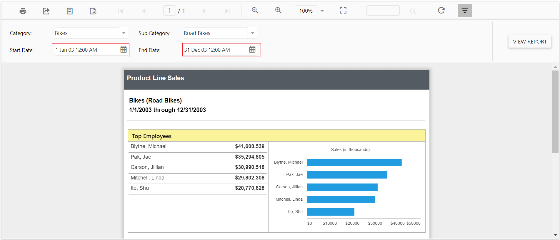
Preview the report and the see date time format in datetime parameter.
Change time display format for parameter
The TimeDisplayFormat custom property defines the time format to be displayed in the time dropdown inside the DateTimePicker popup. You must set the DateTimePickerType custom property as DateTime before setting the TimeDisplayFormat. By default, the TimeDisplayFormat value is set as empty.
You can set the TimeDisplayFormat property value, as shown in the below.
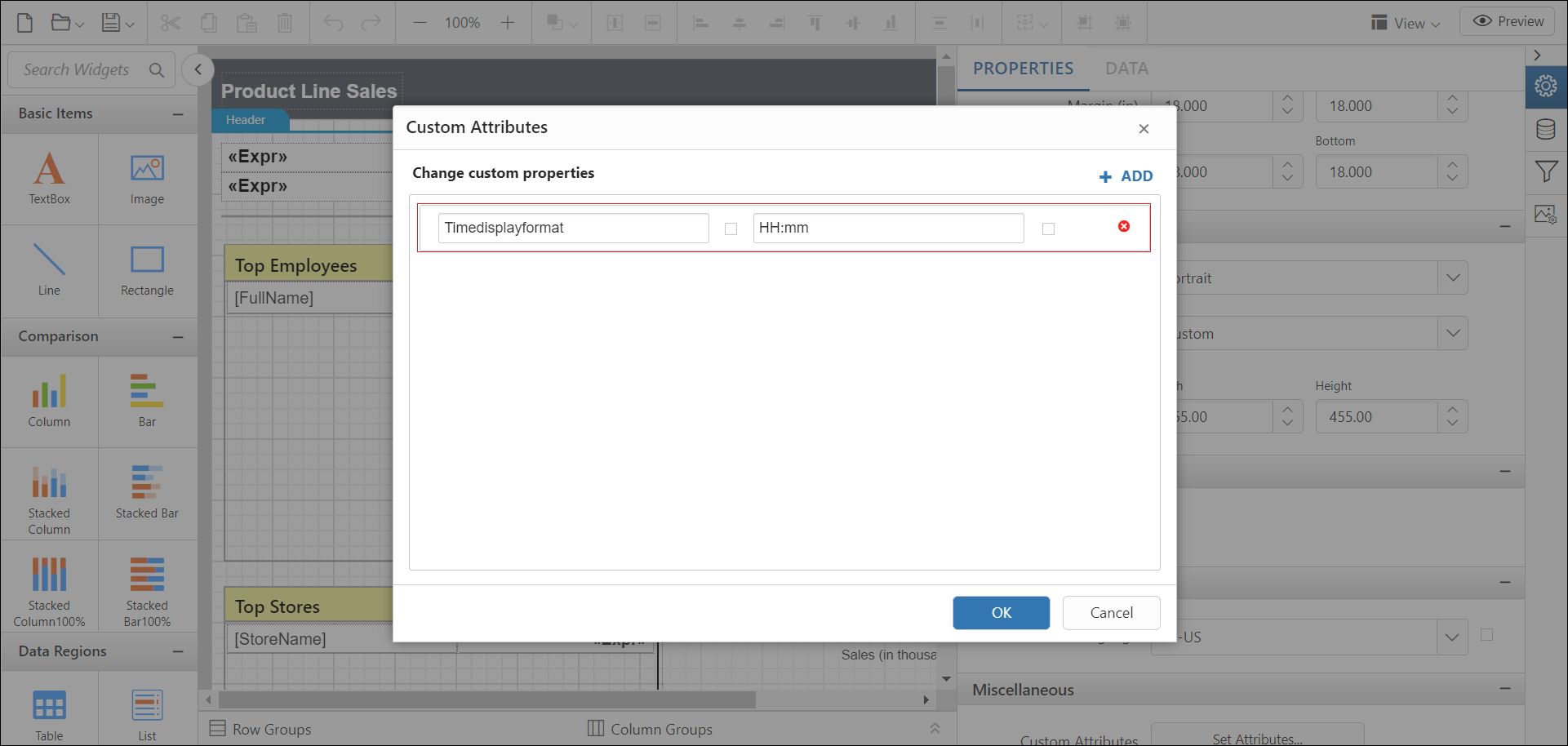
Preview the report and the see time format in datetime parameter.

Set time interval in datetime parameter
The TimeInterval custom property is used to set the interval between the two adjacent time values in DateTimePicker popup. You must set the DateTimePickerType custom property as DateTime before setting the TimeInterval. By default, the TimeInterval value is set as 30.
You can set the TimeInterval property value, as shown in the below.

Preview the report and the see time interval in datetime parameter.

Enable filtering and searching in drop-down report parameter
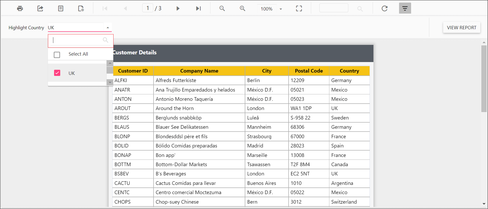
Setting EnableFilterSearch custom property enables search and filtering option in dropdown parameter to easily find the values. The property value should be boolean. By default, the EnableFilterSearch value is false.
You can set the EnableFilterSearch property value, as shown in the below.
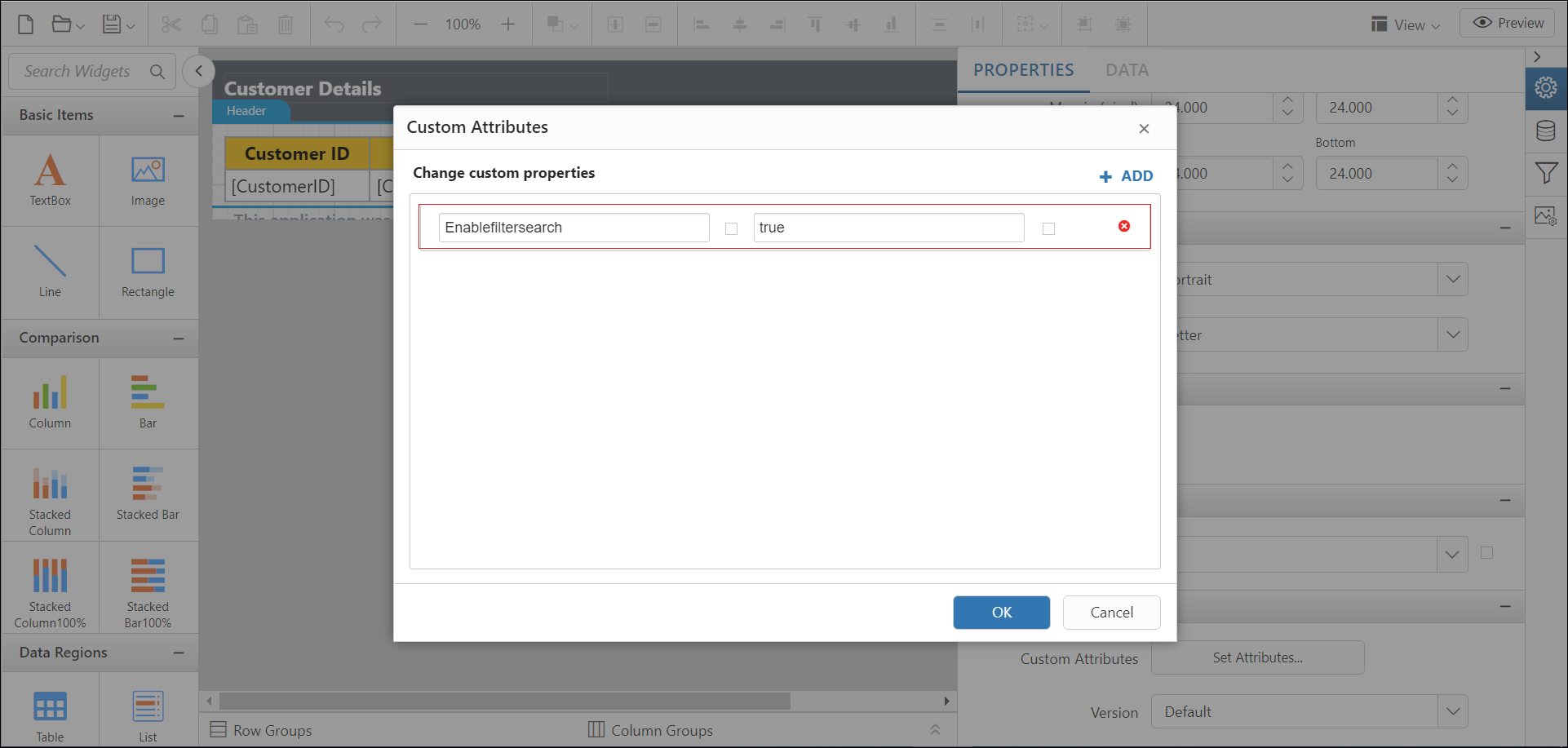
Preview the report and the see search filter in parameter.
Change date report parameter to display date time picker
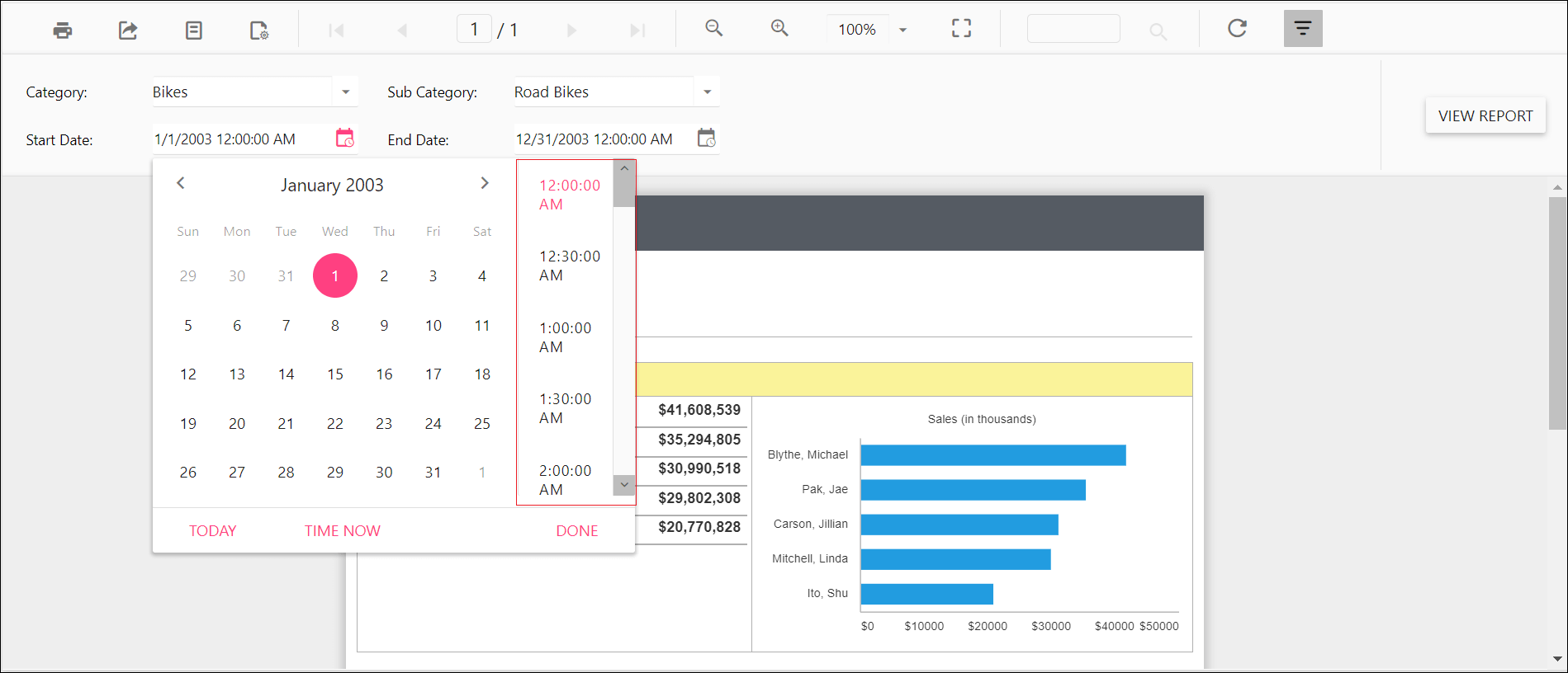
You can set DateTimePickerType custom property value as DateTime to change date parameter item to display DateTimePicker for value selection as shown the below.
You can set the DateTimePickerType property value, as shown in the below.

Before enabling date time picker type, the default value will be displayed as below..
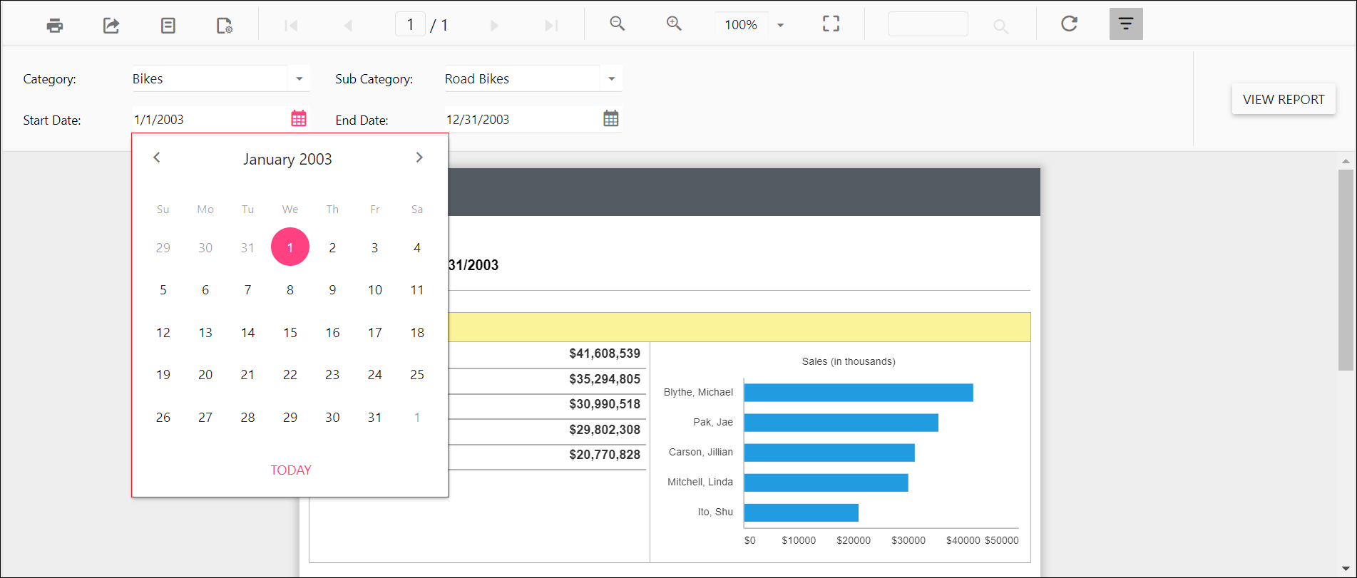
Enable date time picker type and see the time in DateTimePicker as in below output.
Enable popup resize in drop-down report parameter
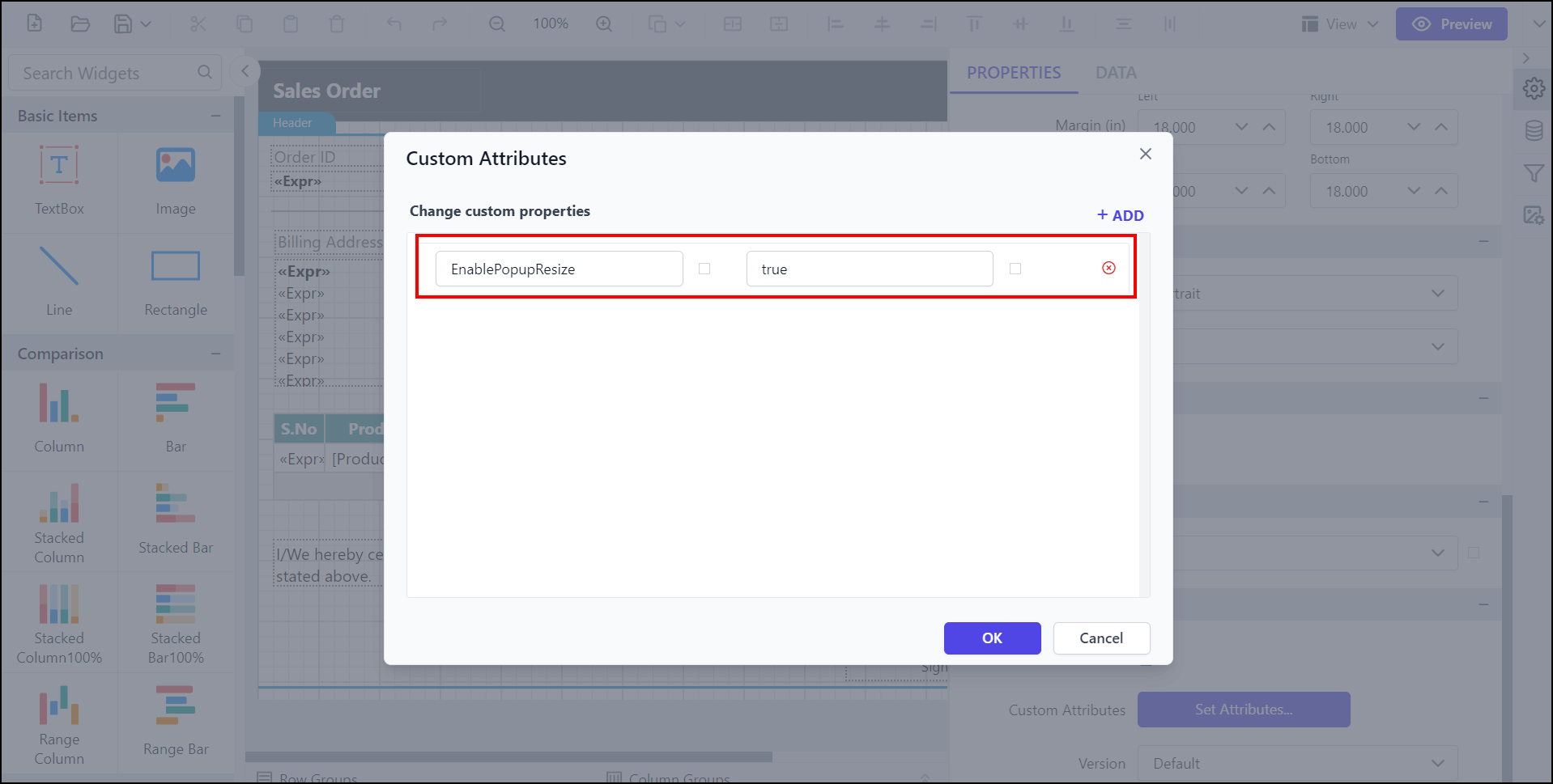
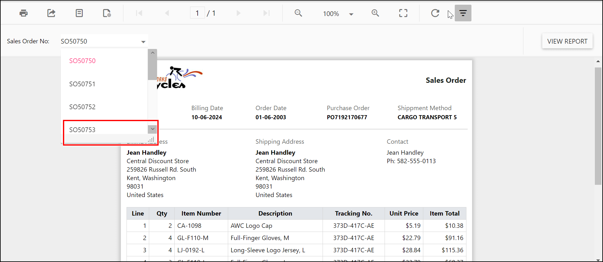
The EnablePopupResize custom property enables the popup resize option in drop-down parameter to adjust the size of the dropdown in EJ1. The property value should be a Boolean. By default, the EnablePopupResize value is false.
You can set the EnablePopupResize property value, as shown below.
Preview the report and see the popup resize option in the parameter.
Customizing parameter block position
The custom property ParameterBlockPosition helps to customize the position of the parameter block in the classic view. It accepts the following values:
Right - Displays the parameter block on the right side of the report.
Left - Displays the parameter block on the left side of the report.
Top - Displays the parameter block at the top of the report.
Bottom - Displays the parameter block at the bottom of the report.
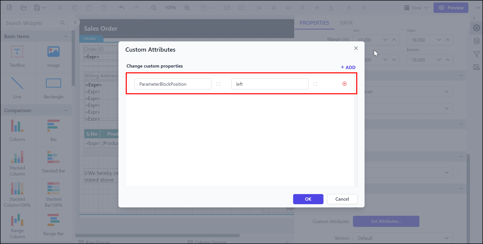
Enable the ParameterBlockPosition and see the parameter position as shown in the output below.
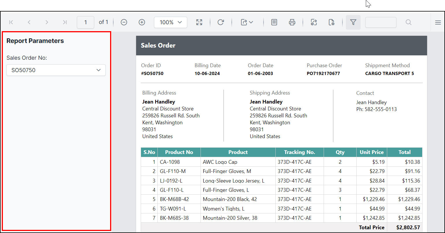
Set specific parameter item width
The ItemWidth custom property specifies the width of the parameter item. By default, the item width value is set as 185px. You can increase or decrease the width of the parameter item as needed.
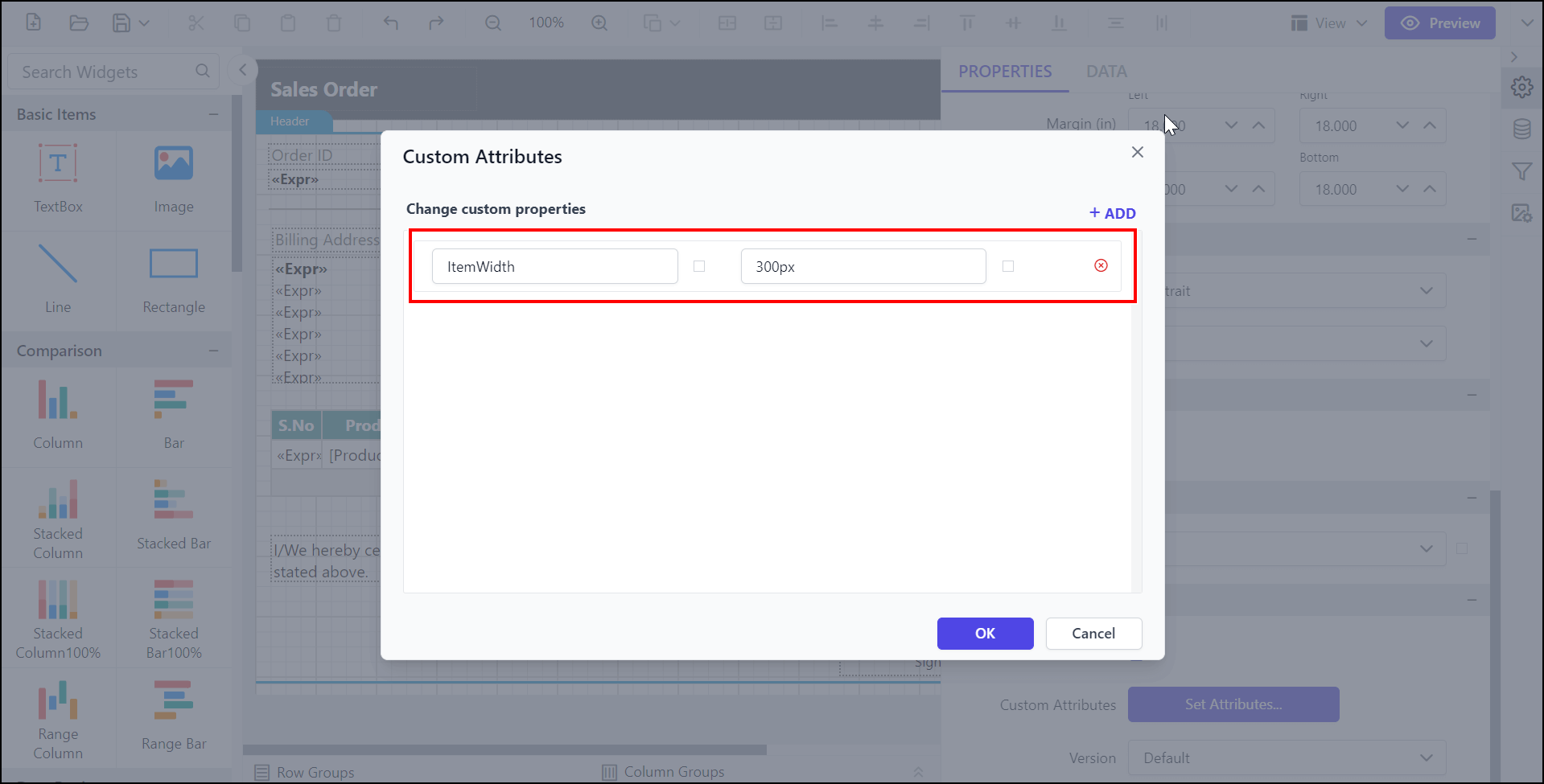
Preview the report and see the width of the parameter.
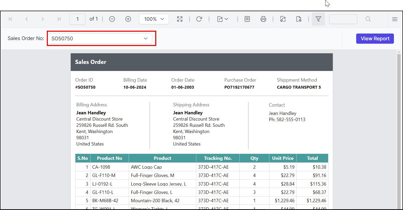
Change the first day of the week in the Calendar
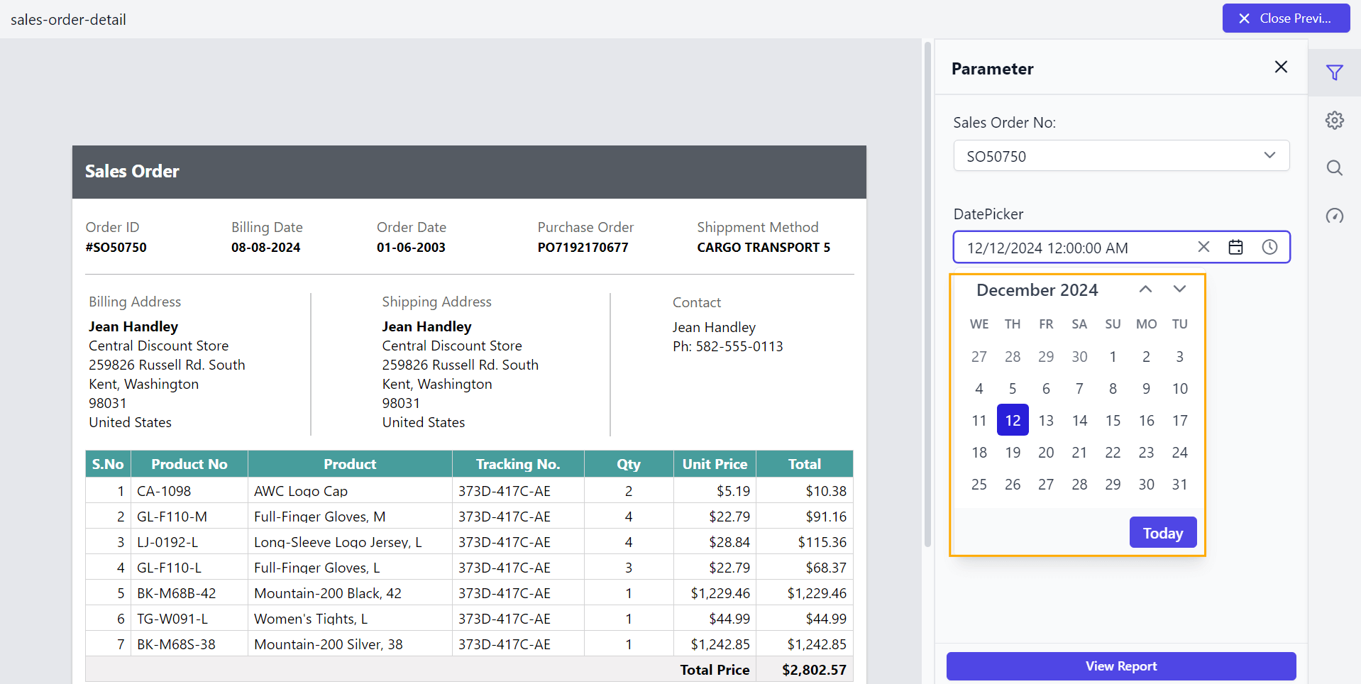
The Calendar allows you to change the first day of the week using the WeekStartDay property. Generally, the days of the week are numbered from 0 (Sunday) to 6 (Saturday).
By default, the first day of the week is determined by the culture settings.
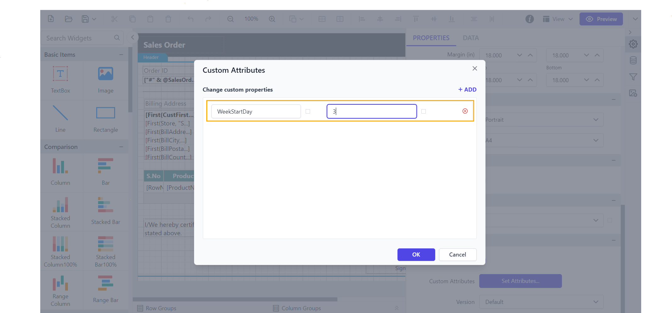
Enable the WeekStartDay property to set your preferred start day, and see the calendar updated as shown below.
Set the mandatory parameter
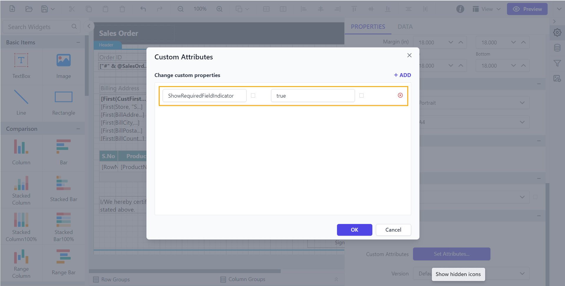
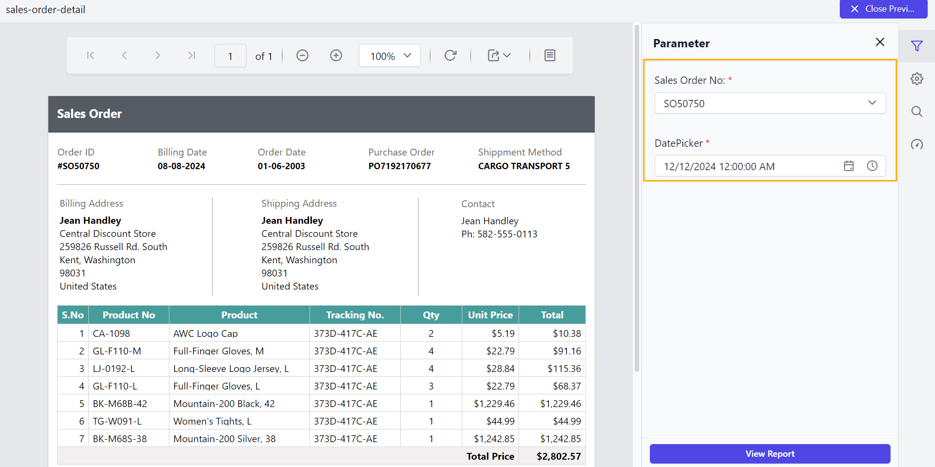
The ShowRequiredFieldIndicator custom property is used to indicate a mandatory parameter that must have a non-blank value to be valid. The property’s value should be Boolean. By default, the ShowRequiredFieldIndicator value is false.
You can set the ShowRequiredFieldIndicator property value, as shown below.
Preview the report and see the required field in parameter.
Enable scroller for parameter block
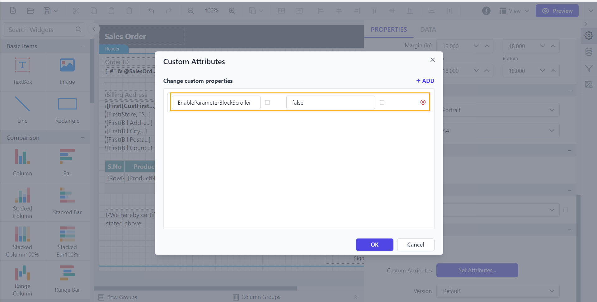
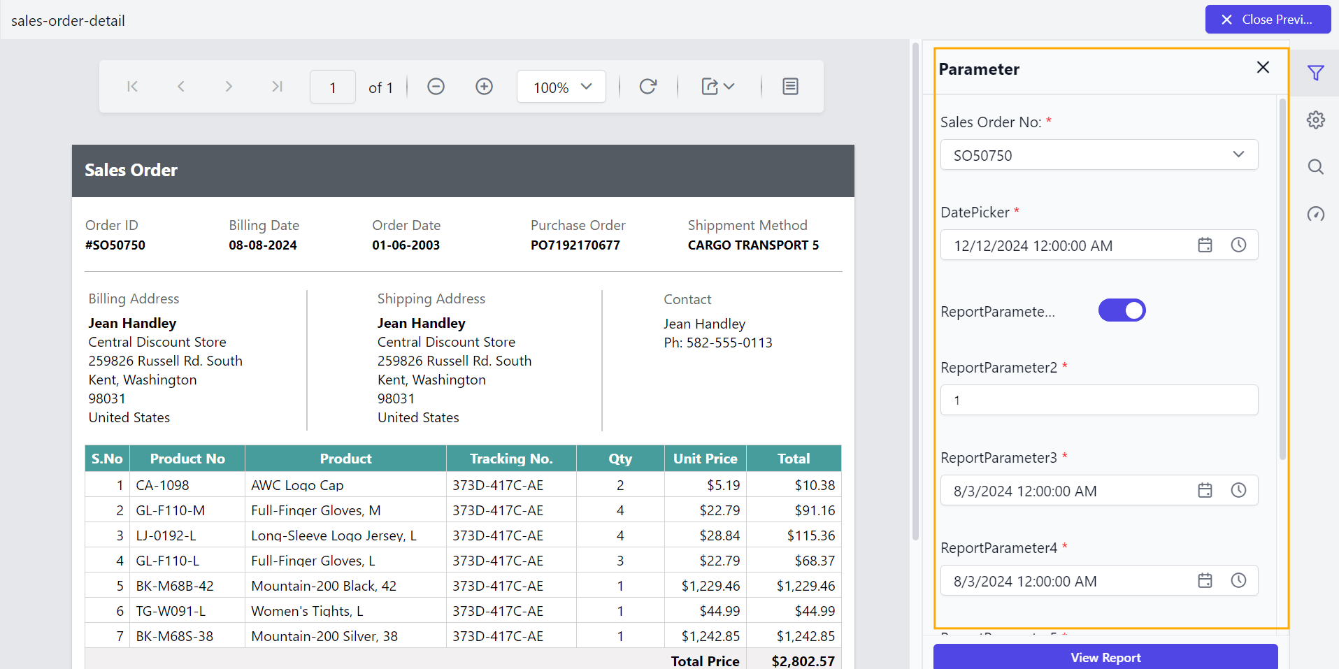
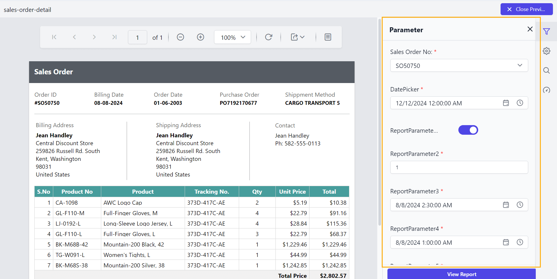
The EnableParameterBlockScroller custom property allows you to enable or disable the scroller for the parameter block. The property’s value should be Boolean. By default, the EnableParameterBlockScroller value is true.
You can set the EnableParameterBlockScroller property value, as shown below.
Before disabling the parameter scroller, the default value will be displayed as shown below.
Disable the parameter scroller and see the output as shown below.
Date start view for date report parameter
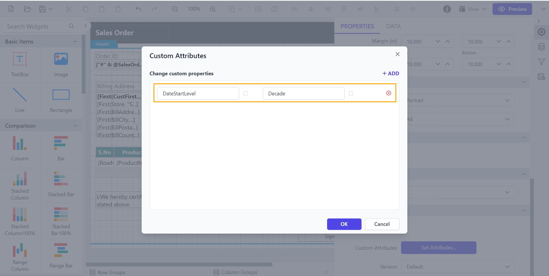
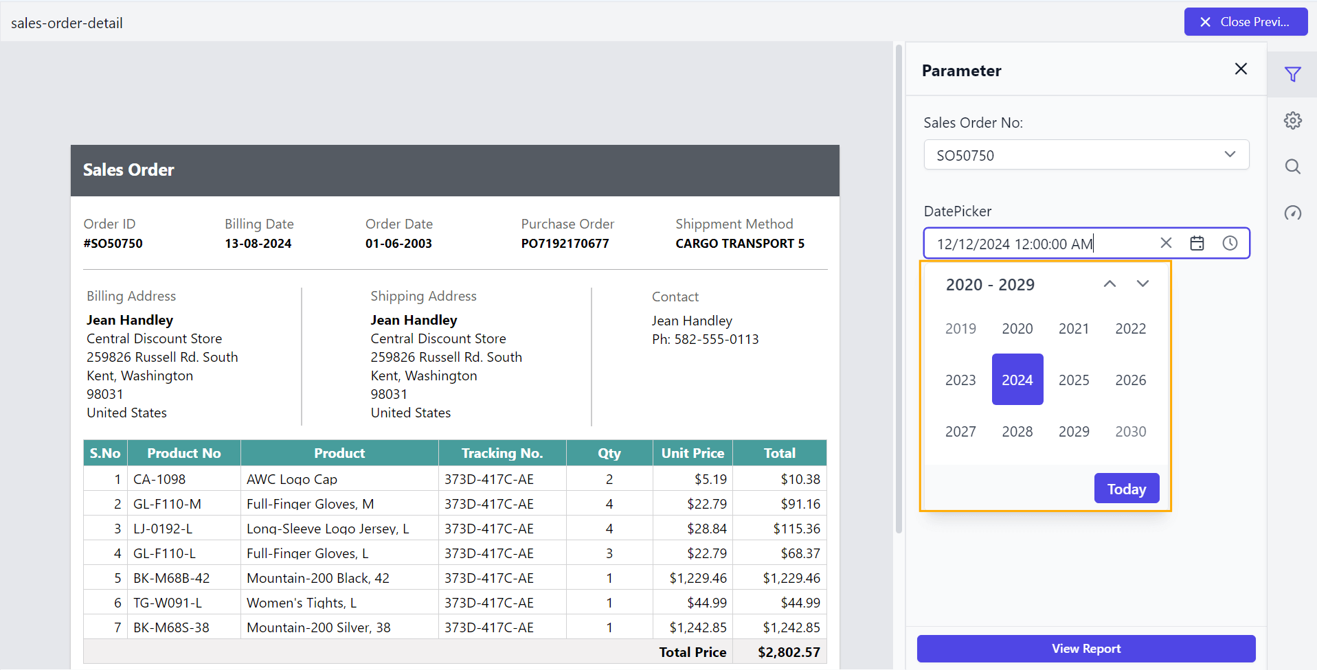
The DateStartLevel custom property specifies the initial view of the datetime parameter item. By default, the DateStartLevel value is set as Month.
Year - Displays the months in a year
Decade - Displays the years in a decade
You can set the DateStartLevel property value as shown below.
By default, the DateStartLevel is set as Month as shown below.
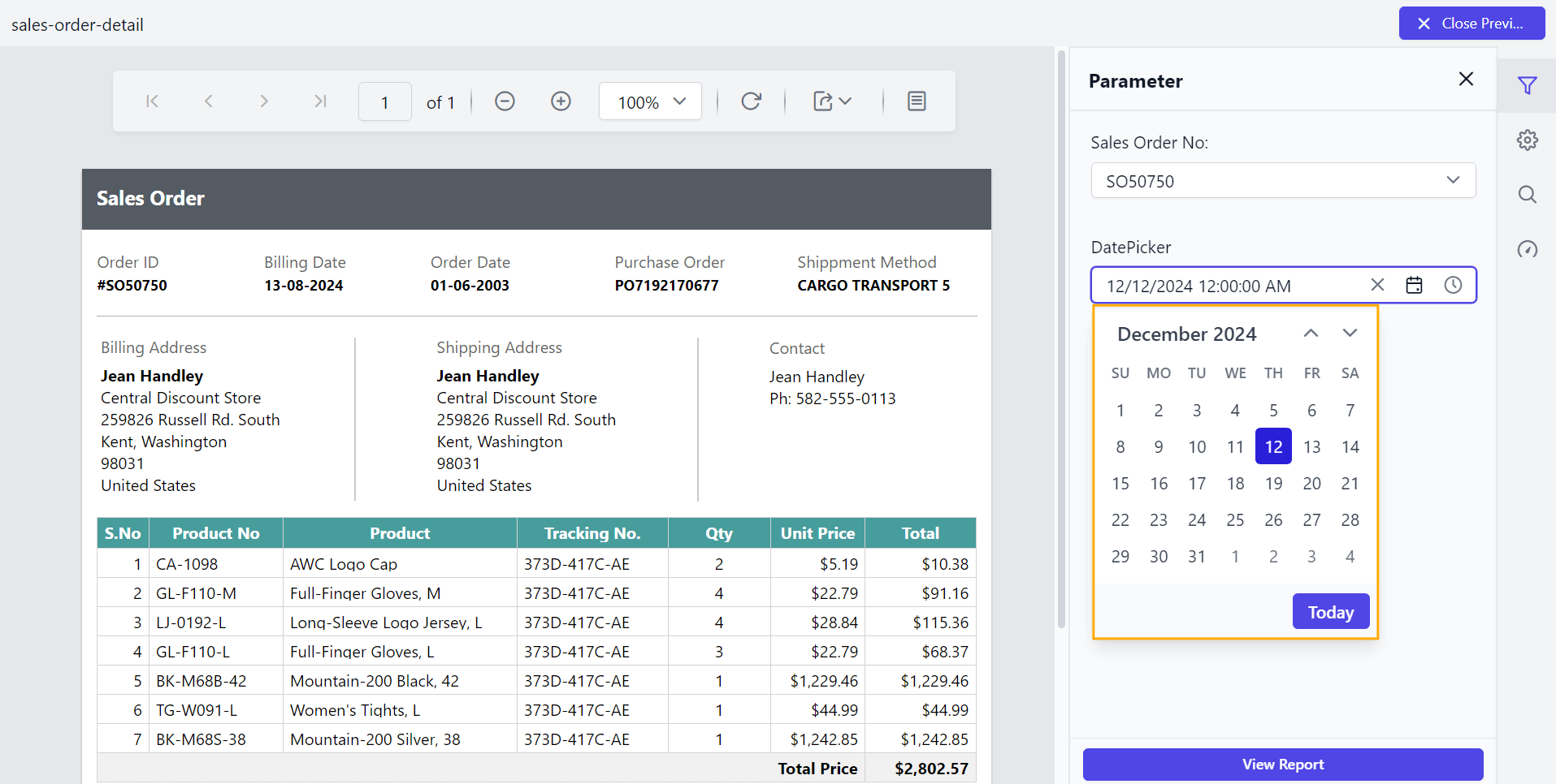
Preview the report to see the DateStartLevel set to Decade in the datetime parameter.
Date depth view for date report parameter
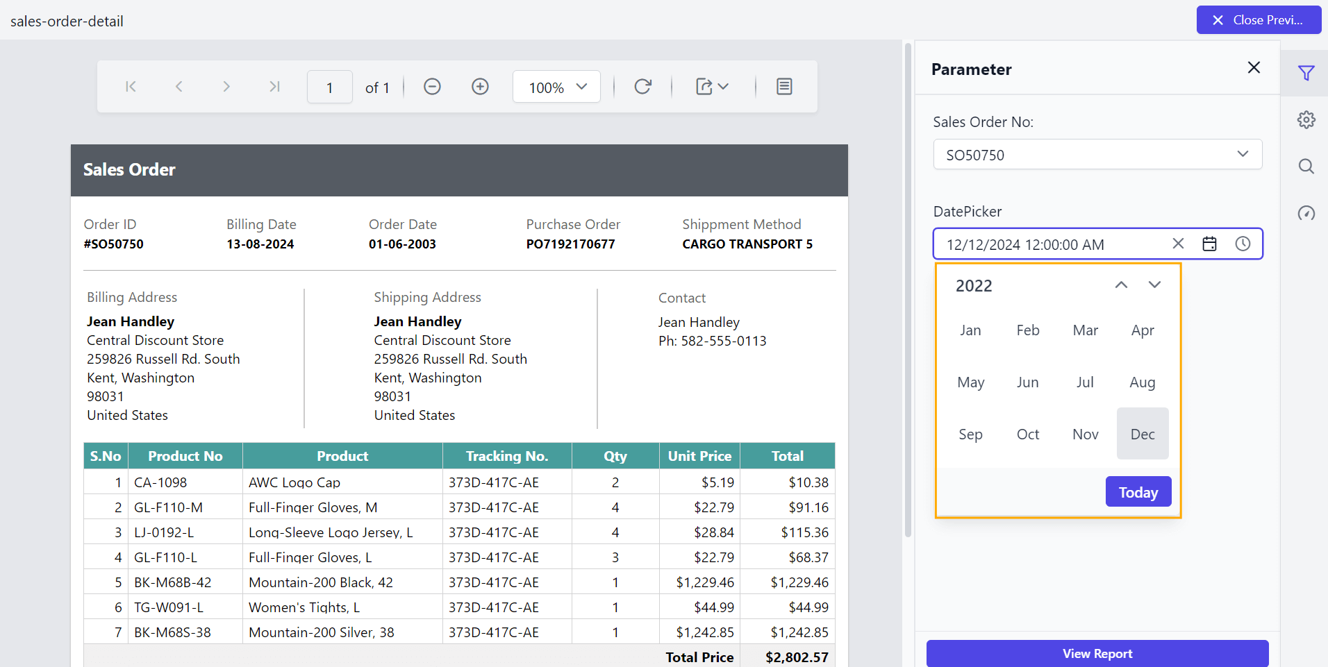
The DateDepthLevel custom property sets the maximum level of the datetime parameter item, such as Month, Year, and Decade in the calendar. The depth view should be smaller than the start view to restrict its view navigation. By default, the DateDepthLevel value is set as Month.
You can set the DateDepthLevel property value as shown below.
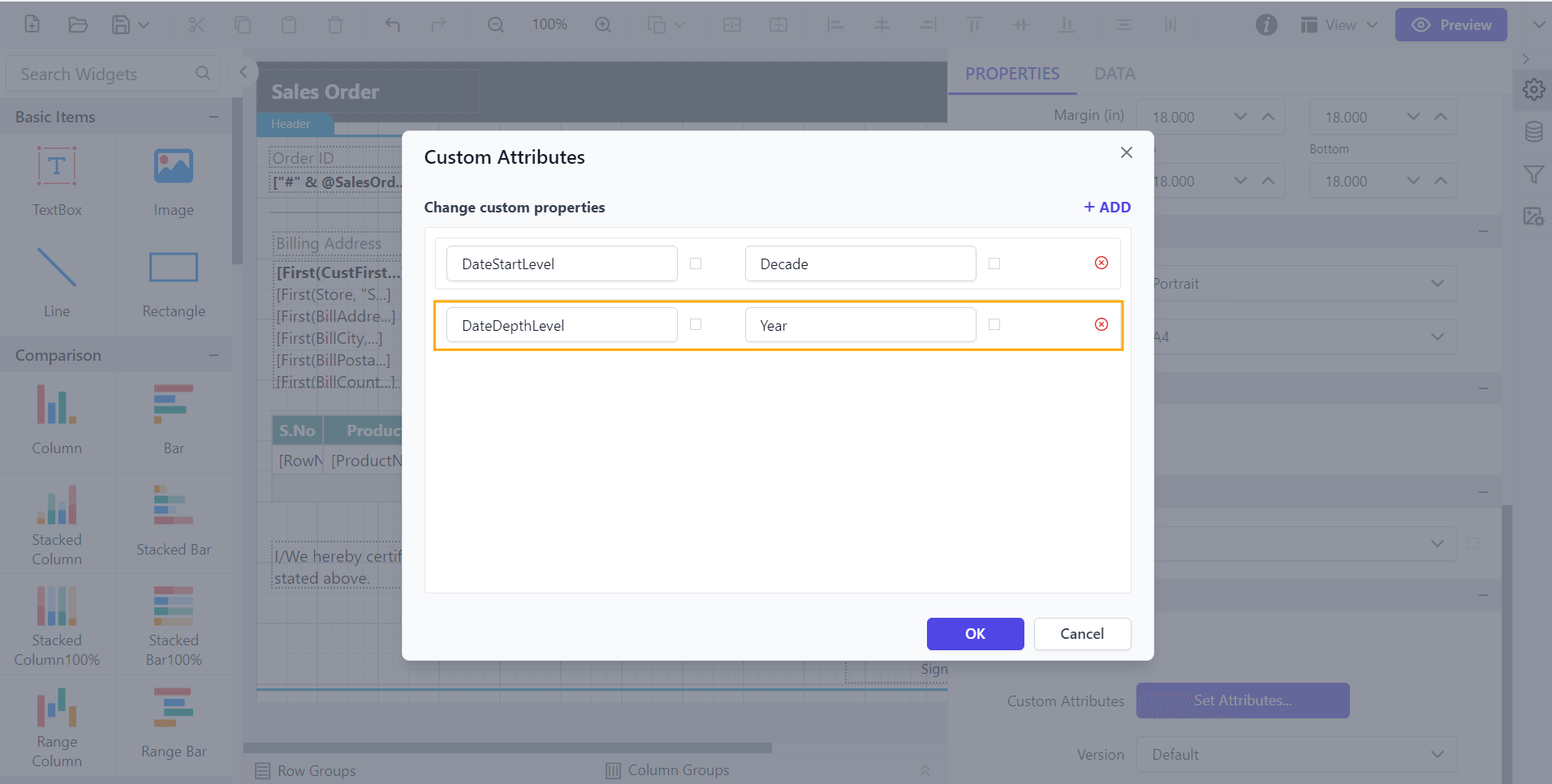
Preview the report to see the DateDepthLevel set to Year in the datetime parameter.
Virtual scrolling for dropdown list and multi-select parameters
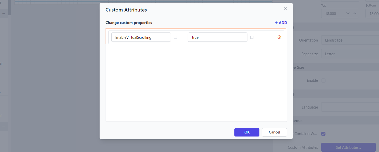
The EnableVirtualScrolling property allows dropdown lists and multi-select parameters to load values dynamically during scrolling. This improves performance and speeds up the rendering of the parameter popup, especially for large datasets.
You can set the EnableVirtualScrolling property’s value as shown below.
Enable Selection Order for multi-select parameters
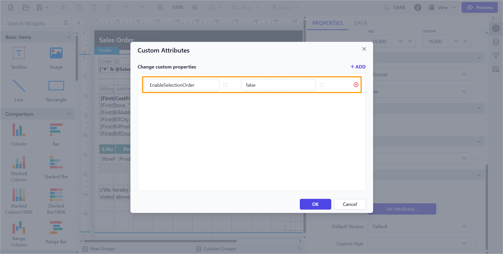
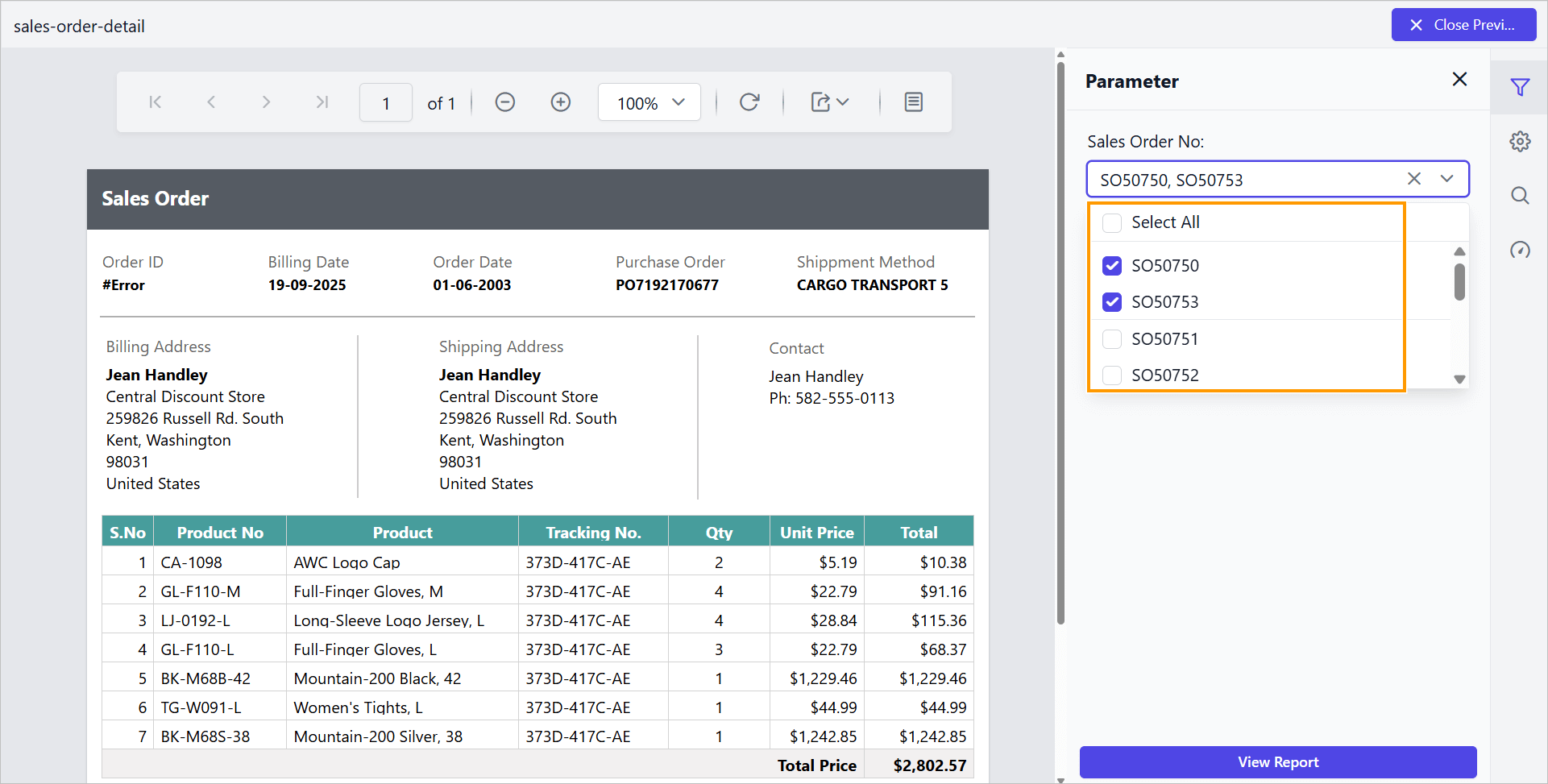
The EnableSelectionOrder custom property allows you to maintain the order in which users select items. By default, the value of EnableSelectionOrder is set to true, which means the selected items in a MultiSelect dropdown will be displayed in the top.
You can set the EnableSelectionOrder property as shown below:
Before disabling the selection order, the default value will be displayed as shown below.
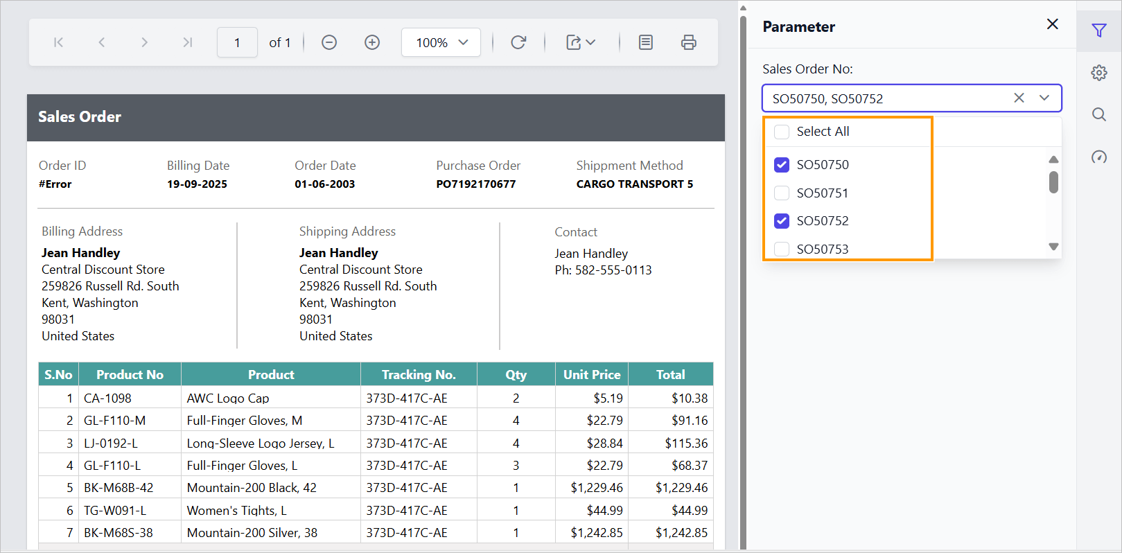
Preview the report and check the selection order in the parameter list as shown below.
Display Selected values for multi-select parameters
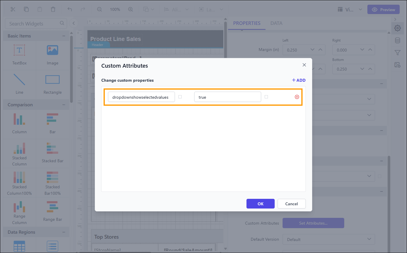
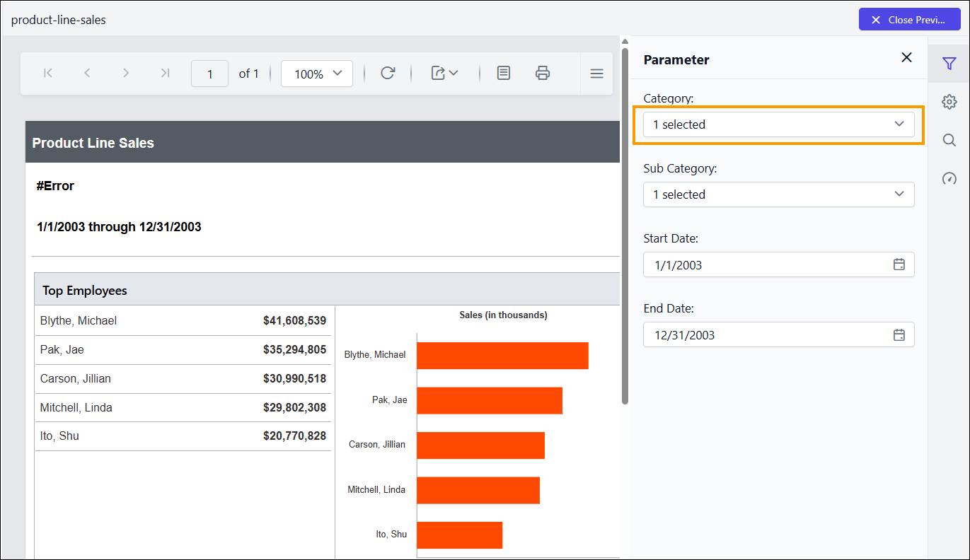
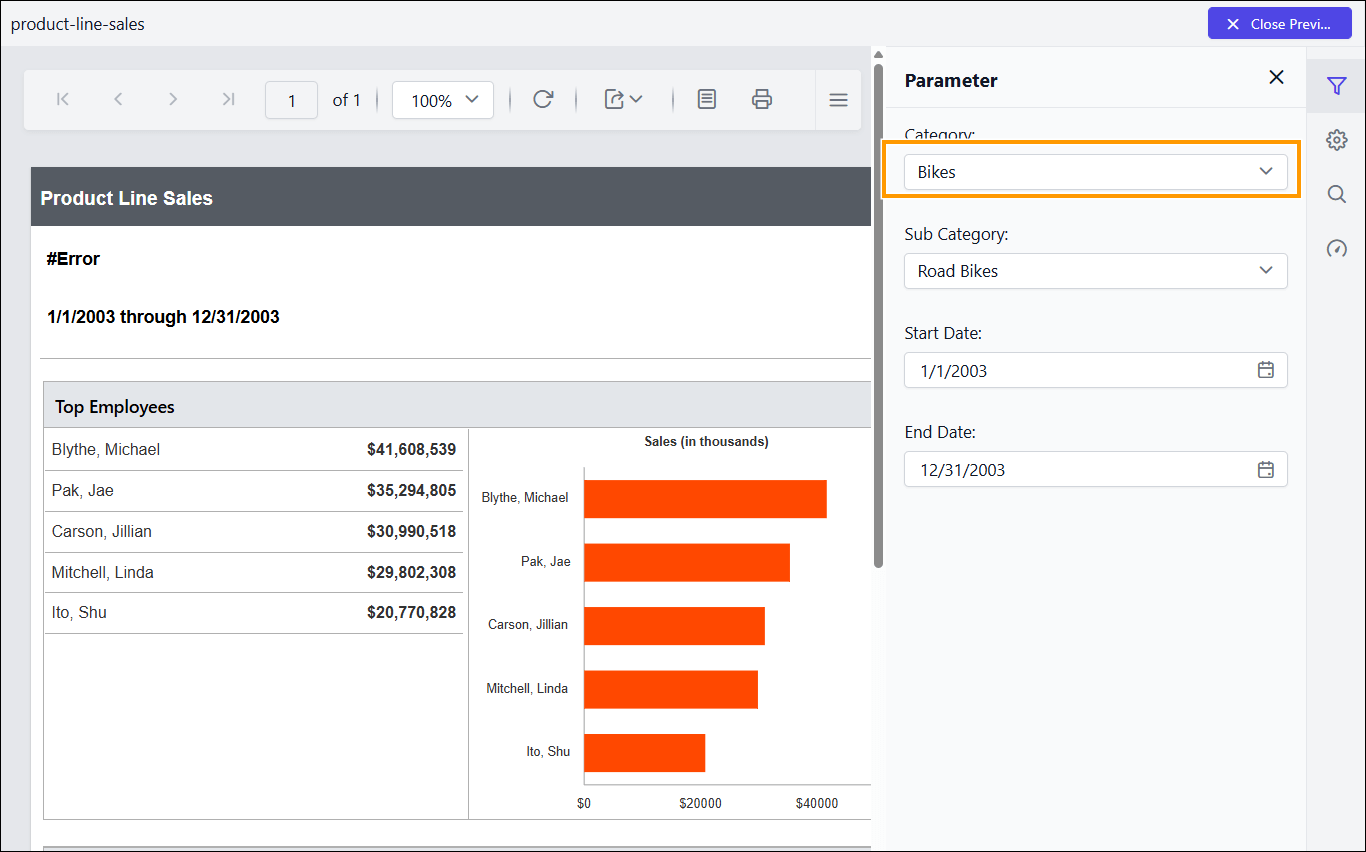
The DropdownShowSelectedValues custom property allows you to display the selected values in the MultiSelect input box. By default, the value of DropdownShowSelectedValues is set to false, which means the input box displays only the number of selected items in a MultiSelect dropdown
You can set the DropdownShowSelectedValues property as shown below:
Before enabling this property, the default value will be displayed as shown below:
After enabling the property, preview the report to see the selected values displayed in the parameter list, as shown below:
- Show only distinct values in parameter
- Change the dropdown parameter pop up height value
- Change the dropdown parameter pop up width value
- Set the minimum date range for the date report parameter
- Set the maximum date range for date report parameter
- Hide the report parameter block
- Set date and time format for parameter
- Change time display format for parameter
- Set time interval in datetime parameter
- Enable filtering and searching in drop-down report parameter
- Change date report parameter to display date time picker
- Enable popup resize in drop-down report parameter
- Customizing parameter block position
- Set specific parameter item width
- Change the first day of the week in the Calendar
- Set the mandatory parameter
- Enable scroller for parameter block
- Date start view for date report parameter
- Date depth view for date report parameter
- Virtual scrolling for dropdown list and multi-select parameters
- Enable Selection Order for multi-select parameters
- Display Selected values for multi-select parameters