Chart Series
This section explains how to customize the chart series appearance using the properties panel. You can add multiple series to the chart and the available series will be listed in the Choose Series drop-down.
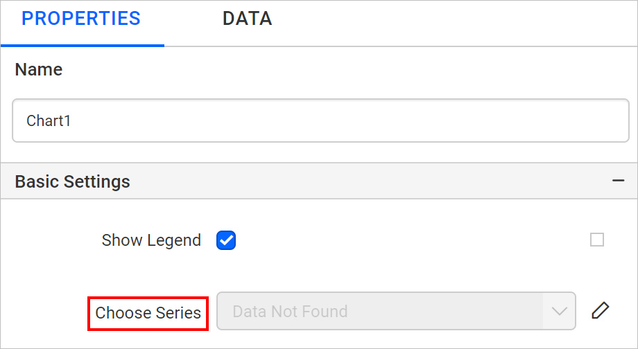
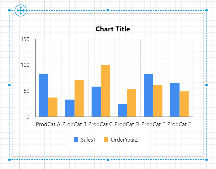
In the below snap, the chart has single series.
So, only one series is listed in the drop-down,
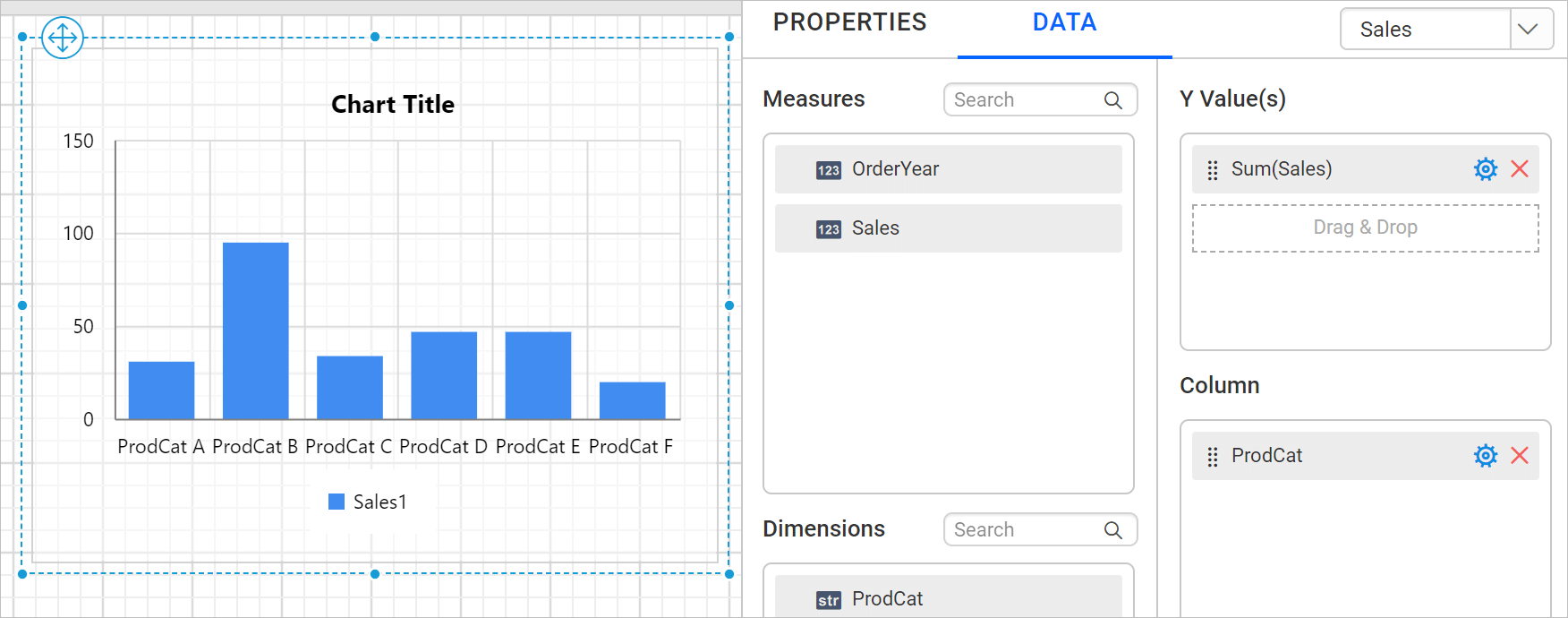
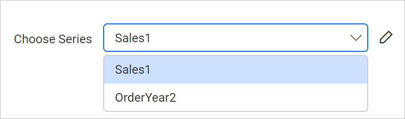
If the chart has multiple series as below,
Now, both series will be listed in the properties panel.
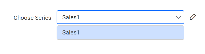
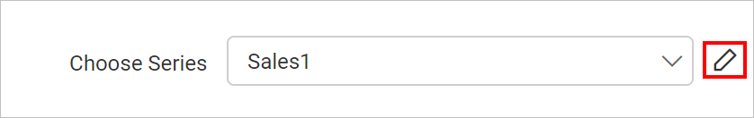
To customize the series appearance choose the required series name in the drop-down. Then click on the edit icon.
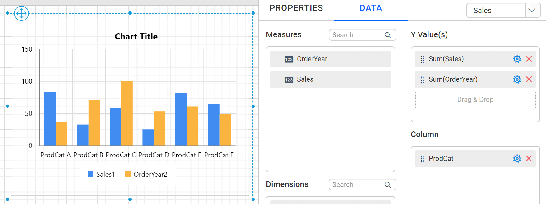
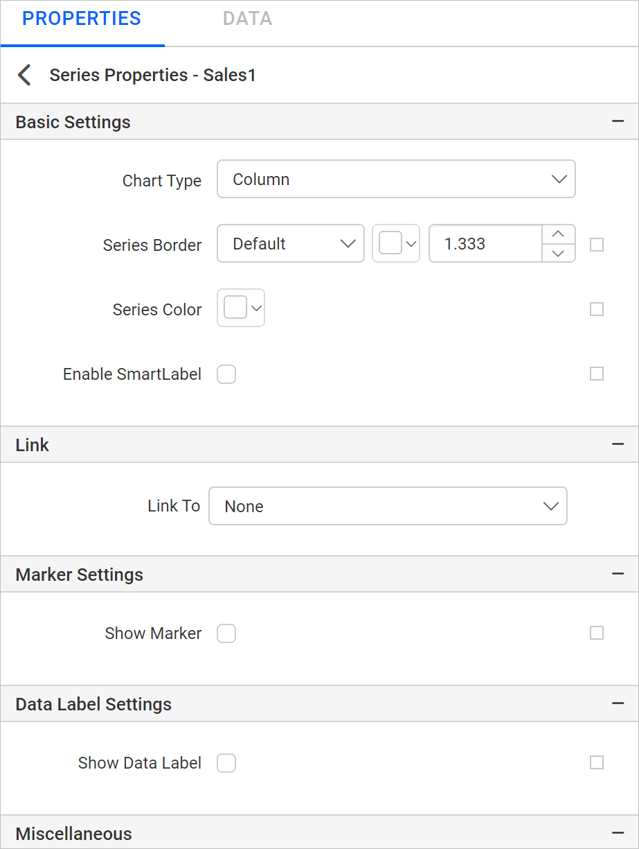
Now, the respective series properties will be displayed in secondary panel.
Basic Settings
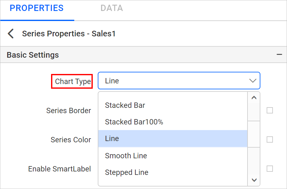
Chart Type
Supported chart types will be listed in the Chart Type property dropdown. You can switch a series to required chart type based on your data presentation.
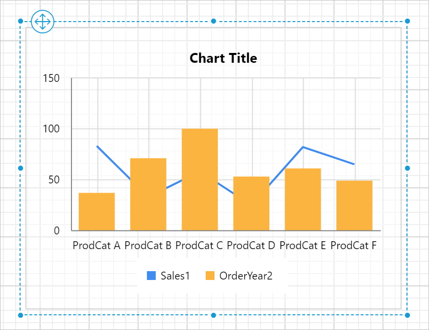
For example, the chart has two series. Both series are of column chart type.
Let’s choose first series and change chart type as Line.
Now, you can see respective series is changed to line type in chart surface.
Refer Chart switcher section, to customize each series using the properties panel.
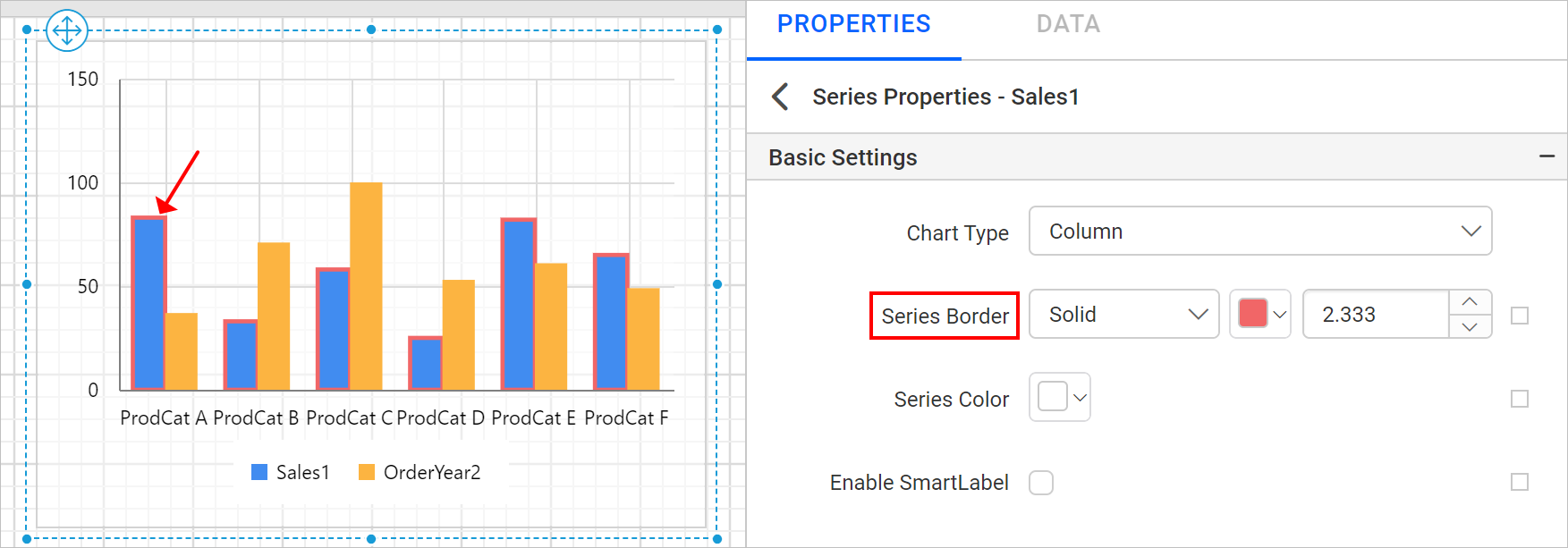
Series Border
Series border properties can be used to customize the chart series border in the design.
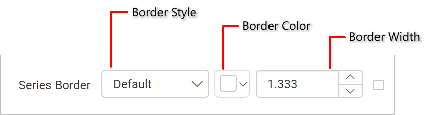
In the below design, border color, width and style properties are applied to the chart series.
You can also set properties based on dynamic values, by using the Expressions. Refer Set Expression and Reset Expression section to open set/reset expression menu in properties panel.
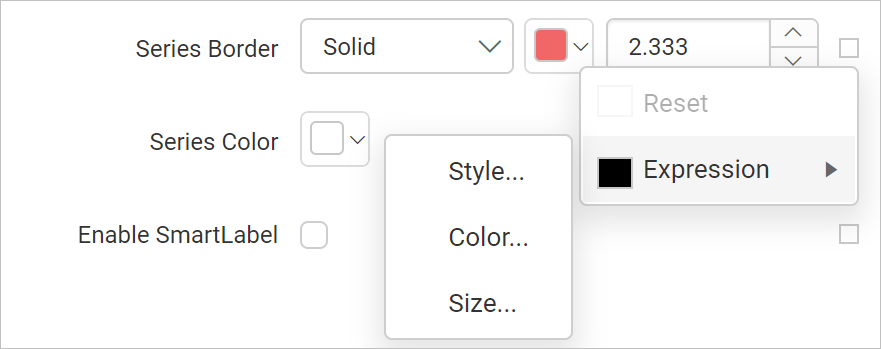
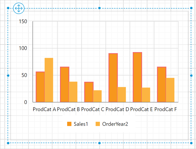
Series Color
Series Color property can be used to customize the series colors in the chart area. If the chart has multiple series, you can differentiate the series using this property.
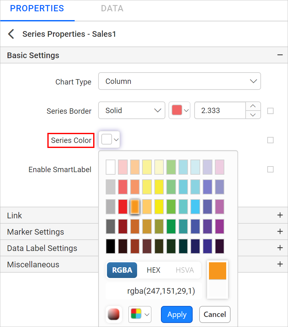
Now, the selected color will be applied to the respective series in the chart design.
You can also apply series color based on dynamic values, by using the Expressions. Refer Set Expressions and Reset Expressions section to open set/reset expression menu in properties panel.
Series Shadow
The Shadow Color property lets you set the color of shadows for chart elements, enhancing their appearance. The Shadow Offset property adjusts the distance between the chart series and their shadows, allowing for subtle or bold shadow effects.
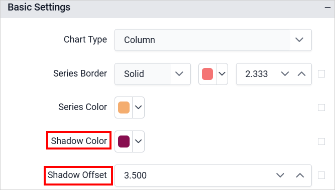
The selected shadow color and offset will be applied to the corresponding series in the chart design during preview.
You can also apply shadow properties based on dynamic values, by using the Expressions. Refer Set Expressions and Reset Expressions section to open set/reset expression menu in properties panel.
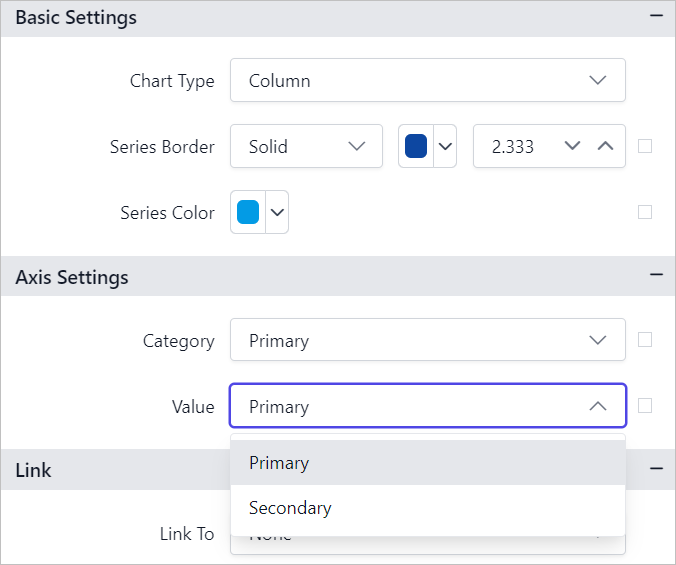
Axis Settings
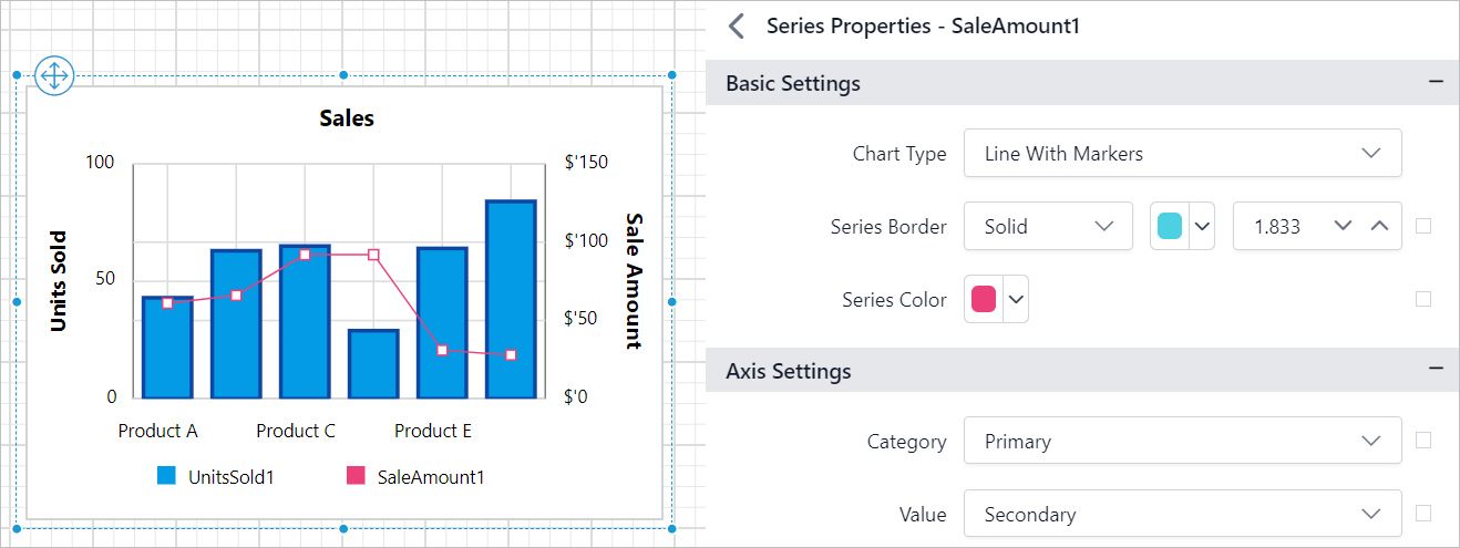
Charts typically have two axes to help organize and display data more meaningfully. They can be easily visualized by presenting series data with different ranges or unit types on different axes, using primary and secondary axes.
Primary and Secondary axis options will be listed in the Category and Value property dropdown.
If you want to showcase the number of units sold (in unit type numbers) in every month of the year along with the total sale amount (in unit type Dollars), you don’t have to compare this in two different charts. Instead, you can display the total number of units sold (in unit type numbers) on the primary y-axis and the total sale amount (in unit type Dollars) will be displayed on the secondary y-axis. This allows us to compare multiple series with different ranges on the same chart.
Note: Axis settings are not applicable for
ProportionandKPIchart types.
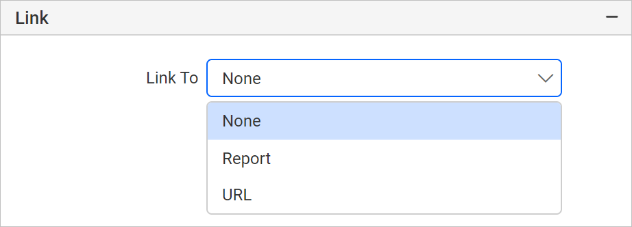
Link
Link To
You can configure Hyperlink, Bookmark or a Report path in the chart series to create an interactive report. Refer Linking section to set or reset link property for chart series.
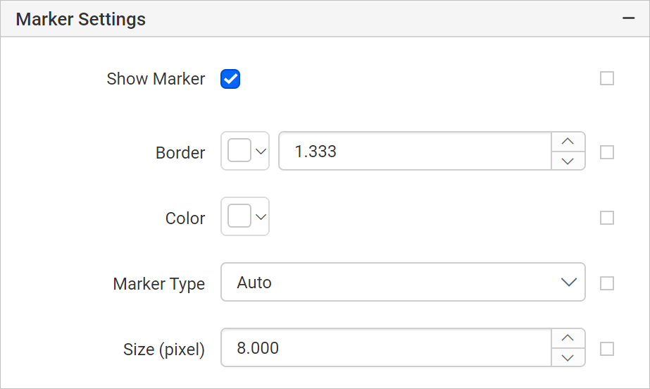
Marker Settings
Show Marker
Data markers are used to provide information about the data point to the user. You can add a shape and label to adorn each data point. To set/reset marker properties, refer Marker property section.
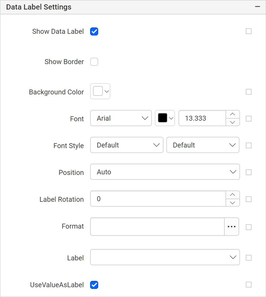
Data Label Settings
Show Data Label
Data label can be added to a chart series by using the Show Data Label property. The labels appear at the top of the data point, by default. To set/reset data label properties, refer Data Label property section.
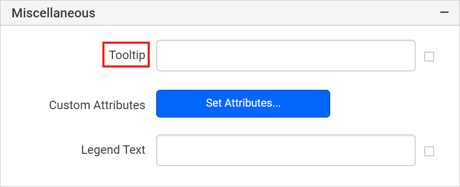
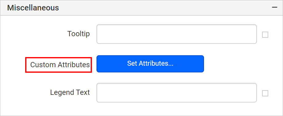
Miscellaneous
Tooltip
Tooltip property can be used to display informative text or value, when the user hovers over the respective series in report preview. To set tooltip for chart series using properties panel refer Tooltip section.
Custom Attributes
This property can be used to set the values for chart series custom properties. To assign values for series custom properties using properties panel refer Custom Properties section.
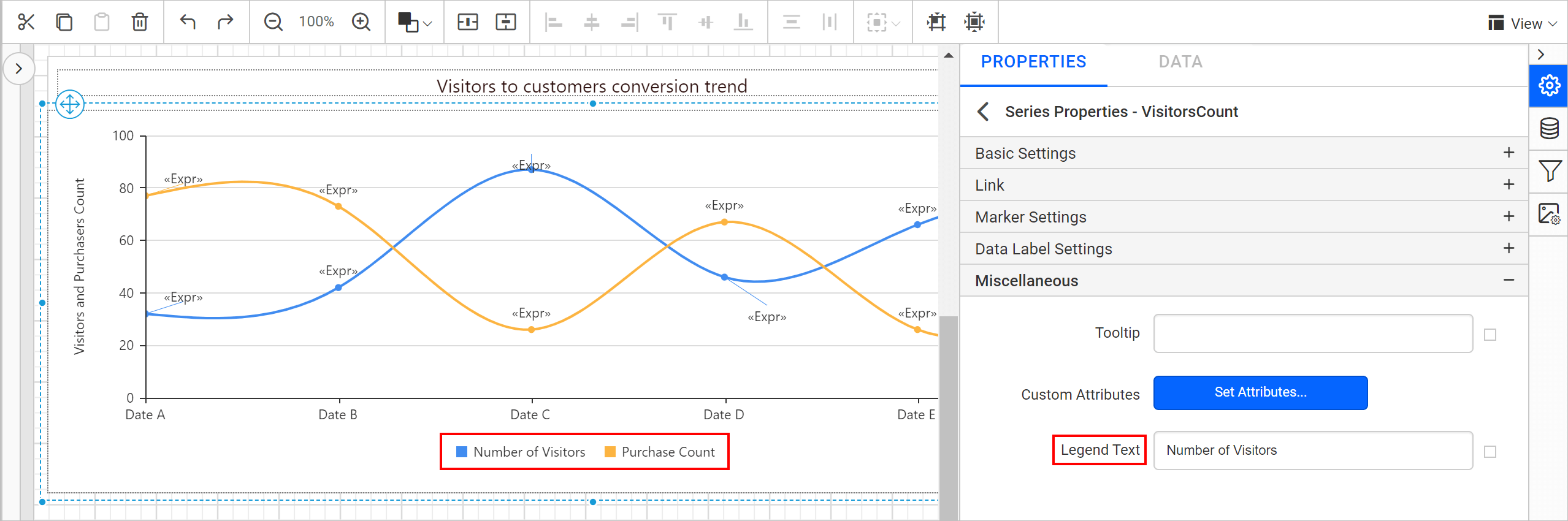
Legend Text
A Legend Text property can be used to customize the legend text of each series in the chart.
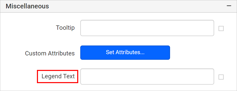
You can customize text for all legends on your report by navigating to the series properties.
You can also set the legend text property based on dynamic values, by using the Expressions. Refer Set Expression and Reset Expression section to open set/reset expression menu in properties panel.